Top Watercolor Techniques to Create Depth in a Painting
Apr 29, 2024As a beginning watercolor artist, have you ever wondered how to create distance and depth on a thin sheet of paper?
This blog post is going to address this topic head on. In it, I offer you four practical watercolor techniques to create depth in your watercolors.
How to Create Depth in a Painting
So let’s dive in and learn more about how to create a sense of depth and dimension in your paintings.
Depth: Definition in Art
What do I mean when I refer to depth in a painting?
Depth in a painting is the illusion of a three-dimensional space on a two-dimensional surface. The perception of space between the foreground, middle ground, and background of a scene is what creates this dimension.
Watercolor artists use a range of techniques to create this sense of distance. Some of them are more advanced, and others pretty simple. Today I cover essential watercolor techniques I use when I want to accentuate the distance in a watercolor scene.
4 Watercolor Techniques to Create the Illusion of Distance in a Painting
Distance is about perspective and perception. To achieve this, you must make some elements of the painting seem closer to the viewer and others further away. Here are some methods I use to accomplish this in my paintings.
1. Apply Soft and Hard Edges for Depth and Distance
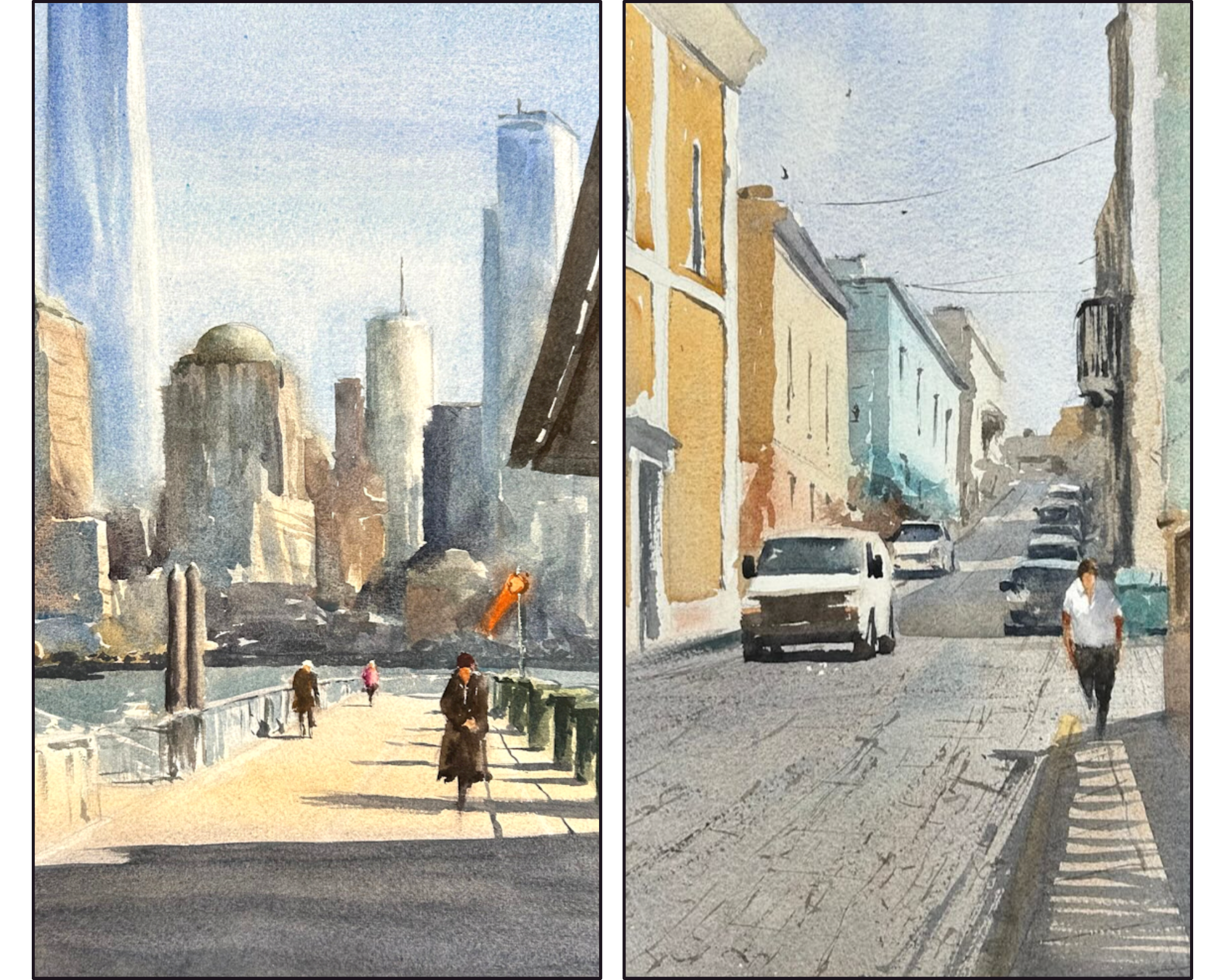
One method of achieving distance in your painting is to use edges strategically. The general rule you should remember is that hard edges appear closer to the viewer and soft edges fade into the distance.

What is the difference between a hard edge and a soft edge in painting?
A hard edge is a crisp, well-defined line that creates a distinct shape, outline, or border.
A soft edge is a less-defined, blurred line that indicates a more gradual transition between elements of your painting.
2. Create a Vanishing Point on the Horizon Line
One line that you should pay close attention to when you paint a landscape is the horizon line. Softening this line helps to add depth to your painting by creating distance between the foreground and the background.
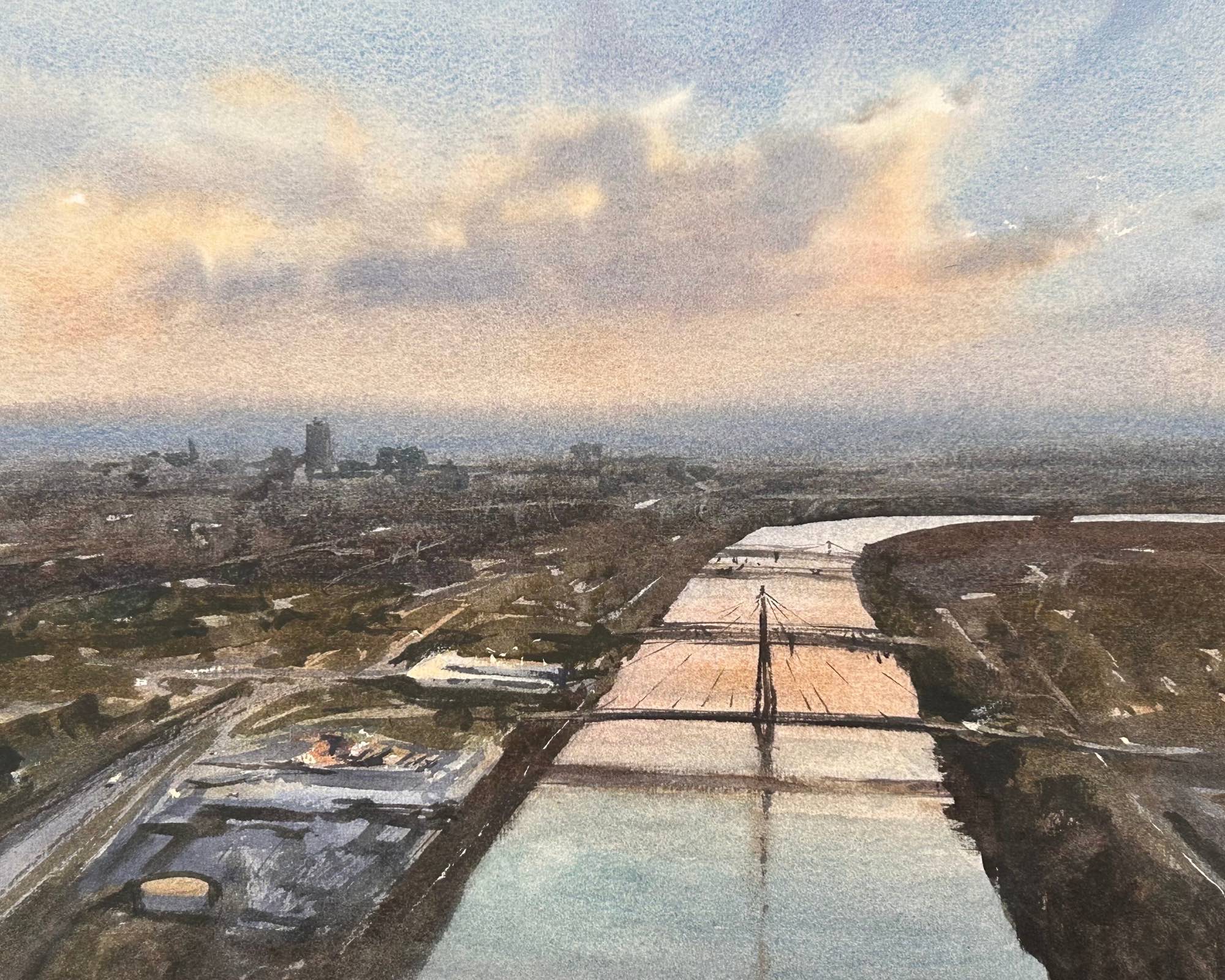
So, before the second wash of this painting, I applied clean water along the horizon line to soften it. This helped to separate it from the foreground and allowed me the space I needed to render this watercolor scene.
The soft edge of the horizon contrasted with the harder edges in the foreground evoke three-dimensional space. Notice how my edges hardened as I moved forward toward the focal point of the painting.
3. Use Color Temperature that Recedes Into the Distance
Another useful tool we have to create depth is color temperature: warm colors and cool colors.
As a general rule, cooler colors feel further away and warmer colors feel closer up.
This doesn’t mean you can’t use warm colors in the distance.
In the watercolor scene above, for example, I painted a sunset with warm colors in the sky - yellow and orange. But the horizon line, you’ll notice I anchored with a blue. And notice that behind the bridge in the foreground - the focal point of my painting - I use a warm color. This pushes it to the front.
What is the difference between a cool color and a warm color?
Cool colors are blues, greens, purples and hybrids of these colors.
Warm colors are reds, yellows, and oranges.
The identification of a color as warm or cool gets more complex when, say, blue and yellow are mixed. This can take some time to get your head around if color theory is new to you. Here is a more thorough explanation of it that should help if you are struggling with the concept.
4. Achieve a Sense of Depth with Saturation
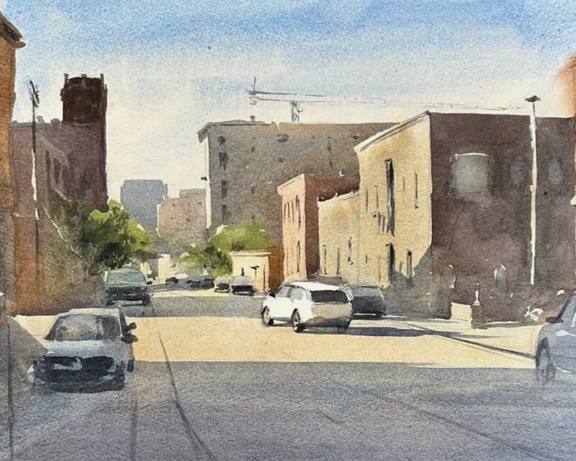
Paintings that create the illusion of depth often have more saturated colors in the foreground than in the background. What I mean by this is that the colors that are richer and less translucent move forward in the painting. The colors that are lighter and more translucent fade into the distance.
In watercolor, this means we are putting more pigment on our brush to create these stronger colors. And, conversely, we are adding more water to our mixes when we want the color to recede.
If you watch my video tutorial, you’ll notice I use a lot more paint in my painting’s foreground. I intentionally create more contrast here. This, along with the other watercolor techniques I am using, helps to convey this feeling of depth.
Other Watercolor Tips to Paint Landscape Paintings
Use Several Colors in Your Washes
Beginner watercolor artists often use too few colors in their paintings. Watch ss I work my way through a wash (in the video). I try to incorporate several different pigments and let them merge on the paper.
This is one of the wonderful things about watercolor painting. In fact this characteristic is one I find particularly alluring. This mixing of colors on the page makes for gorgeous skies, sunsets, landscapes - and really any watercolor subject you want to paint.
Practice Negative Painting
A key skill to learn when painting watercolor is negative painting. In my video, you’ll see that I applied several washes when creating this scene. I paint around the colors already laid down, preserving them and defining them into shapes. This is negative painting.
Negative painting gives us these nice overlapping elements that help create dimension and interest in a painting.
Related Blogs
Creating Depth and Realism: Essential Strategies for Watercolor Landscape Artists

