Common Watercolor Mistake You Can Fix Today
Sep 16, 2024Below, I have placed two of my paintings - one is an older painting, and one is more recent. There are many differences between these two paintings. The first one has several mistakes, but one mistake stands out as the most important to address.

As I walk you through the watercolor painting process I used to create this more recent painting, we’ll also discuss how to avoid this foundational mistake in your paintings.
Stop Making this Mistake in Watercolor Paintings
Enjoy this Post? Like This Pin!
I see firsthand the watercolor mistakes beginners make most frequently. Some are tricky and take a lot of practice to improve on, but there’s one that you can fix during your next painting session. Keep reading to learn a quick fix for more vibrant watercolors!
Step-by-Step Guide To More Saturated, Rich Colors
As I study my older painting and compare it to my newer painting, I see that the key mistake I was making has to do with my paint consistency. I wasn’t using enough paint, and this was causing my painting to fall flat.
Let’s break down the watercolor painting process and highlight the ways that using rich, saturated colors gave me the results I wanted.
First Wash
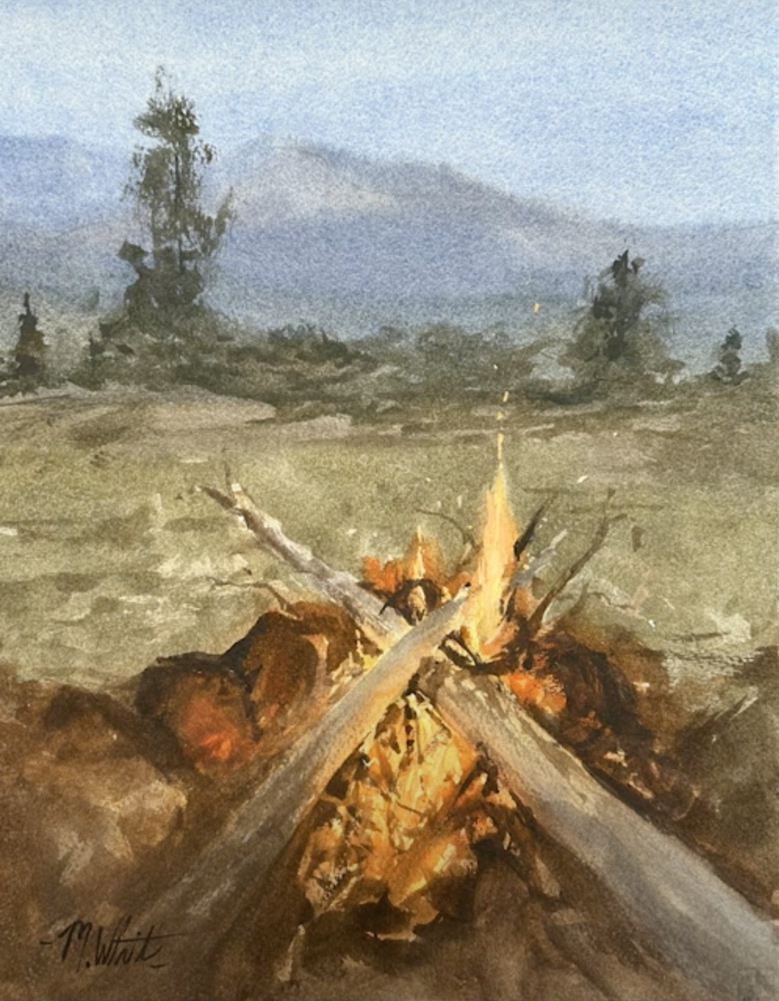
After I lay out my drawing and wet down the front and back of my paper, I begin my first wash. I first focus on the brightest part of the painting, which in this painting is the campfire. In watercolor, we're really painting in reverse. So we have to think about our lightest areas first, and build up the strength of the scene from there.
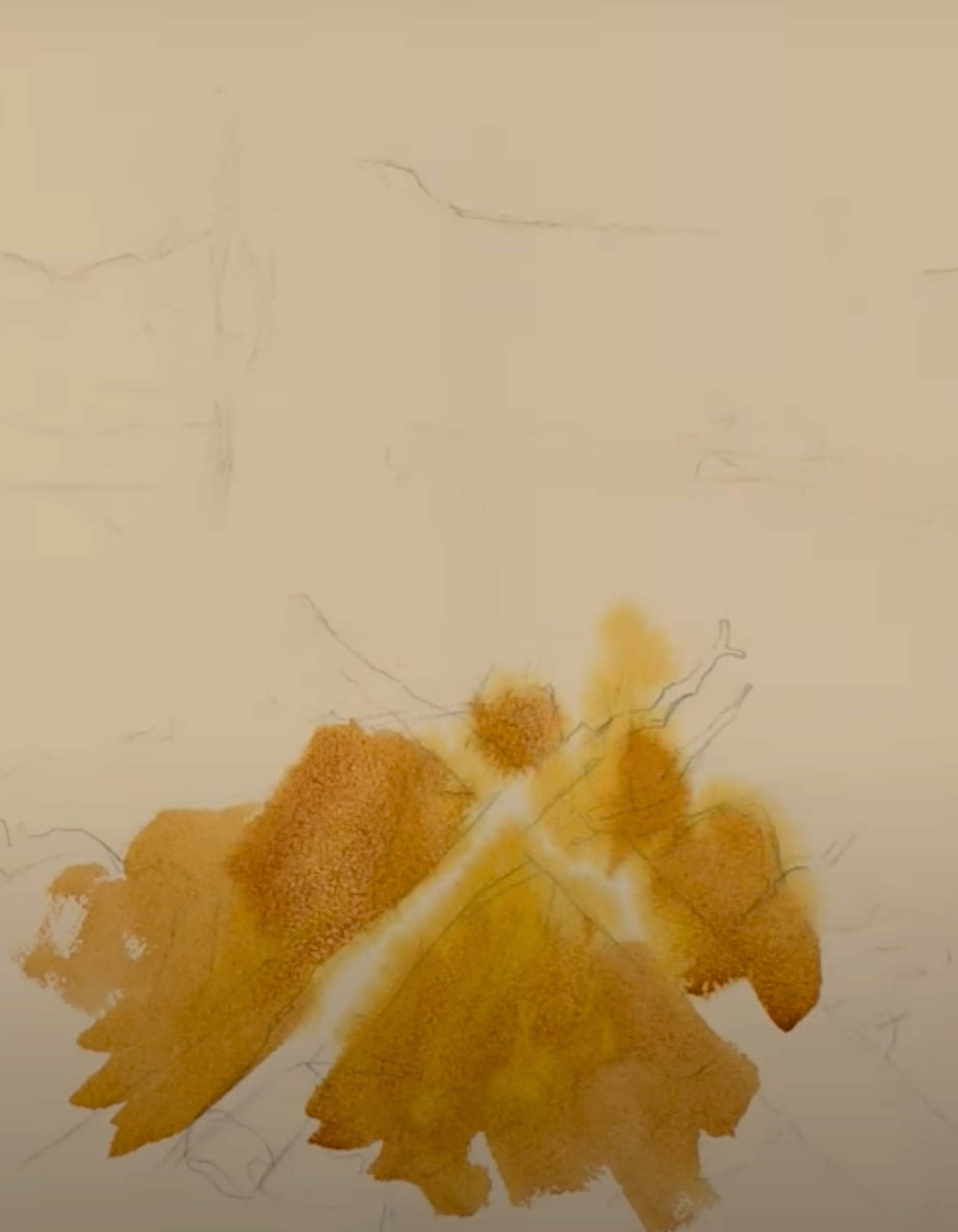
I’m using Cadmium Yellow with Quinacridone Gold, some really rich, vibrant, warm colors. I'm also using some Lavender and throwing in a little bit of the cooler colors as well.
Now, my whole paper is damp and so you'll see I'm getting nice soft edges in this first wash. The focus right now is the vibrant light of the scene and the color of those light areas. Everything else, we're going to paint over again, so it just needs a light, abstract wash.
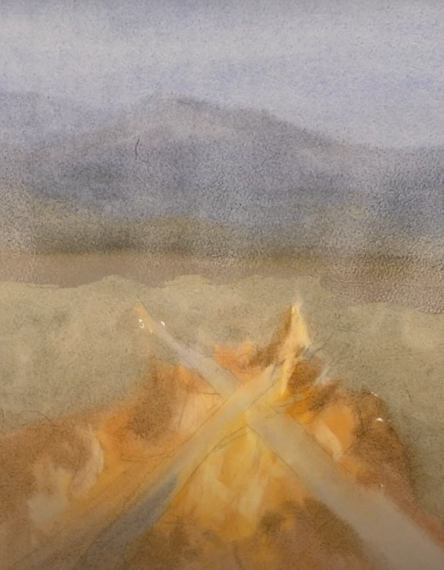
To show the warmth and glow of that fire, I use Burnt Sienna and Rose Madder Permanent and add some Neutral Tint.
For scenes like this, when you want the light to be bright on your first wash, you need a lot of rich paint, because you’re not going to be able to make it as bright as you want unless you have really strong, rich values.
If we don't have contrast, if we don't have those really rich values, we will never achieve the light that we want. Paintings appear muted and dull when the artist doesn’t push those values.
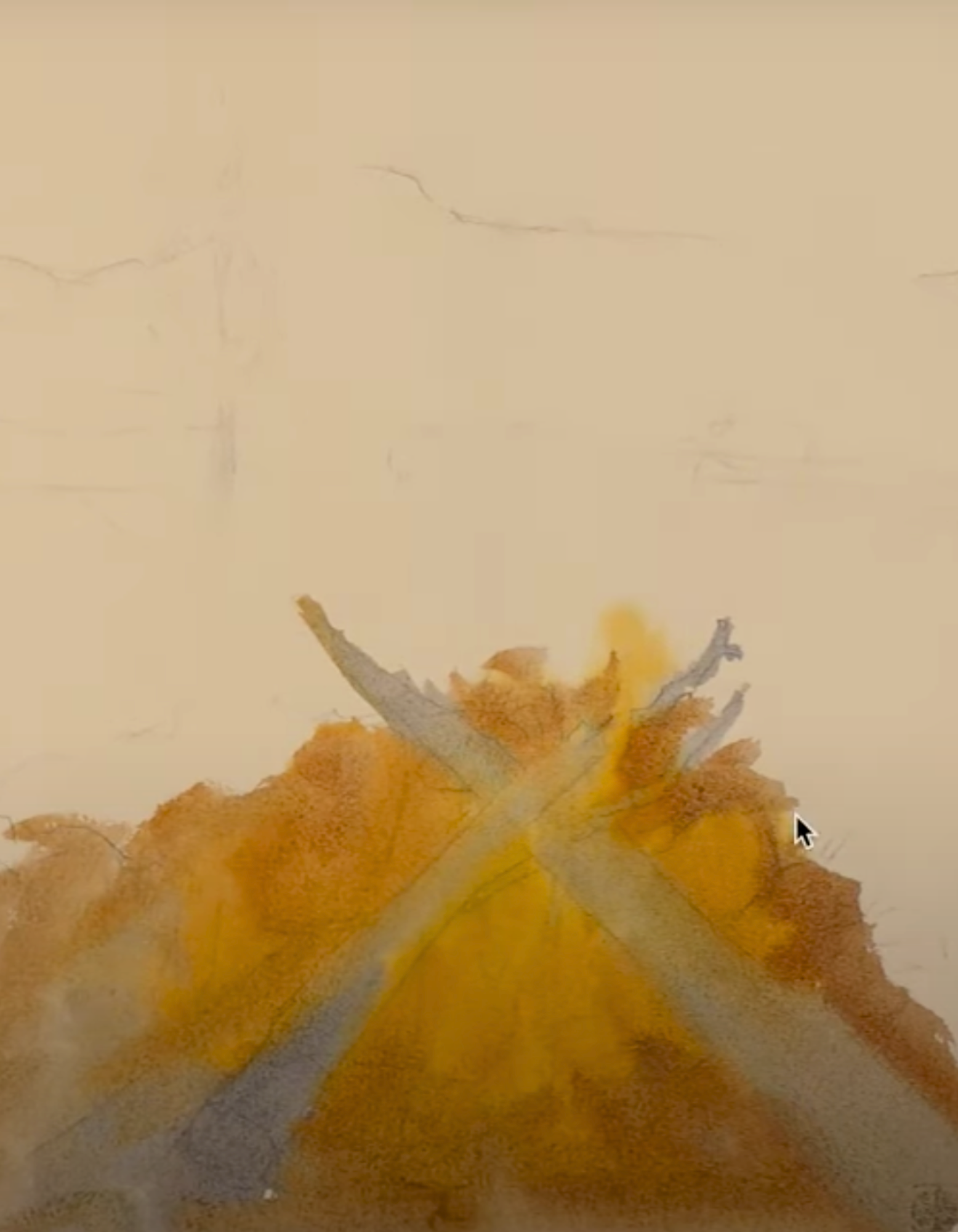
While the paper is still wet, I want to do one last thing to this fire. It needs some small areas that are brighter and stand out from the rest. So next, I take a damp and clean brush and lift off some of the areas in the flames that I want to be extra bright.
Lifting is a watercolor technique that you can use to remove some paint from the watercolor paper while the paint is still wet. To do this, you use a slightly damp brush, sponge, or paper towel. Then, using blotting or brush strokes, you soak up some of the pigment.
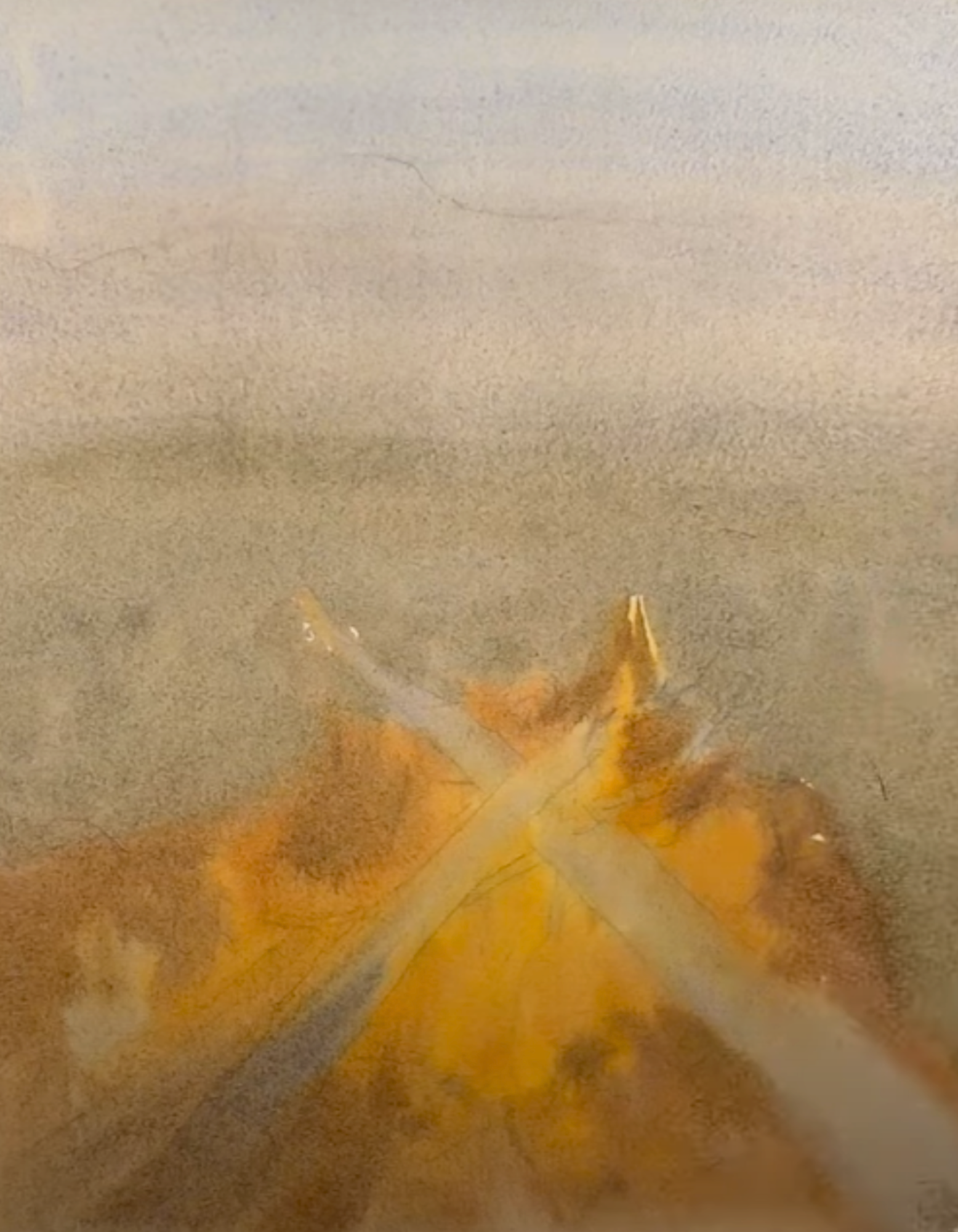
This is what the first wash of the scene looks like.
Again, the focus is on this bright area of light and laying in the lightest values. I was not shy about how saturated I made the colors in the foreground because I knew that in order to get the light as bright as I want, I needed to lay those colors down in the first wash.
Second Wash
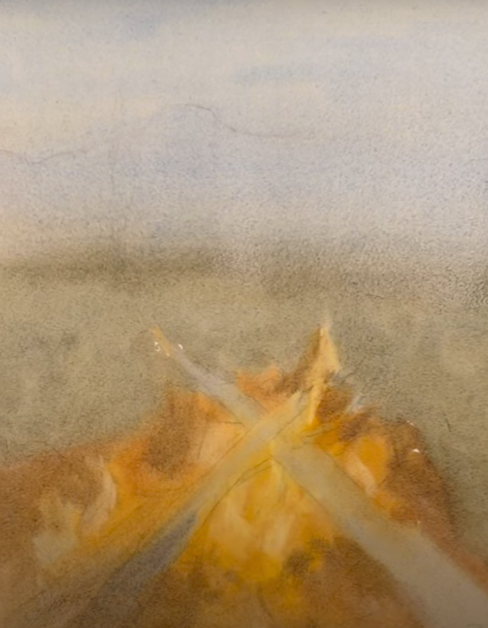
When my first wash is completely dry, I start my second wash at the top of the sky, using some Lavender and Cerulean with some Cobalt Blue.
What's great about painting another wash for the sky is that now I can paint the mountains in the distance with a nice, lovely, soft, wet edge. With my calligraphy brush and some Burnt Sienna and Lavender, I just suggest those mountains. Then I drop in a mixture of Lavender, Cerulean, and Cobalt Blue while it's still nice and damp.
As I work down the paper from the mountains, it would be tempting to leave the grass color as is. But the problem with that is the values are just not strong enough. I know that I want the ground to be a stronger value so that I really showcase the light of the fire.
So paint over the ground, negatively painting around the campfire. So you can see that a little bit of value is already starting to make a difference because the log was a lighter color than the grass behind it.
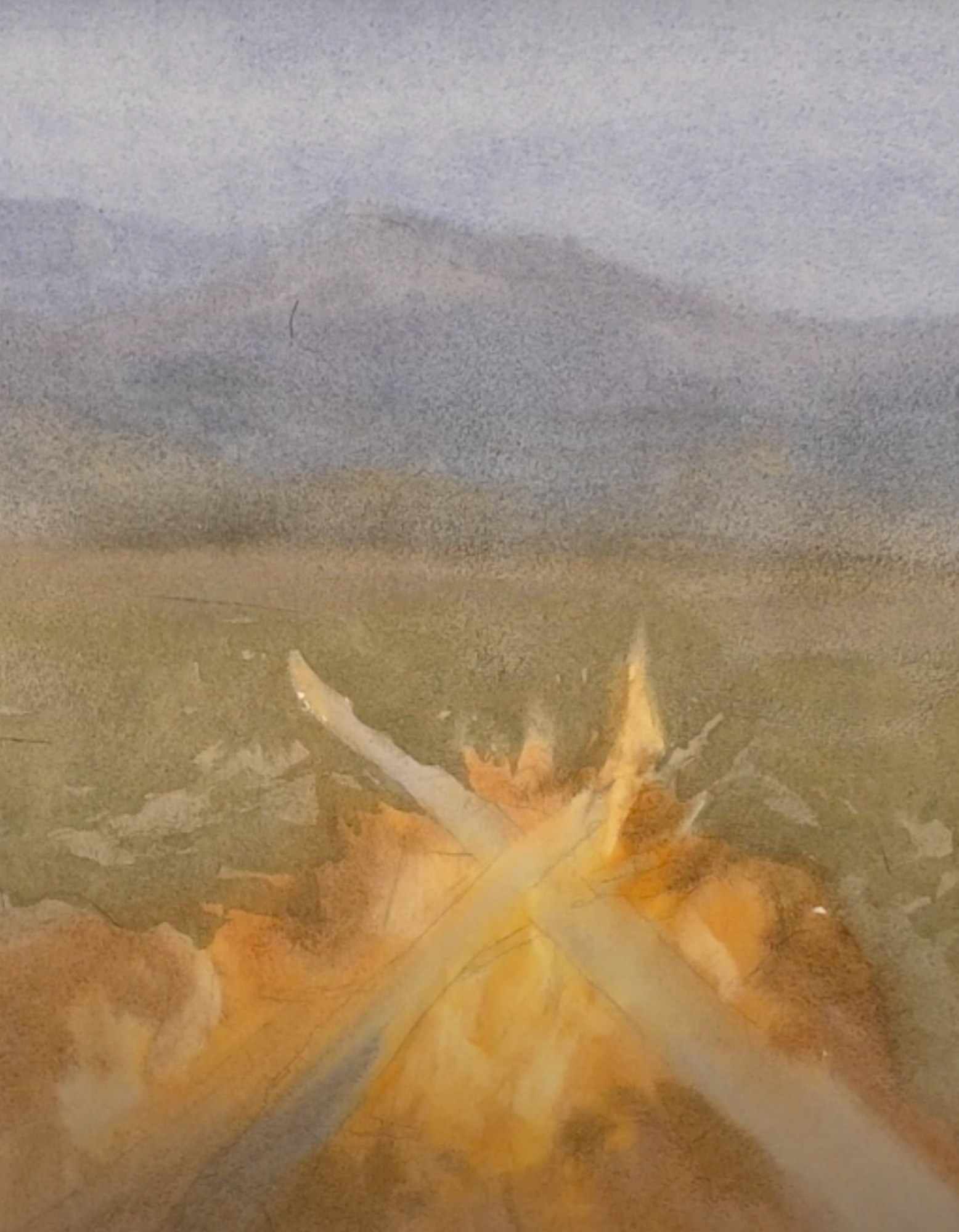
The flames need to be brighter than the grass behind it, and by being willing to work in layers like this, I can get to that strength to make this light bright. Next I work in the darkness of the stones that are around the fire and everything else around the fire to really get up to that strength that I want.
We're starting to get that nice glow feeling because I've added the warmth of the reflection and painted darker areas around the logs to really get that feeling of light.
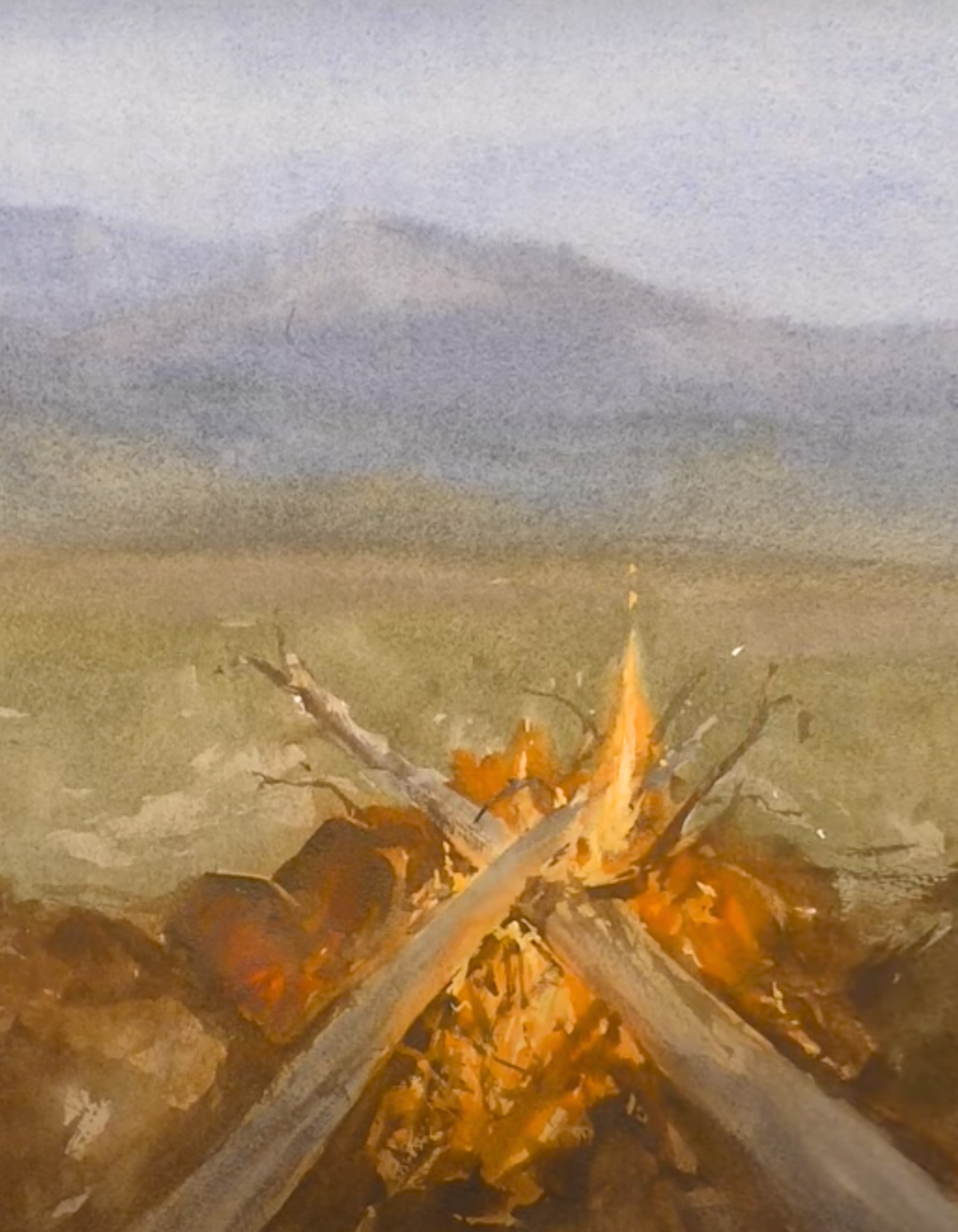
Next, I go back and I use some gouache to depict little sparks flying off the fire and then I move to the background.
Using my calligraphy brush and a good thick amount of paint, I drop in the trees in the middle ground, which brings it a little more interest and creates some nice depth. The trees are an example of dry brushing and I’m using a thick paint consistency.
Now we are down to just a few little finishing touches, and I want enough interest to pull this fire forward and let the rest of it sit in the background. So I add a few little darks on some of the stones and around the key areas of the fire and a few more little darks on some of the trees.
Here’s a look at the finished painting.
Fix One of of the Most Common Mistakes Today
When students learn to use really rich paint with the right ratio of paint and water, we can move from values that are weak and muted to paintings that are dynamic and can catch your eye. The next time that you are mixing, make sure that you're using enough paint to really push those values and create a powerful scene.
Related Blogs
Creating Depth and Realism: Essential Strategies for Watercolor Landscape Artists
How my John Pike Palette Helps Me Increase the Vibrancy of My Watercolors
Mastering Warm Realistic Light: A Watercolor Tutorial for Captivating Art