How to Use Cool and Warm Colors to Depict Distance
Mar 03, 2025Color temperature is something embedded in a lot of my instruction. But a simple landscape painting tutorial like the one above offers a perfect opportunity to highlight the way that you can use cool and warm colors strategically to depict depth and distance.
Let's discuss it!
Strategically Using Cool and Warm Colors for Depth
Here's the basic concept you need to know to use color temperature to your advantage: cool colors recede and warm colors pop forward.
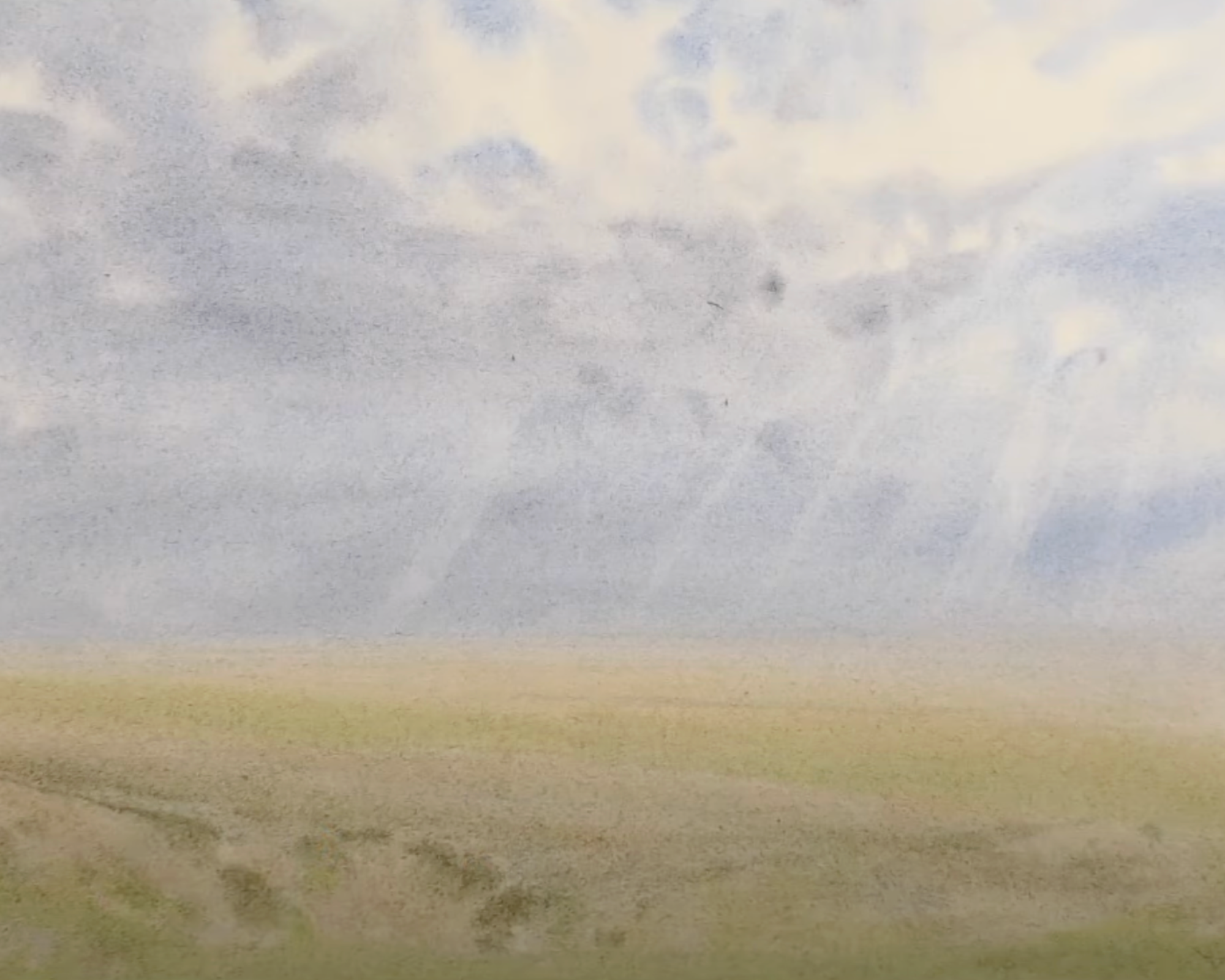
You'll notice in the pictures below that depict my painting process that the horizon line is a lavender-grey and as you follow the painting into the foreground, I have gradually warmed the pigments up. This gradient gives the impression of depth.
Some other strategies I used to create depth in this watercolor landscape scene is to add texture and saturation to the foreground.
Watercolor Landscape Painting in 3 Steps
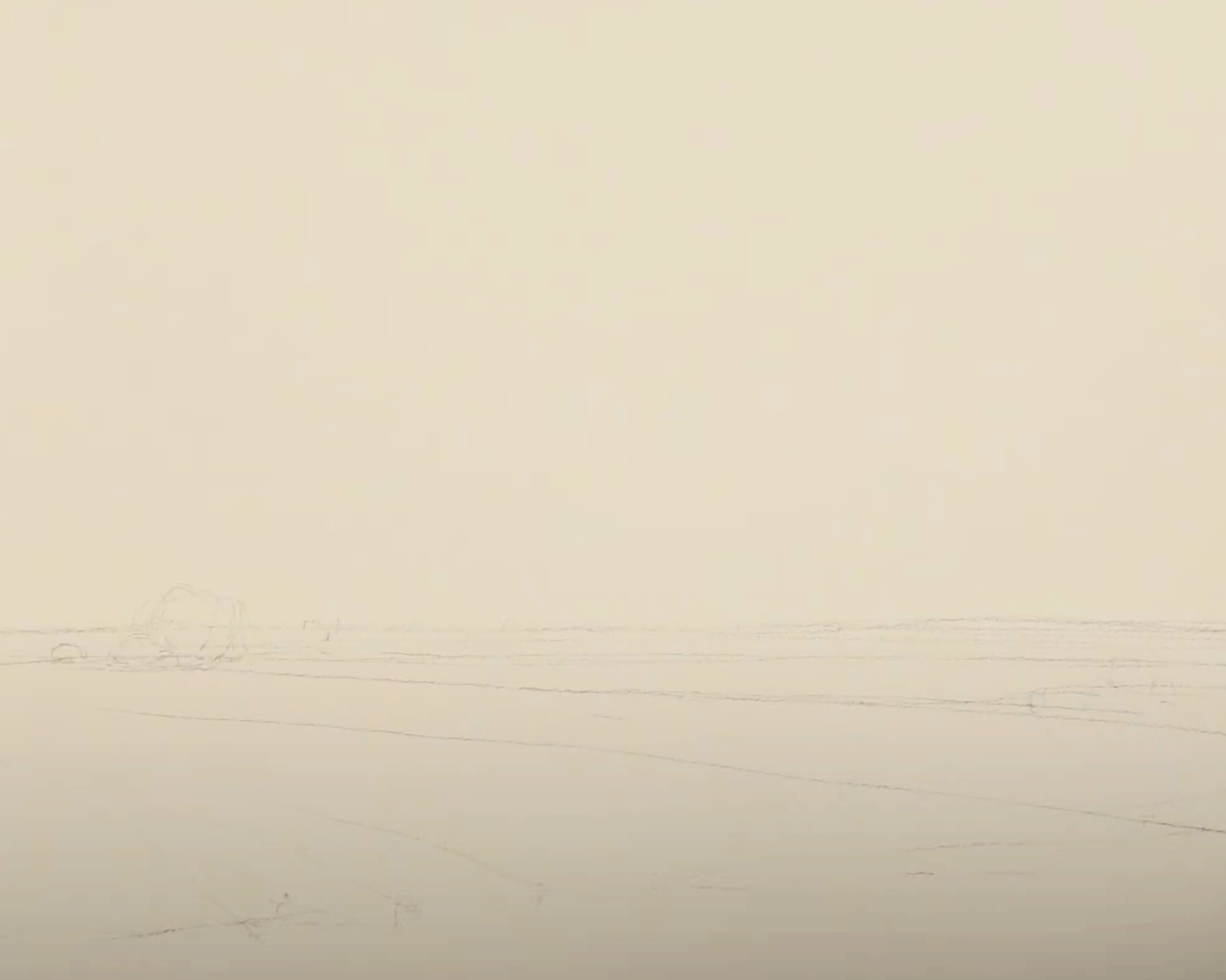
Drawing - Choosing Your Focus
You'll first notice that this drawing is minimal. For a painting like this, you don't need much.
The one decision you have to make, though, is whether you want to emphasize the sky or the land. I was intrigued with the sky in my reference photo, so I drew the horizon line on the bottom half of the paper. This gave me the top two-thirds to paint the gorgeous sky.
First Wash - Cool to Warm Colors
Here's where you can see really clearly the gradual shift from cooler colors to warmer colors. See how it goes from a grayish purple at the horizon line to a vibrant green? This was intentional, and if you want to see the whole process and hear what colors I am using, watch the video above.
A couple other notes about this wash:
- When you paint a sky, don't try to replicate a reference. With wet on wet painting, you don't have the control to copy the sky exactly. This free-flowing mix of colors is part of what makes it so beautiful, so don't fight it too much. Just take inspiration from the sky you're looking at.
- An element that I took inspiration from were the sunbeams in my reference. To achieve this effect, I took a nearly-dry brush on my wet sky and lifted paint from the light source down to the ground.
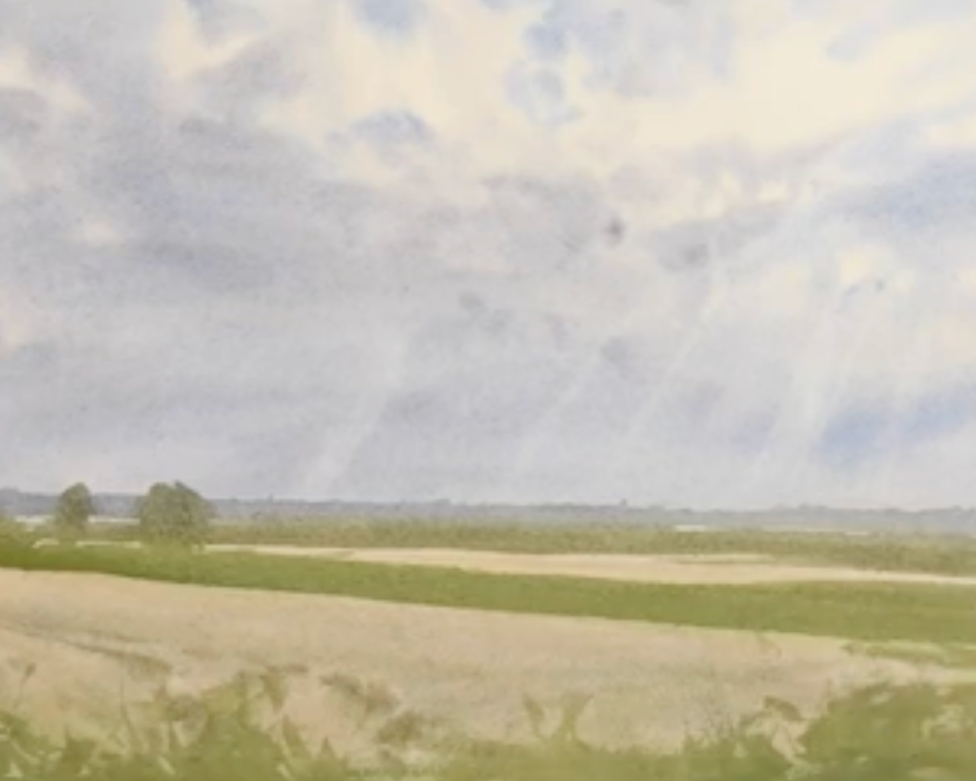
Second Wash - Make Connections
Some scenes make it really easy to find connections; others are harder. Sometimes I take some liberty with the scene and make connections that aren't there in reality. I do this because it makes a huge difference. The painting looks more unified and complete.
Notice the way elements in this wash are connected. One example, if you're having trouble seeing it, are the trees in the middle left of the painting and the way they are connected to the line of greens in the fields.
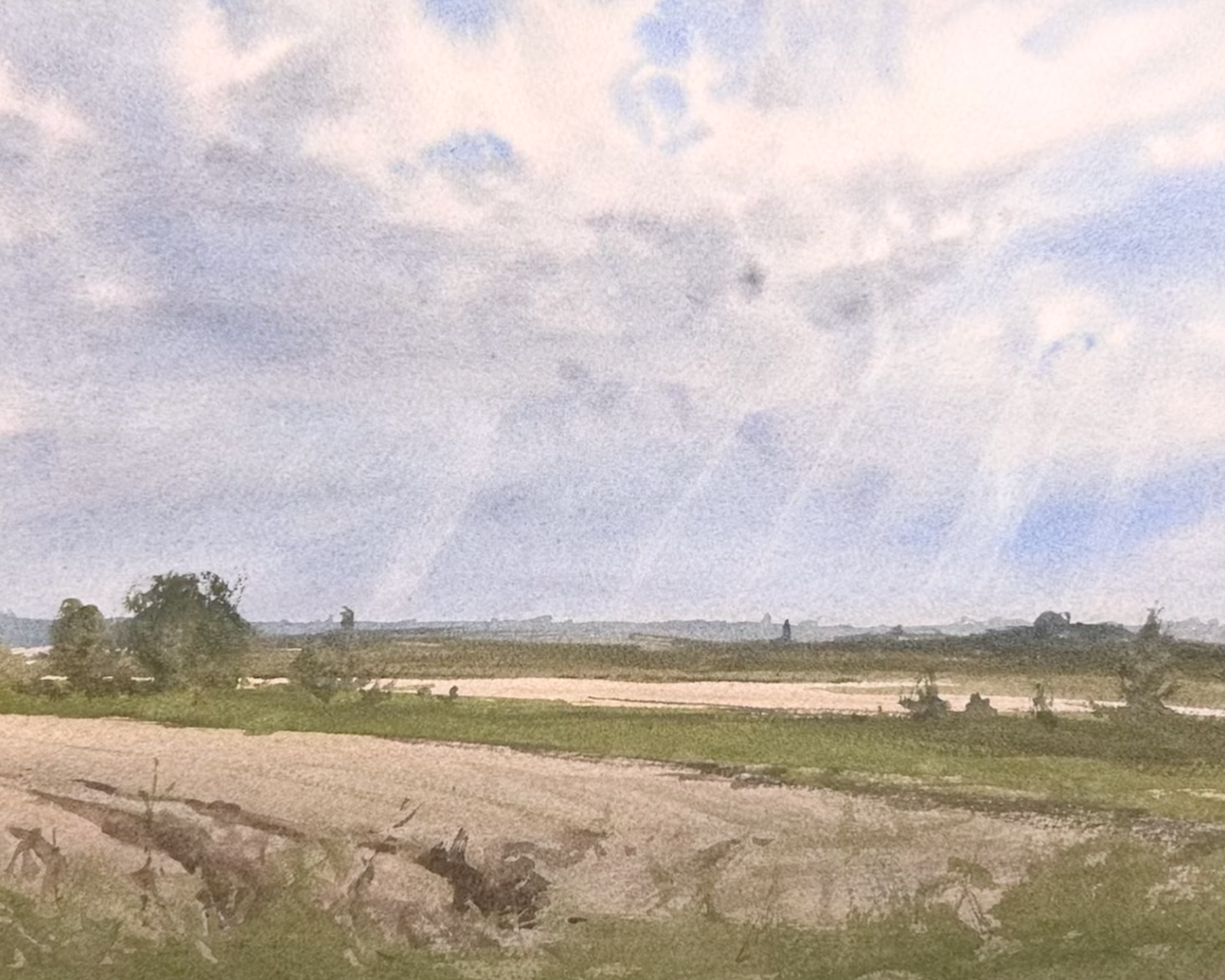
Third Wash - Darks and Details
The last wash of this scene is simply adding those darkest values and details that top the painting off. One way to think about these last two washes is that the second wash is focused on finding connections and the third wash is about making meaningful separations/distinctions.
Materials Used For This Painting
I am painting on Saunders Waterford Cold Press 140lb paper.
I have my surface tilted to 35 degrees. I use a variety of brands of brushes, but mainly stick to a large mop, medium round and smaller synthetic brush with a point.
Here are the list of pigments on my palette:
- Burnt Sienna
- Cadmium Red
- Cadmium Yellow
- Medium Cerulean
- Blue
- Cobalt Blue
- Cobalt Teal Blue
- Cobalt Turquoise
- Lavender
- Neutral Tint
- Payne's Gray
- Quinacridone Gold
- Raw Sienna
- Raw Sienna Light
- Raw Umber
- Rose Madder Permanent
- Ultramarine Blue
If you would like to purchase some of the brushes I feature in this video you can take a look at my Amazon Affiliate link: https://www.amazon.com/shop/m.white.art
Related Blogs
Watercolor Sky Techniques For Better Results