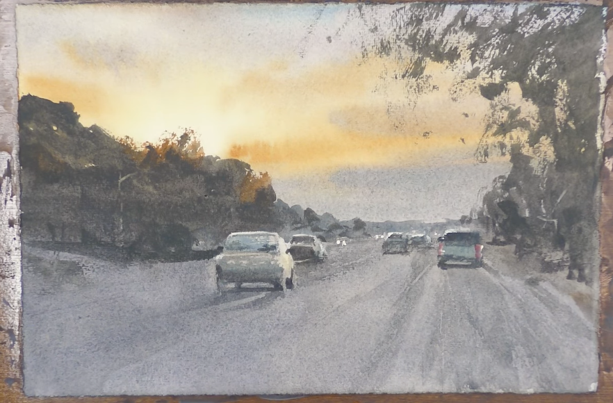
Step-by-Step Watercolor Painting Demo - Fall Sunset
Nov 23, 2022Over this holiday week, I'm offering you a free video demonstration with step-by-step directions.
If you have some extra time, follow along with me as I paint this evening scene, capturing the feeling of its bright, powerful light. And if you're busy, no worries. Bookmark this real time watercolor demonstration for a time when things slow down a bit for you.

How to Paint the Bright Light of a Sunset
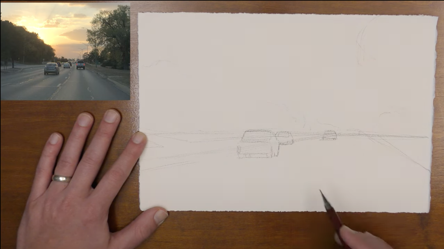
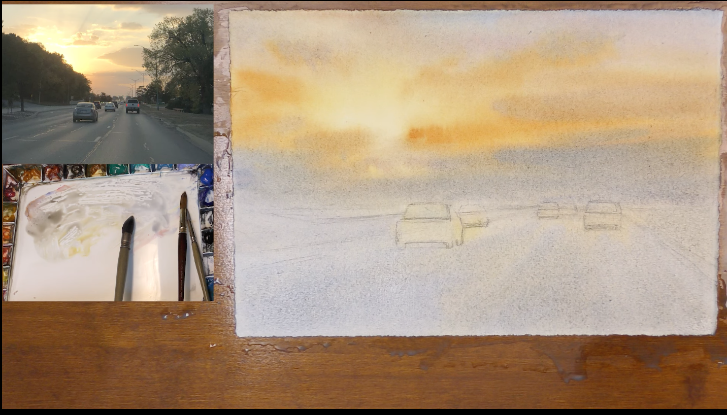
The first thing that I do is lay out a simple drawing. Since I want the sky to be the focus in this painting, I'm going to lower my horizon line down to the lower third. My main concerns right now are keeping perspective in mind and outlining where I want my cars to be.
 Then I take a natural sponge and squeeze out a lot of the water. Over the back of the paper, I wipe the sponge, nice and even. What this allows me to do is to really take my time when I'm painting this first wash. I can spend a little more time working on the paper because I know the paper is still damp and I'm still going to get soft edges when I come back and paint.
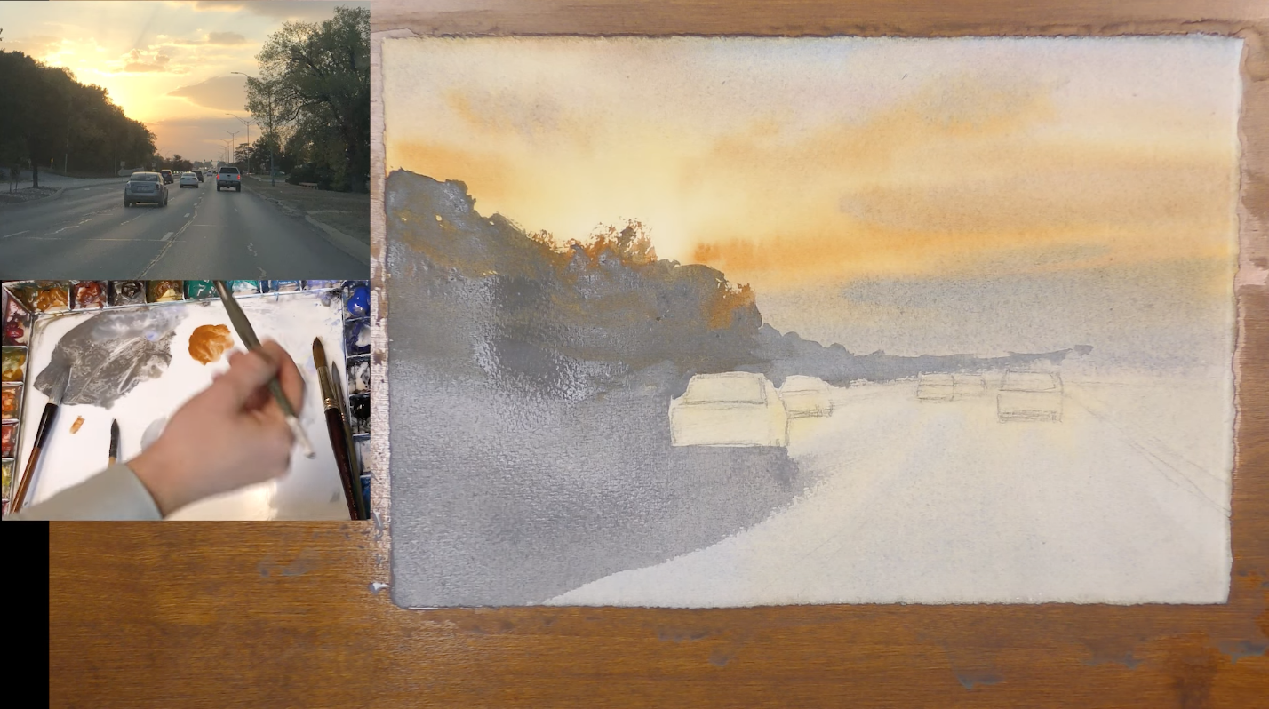
The First Wash - Thinking About the Bright Areas
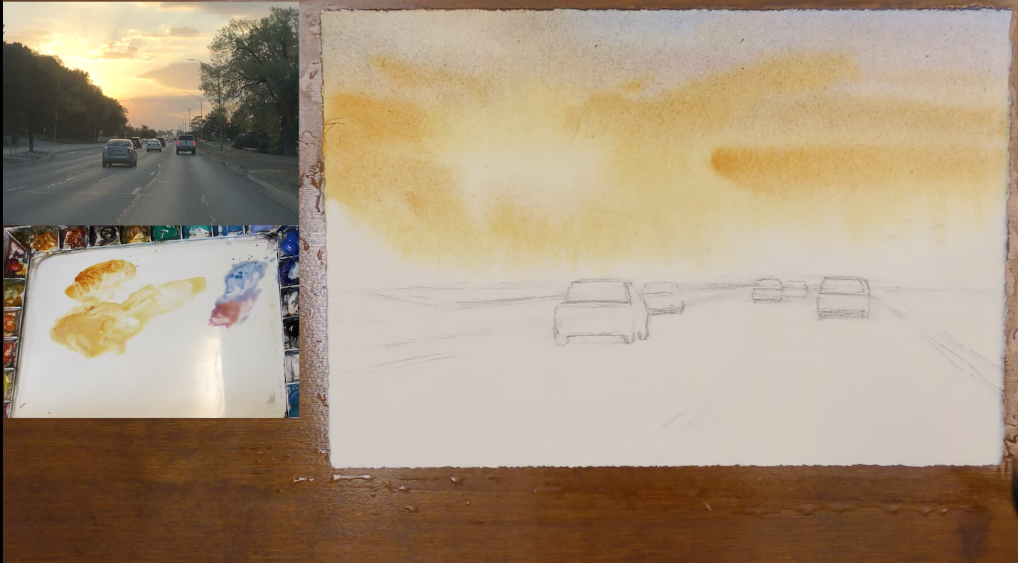
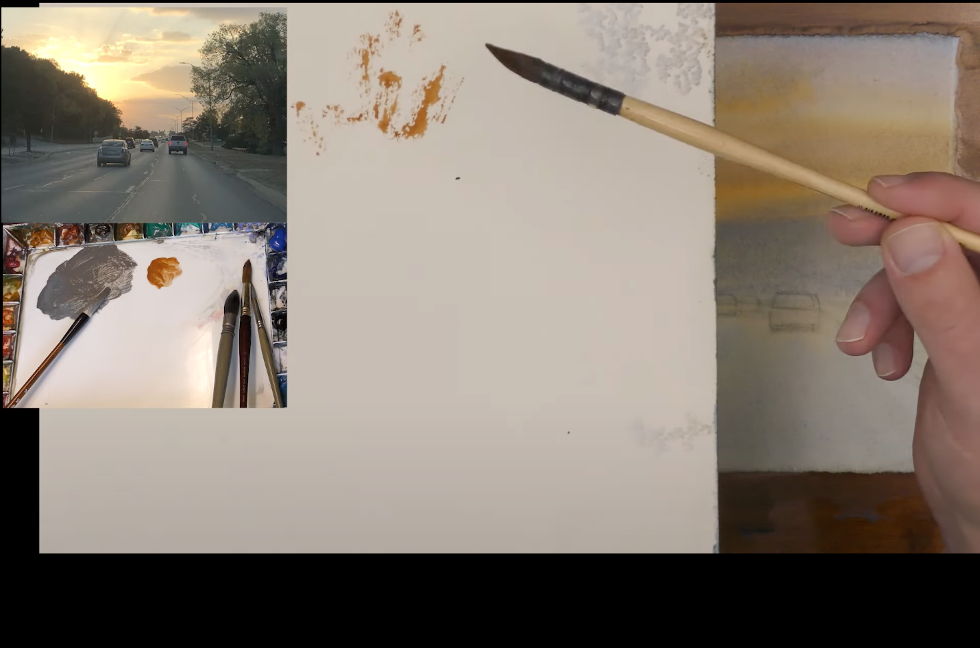
First, I'm going to mix my colors. I'll use Raw Sienna as my base and add Quinacridone Gold, which is a really punchy, warm color. A little bit of that goes a long way. Right now, I'm thinking about the brightest area of my painting and then painting around it.
And as I get further from the brightest area of my painting, I can use a little bit more Quinacridone Gold and Raw Sienna, building up strength as I move away from that lightest, brightest area.
Then I will mix in a little bit of Ultramarine, Cerulean, and Lavender.
 I really want to push the strength around that light. You might think I'm going a little dark, but you really have to be dark because you want that light to shine bright. It all works together.
Rose Madder Permanent, Quinacridone Gold, Raw Sienna. Again, I'm just leading up to where the light is and avoiding it so I can really keep the strength there. And what you're seeing happen is some lovely mixing. These nice soft transitions in color happen because the paper is wet.
Let’s use some Lavender, Burnt Sienna, and Raw Sienna. This is a nice warm-leaning neutral.
TIP: If you get a little bit of green as you mix warm and cool colors, mix in some Rose Madder Permanent.
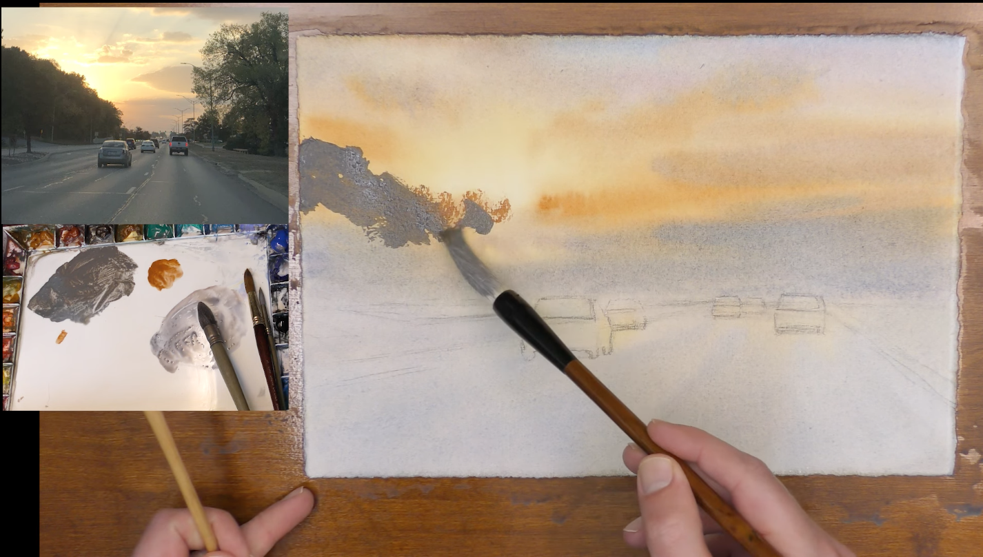
With this mix, I am going to add in some clouds. Then I am going to put a little more Cerulean at the very bottom, which brings us to the horizon line there.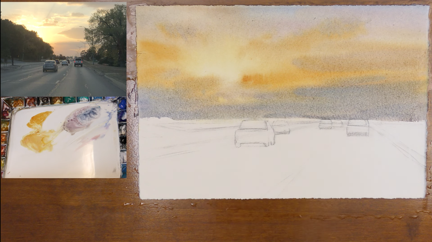
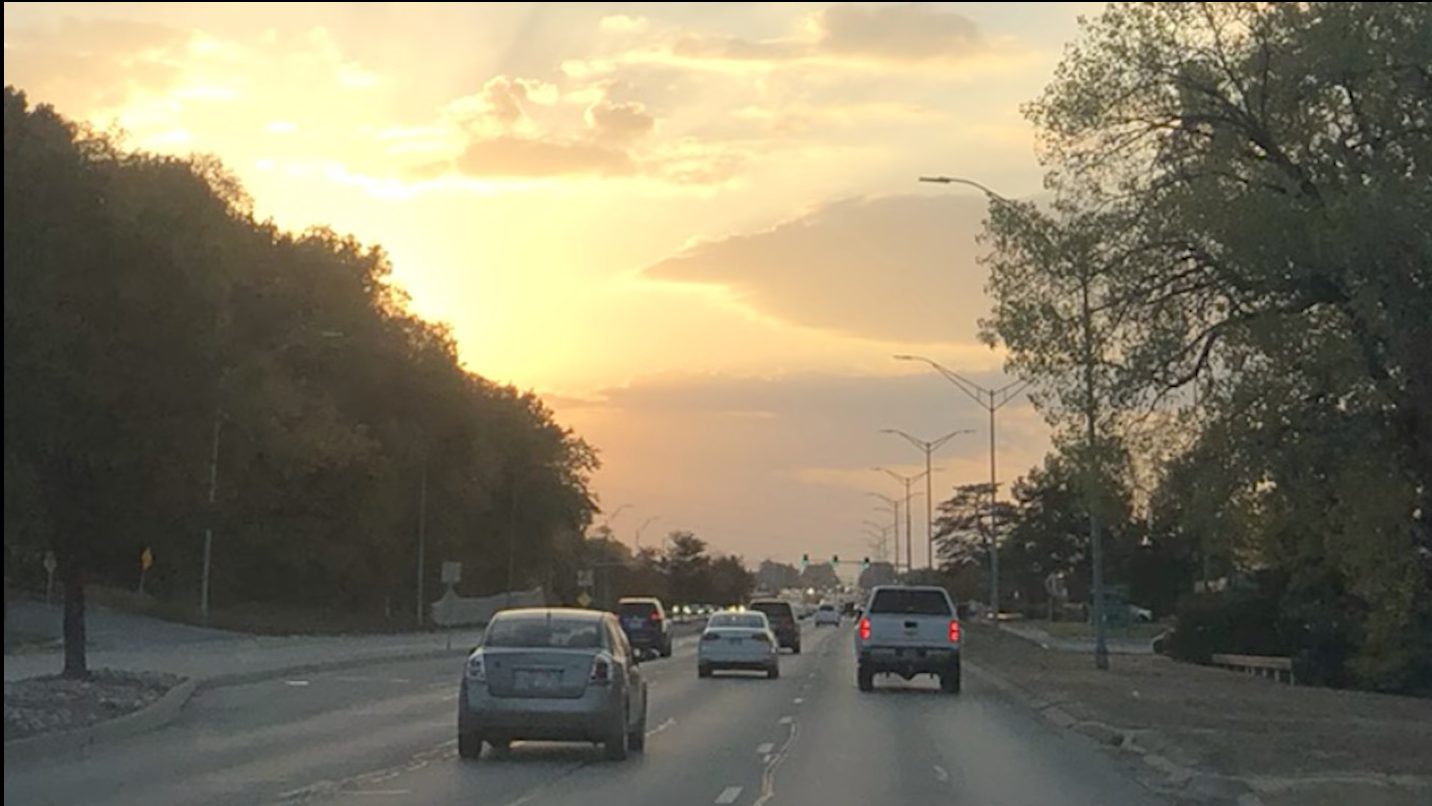
You know, this isn't going to look exactly like my reference photo. It's just not how it works. I can't capture exactly what I see here. I'm trying to create an impression.
For the first wash, I just want to cover all of the painting. I know I'm going to be going over a lot of this again.
As I reach my car, I'm going to take a smaller brush and put some warm color on that car. The top of that car is reflecting the sunset. So I want some warmth in there and on the side of the car, too.
And then I'm going to rinse that off, take some Cerulean, and cover the whole paper so all this connects. And I know I'll be going over all of this once again, but I still want to get some strength.
I am going to add a neutral, more warm, gray, and some lavender to neutralize it a little bit, letting these colors just blend on the paper. I'm just getting a lot of these colors I already have on my palette and mixing them together.
Now that we have all the lightest values of the scene, we have our sun set in place.
So, there's my first wash of the autumn sunset. When we come back in, what we're going to do is work on this big mass of trees and move on down and cover all the road again and the backs of the cars again and leave our little areas of highlights around the scene so we can really push that strength. So at this point, I'm going to let my paper dry and then we'll come back in and move forward.
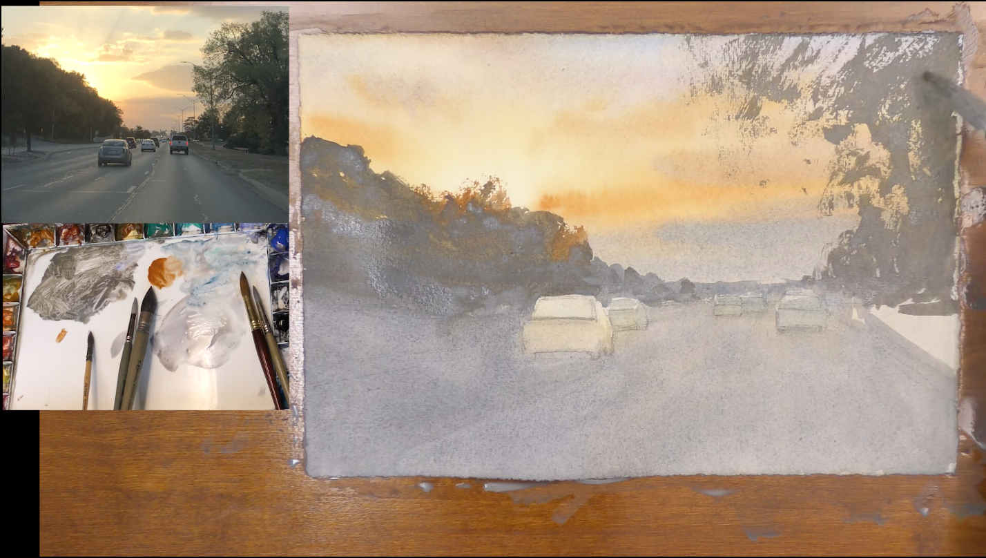
The Second Wash - Finding the Connected Shape
All right, during this part of the painting process, I'm going to pay attention to those middle values and darks. Now, look at these massive trees that overlap in front of the light here. What you'll notice is when you look at the very edge of it that's close to the light, you see some warm colors, some difference in that edge versus the other edges of the shape.
So when I paint this, I'll have some more dull, dark earth tone for the trees. But when I get to that point where the light is, I want a few little touches of color. And that is going to really push our illusion of this strong light.
I want some strength for these trees. I really need to push these values. So I'm using some thick paint. You'll notice on my palette, I use two paints. I squeeze out a lot of paint. I spray them down really good before I start the painting because I really want my values to be strong. When I need that strength, I want to be able to get it. So I'm taking some Raw Umber and I put some Lavender in with that. I add some Cobalt and Turquoise, really just experimenting with my colors. I like to think of colors as leaning towards warm or cool, and then they think about value.
Then, I'm going to take a smaller, soft brush and I'm going to go ahead and mix up some more vibrant, thicker, warm color: Raw Sienna and Burnt Sienna. When I get up near the sunset, I'm going to switch to this.
Another thing that's helpful as I start to paint trees, get some scrap paper, I'm going to be using the side of my brush.
So that kind of broken edge that I'm getting, that's what I want for my painting. If you want to practice it a little bit before you start, use some scrap paper and make sure you have your brushwork down.
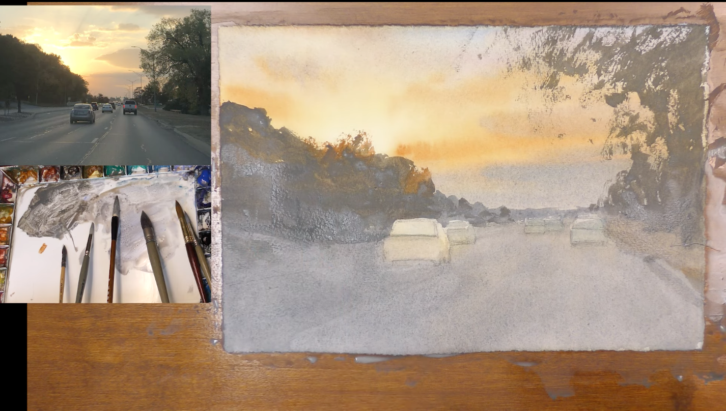
Now what we're going to do is I'm going to go in and paint these trees and I'm going to connect it while it's wet with the ground using this color. And we'll just work our way across the painting from a wet edge.
What I'm really concerned about here is the value against the sunset.
I can leave a few little gaps in this tree, but a lot of it is filled in, kind of using the side of my brush here. To get some texture, I'm going to use the side of my brush.
I want to keep this edge wet and keep working across from this wet edge, using the side of my brush, varying my brush marks.
You can see as we start to get some of these darks in how bright that light is going to look. And that's what we want. That's the whole point of this painting is to show that light and I'll be coming in and put in a little bit more darks in this in just a minute.

Right now, I'm really thinking about connectivity. I am reloading my brush often and keeping that edge wet.
Then, I am going to wash the warm color off of and think about distance. I'm getting a little cooler as I move further back in the painting, mixing in some Cerulean and Lavender in with that mixture that I already have.
I'm squinting and I'm thinking about a variety of shape and variety of brushstroke. I am painting around my cars, trying to achieve a nice, thick brush stroke. I really want to minimize the background because it is not what this painting is about.
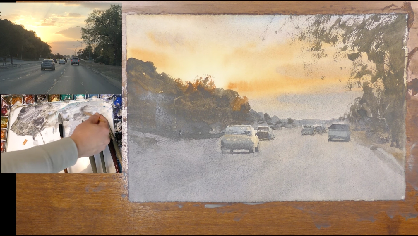
What I want to do now with my large brush is to connect this wash. Everything needs to be a little darker. When we get to the car, use a little bit smaller of a brush and use mainly cool colors on the back of that car. It actually will end up being a little darker than the road. I can come back in and put in some more highlights or darks on this car later, but right now, I just want to connect this wash. I don't really want a hard edge yet, so I'll come back to that car later.
I want to keep moving around the scene, painting some directional lines on the road. I am just painting right into that shape that we've already started to paint, covering all the ground. You can go into the cars as well. Essentially, we're covering the whole bottom half of the painting again.
I'm going to use a little bit of Cobalt Teal Blue. The key here is to just keep moving and finding connections. Sometimes I want to stop and think about details, but it's not the time to think about details.
I am mostly thinking about edge, connectivity, and value. I add some more Cerulean, knowing I'll be coming back over these cars another time. We need to get a little stronger in some of these areas.
Then I use the side of my brush and do a little dry brushing. All of this has really abstracted on the right of the painting. It's just an accent to what's going on on the other side. The light is the main story.

All right. I want to load up some Raw Sienna, Cobalt Turquoise and use the side of my brush. Vary the brush angle and use really nice, confident brush marks. Don't fiddle with things too much.
I love the look of that strong dry, broken brush mark against the softness of the sky. I really like that. That contrast and edge is really beautiful. We have to take advantage of that in watercolor.
Darks, Details, and Highlights
The edge of the painting feels like we're getting the light to really stand out and shine that nice fall evening feel. That's what I'm going for there.
Now, I want to think about darks. You know, since the painting's still damp, I can go back in and just give a little more definition into a few areas. I use some Raw Umber, Ultra Marine Blue, to make a thicker pool of paint.
Using some of that Cobalt Teal Blue, and a little bit of Lavender. I'm just mixing that in with some of this other color that I already have. I'm just going to put a little more value on the the back window and the back of the car.
Now I want to make some loose directional lines on the road and I want to use a dry brush to do that.
Then, I'm going to use a little bit of gouache to add a few little headlights in the distance.
Now, one thing I'm noticing is I think my values are a little light down on the ground compared to the sky.
So what I'm going to do is just glaze over this area - give it one more pass, and I'm just using some Ultramarine Blue and some Burnt Sienna to see if I can make that look any stronger. That strength is so important in this painting.

Finally, I'm going to take a little palette knife and scratch and a few little directional lines on the road.
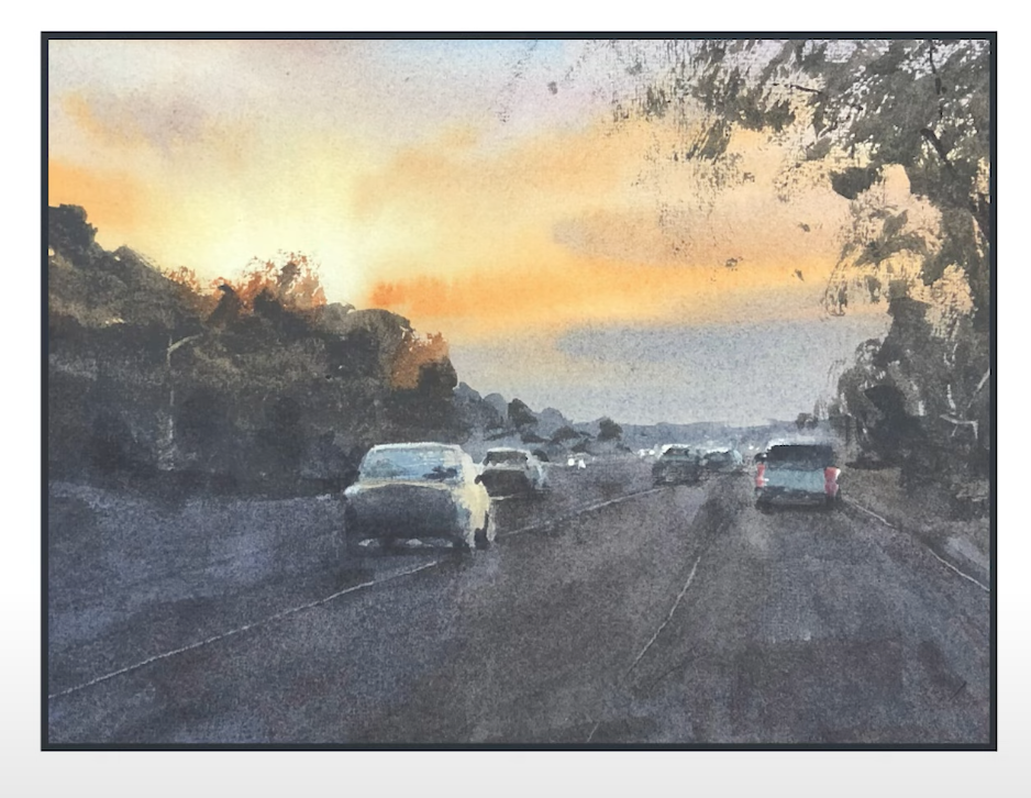
The Finished Painting
Related Videos: