See Your Watercolor Scene With Clarity - One Simple Tip
Mar 16, 2026There is one practice that I began years ago that has made a world of difference in my paintings. It's not so much about process or technique. It's about seeing clearly the scene I am trying to depict.
Keep reading (or click above to watch my video) to learn more about this one simple tip that significantly improved my paintings.
Here's How to Gain a Clearer View of Your Watercolor Scene
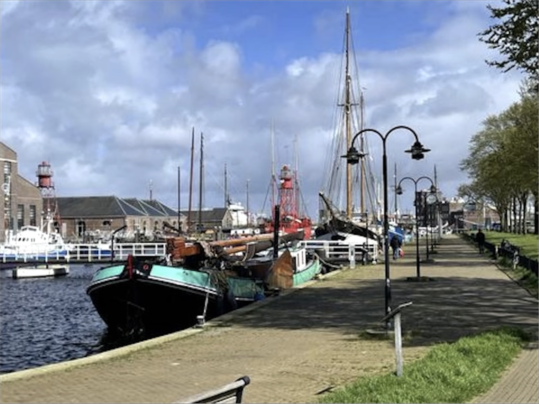
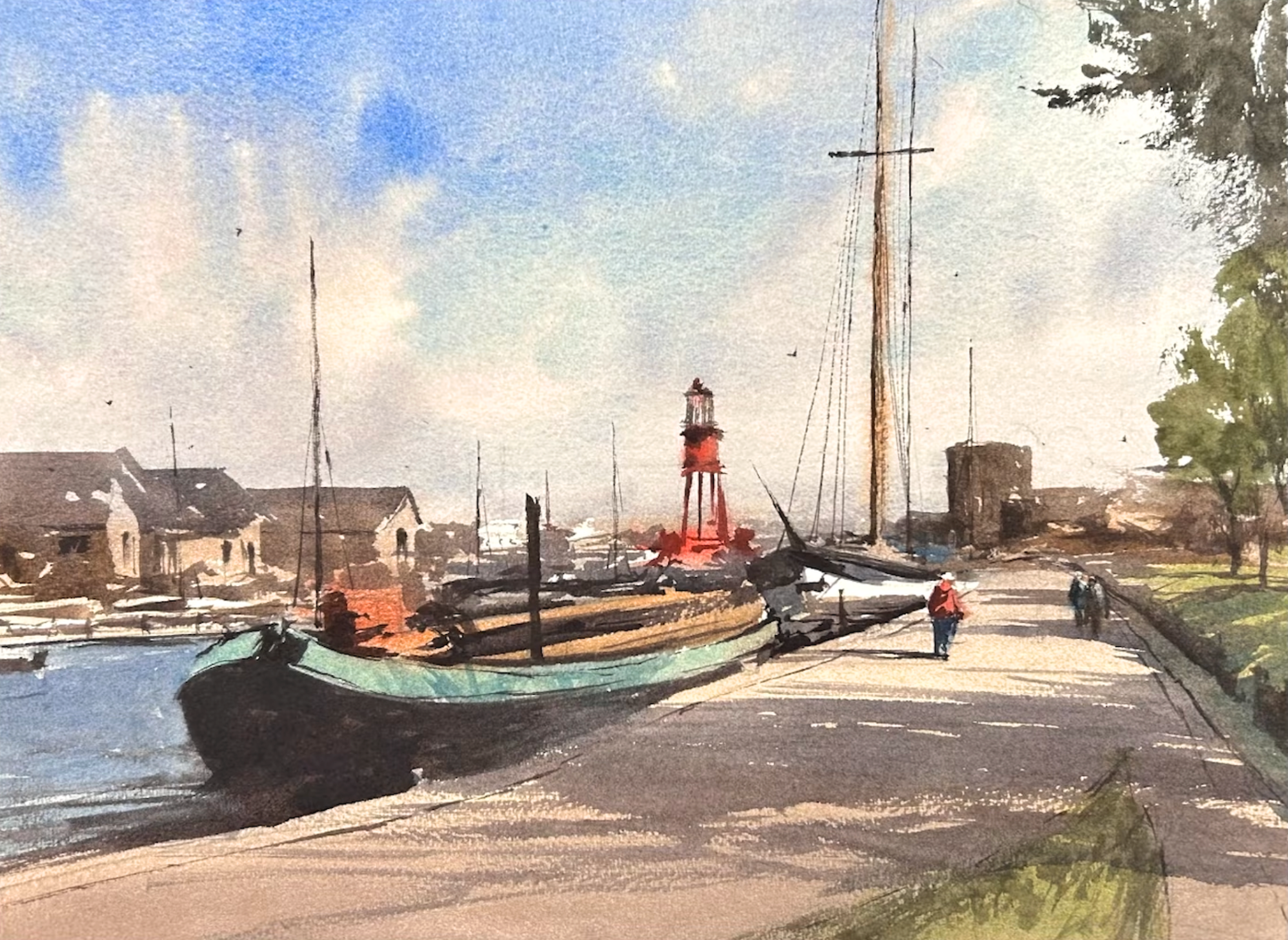
When you study a reference photo (like the one above), you're taking in so much information. You're thinking about color, shapes, values, composition, proportion, perspective. This can become overwhelming.
If you asked me what one thing you could do to tamp down this overwhelm, this is what I would tell you:
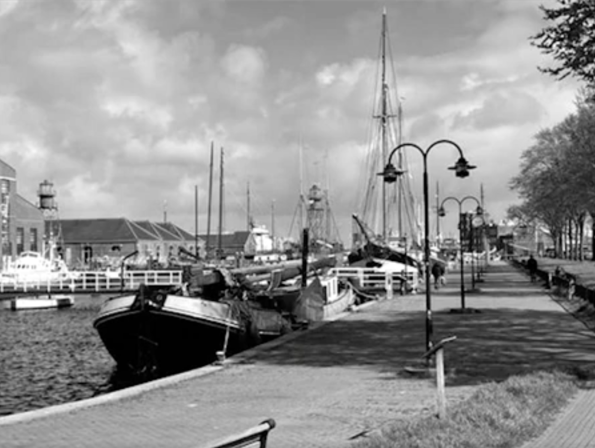
Turn your photo black and white.
Just taking this much information out of the equation can help you see more clearly the task at hand.
3 Benefits of Turning Your Reference Photo Black and White
1. It shifts the conversation in your mind from colors to values.
Colors are important - don't get me wrong. I have refined a palette of Daniel Smith paints that I love to use. Colors are captivating, but values make or break a painting.
Taking the color out gives you the perspective you need to see not just "cobalt blue" and "lavender" and "raw sienna," but a spectrum of light, medium, and dark values.
2. It makes the pattern of light much more apparent.
Stripping the picture of color helps you to perceive the light in the scene with greater precision.
The light looks lighter, and the shadows look darker in grayscale, and it's especially helpful to see the connections between the middle values for my middle value shape in my second wash.
3. It encourages you to see shapes rather than objects.
When you can turn your reference picture black and white and pair this with squinting at the scene, you can train your eyes to see shapes instead of discernible objects. Why is this helpful? Because we all have preconceived notions of what a thing looks like. Picture a car in your mind. Now a house. Now at tree.
Now picture a boat. Compare that boat to the one in my reference. They're likely not the same. When you can home in on the actual shapes in your reference rather than pull from the stored images in your mind, you end up with a painting that is truer to life, more proportionate, and more suitable to the scene.
My process in 3-Steps
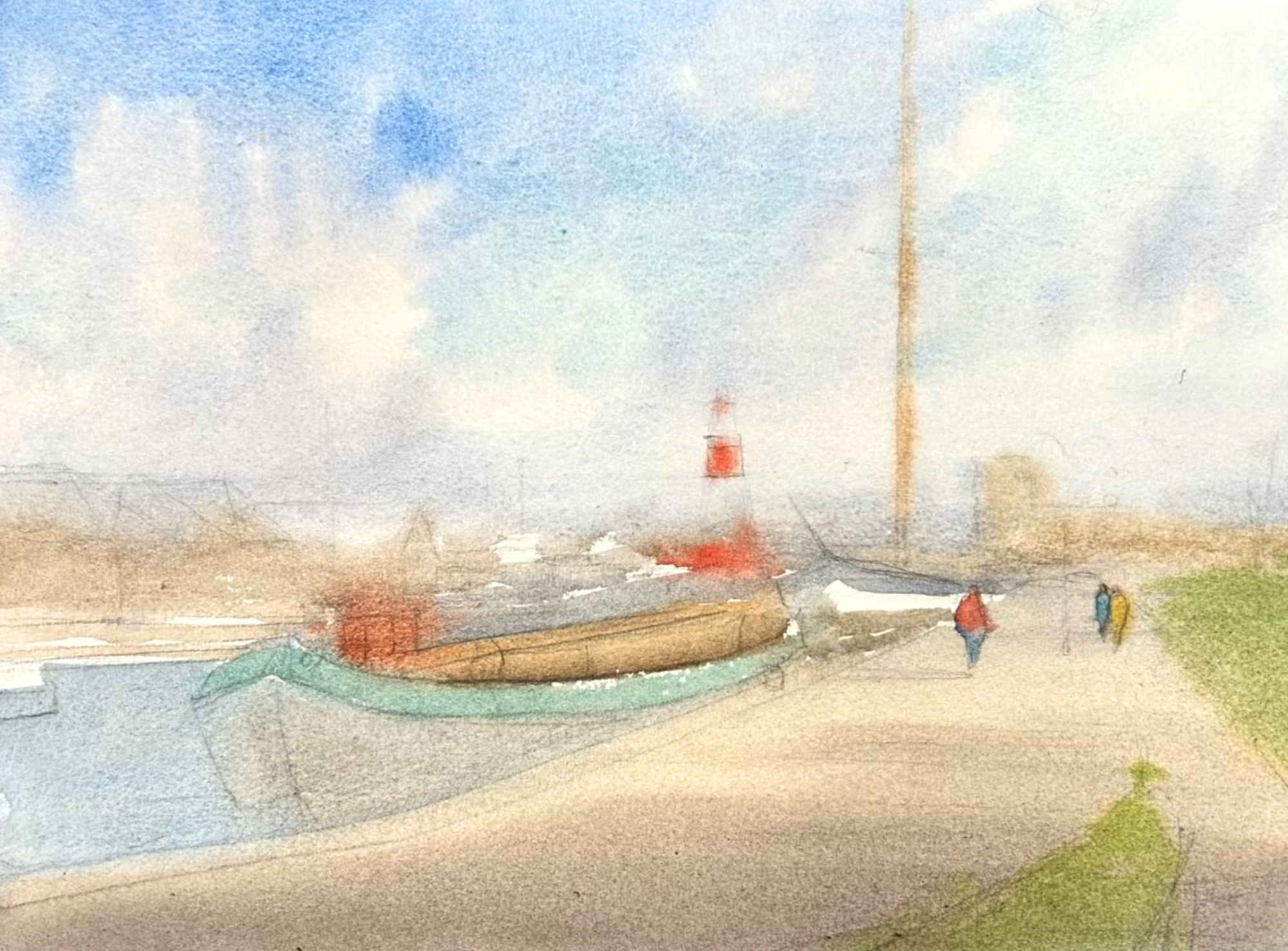
Looking at the scene both in grayscale and in color helps me to plot out a path forward to paint a scene.
First, I paint the lightest values.
I think of values as a spectrum of white to black divided into numbers from 0-10. The first was (below) are values 0-3.
The second wash is for the middle values (4-6), and as you can see, I connect them into what I call the middle value shape.
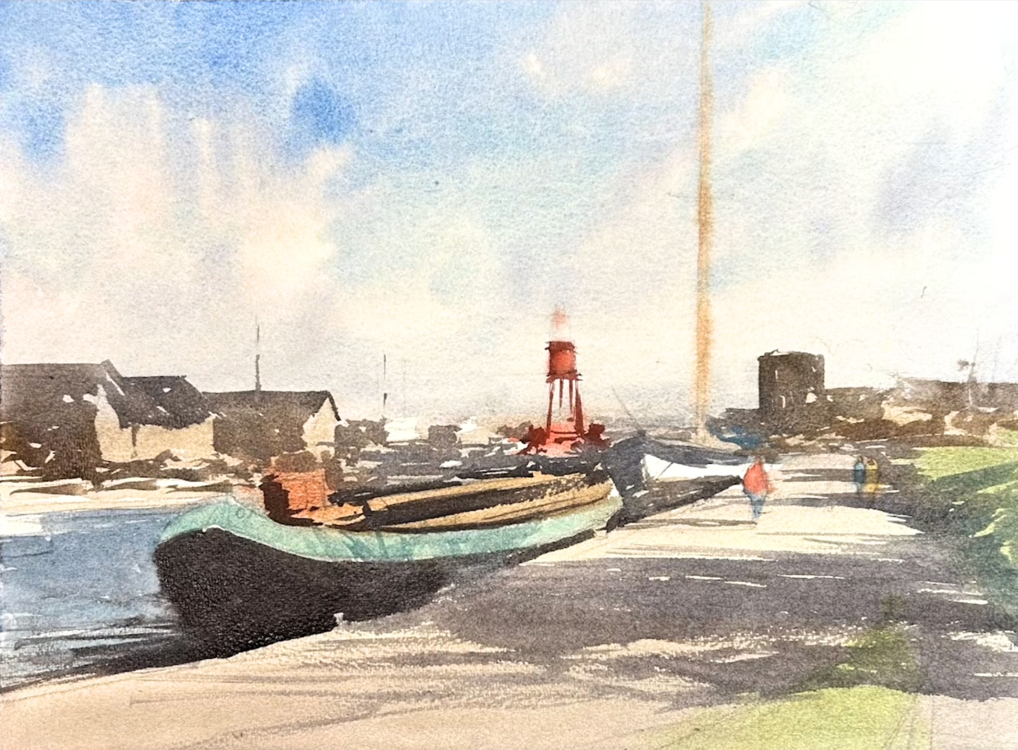
The third wash is for darks and details (7-10). Having a black and white version of my scene goes a long way in being able to identify these values, light patterns, and connected shapes.
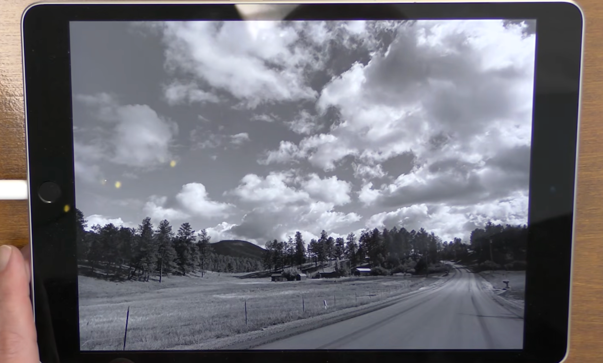
How to Change a Color Photo to B&W on Your Phone or I-Pad
When I paint in my studio, I have both a color and a black and white version of my painting in front of me.
If you're not sure how to do this on your phone or I-pad, watch the last few minutes of the video at the top for instructions.

Related Blogs
How To Use Any Reference Photo To Paint A Stunning Watercolor
Learn to Paint a Watercolor from a Photo with These Easy Steps