Learn to Paint this Street Scene Tutorial - Light, Shadows, and Figures
Mar 31, 2025To paint dynamic and realistic paintings, you've got to learn and master layers in watercolor painting.
The most concise way I can break down this lesson is to give you a mantra for each wash (or layer) of the watercolor painting process:
- 1st Wash - "light and loose"
- 2nd Wash - "finding connection"
- 3rd Wash - "darks and details"
Now let's watch that strategy play out as I paint this street scene!
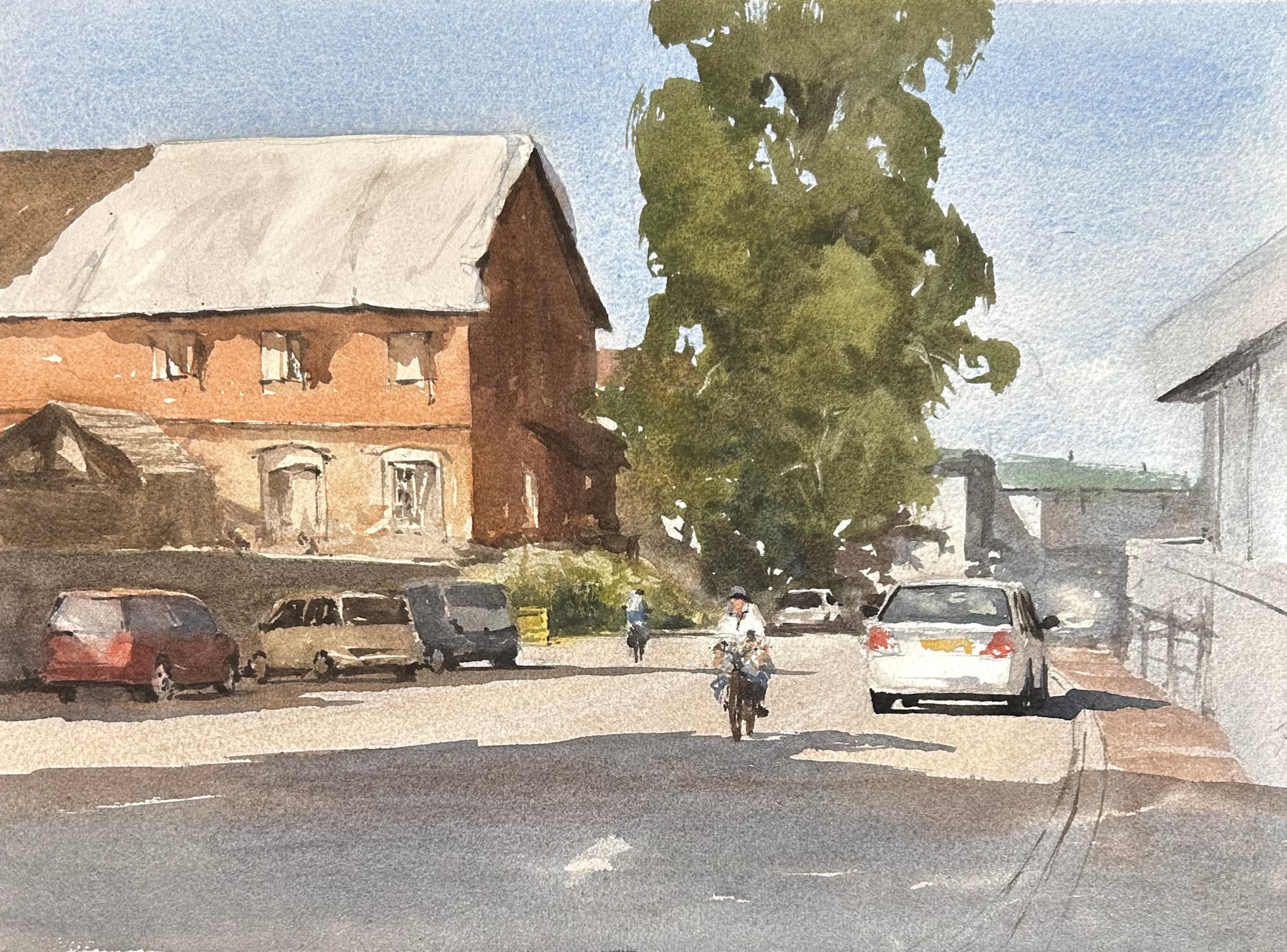
How to Paint This Watercolor Street Scene
What Supplies Do I Need?
I am painting on Saunders Waterford Cold Press 140lb paper, and I have my surface tilted to 35 degrees.
I use a variety of brands of brushes, but I mainly stick to a large mop, medium round and smaller synthetic brush with a point.
Here are the list of pigments on my palette:
- Burnt Sienna
- Cadmium Red
- Cadmium Yellow Medium
- Cerulean Blue
- Cobalt Blue Cobalt
- Teal Blue
- Cobalt Turquoise
- Lavender
- Neutral Tint
- Payne's Gray
- Quinacridone Gold
- Raw Sienna
- Raw Sienna Light
- Raw Umber
- Rose Madder Permanent
- Ultramarine Blue
If you would like to purchase some of the brushes I feature in this video you can take a look at my Amazon Affiliate link: https://www.amazon.com/shop/m.white.art
Drawing
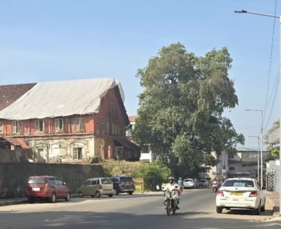
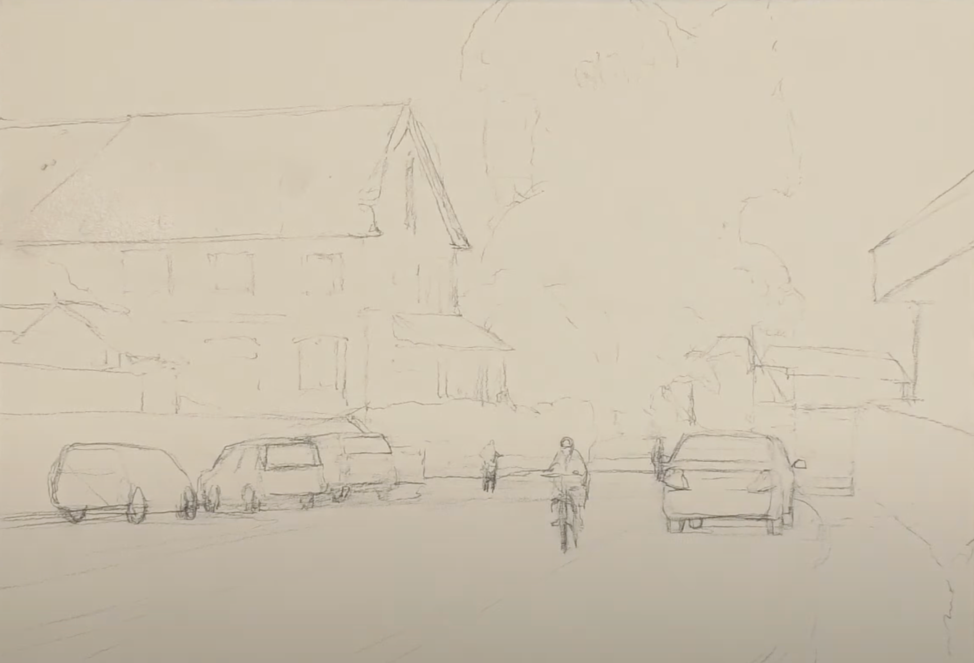
Of course, before you even pick up a brush, you'll want to draw some sort of guideline for yourself. Drawings can be really simple in the case of a sky painting, or really complex when you're painting a well-known intersection of a city. Some require precision, others require an impression.
For this painting - with the cars and figures - I needed a more precise drawing.
To keep things well-proportioned, I followed a couple guidelines:
- Place the figures' heads at about the same line on the paper.
- Give standing figures a height slightly taller than the cars.
- Draw cars on the same plane.
This painting had an element that made me break from my routine approach. The roof in the reference photo has a tarp over a good part of it that is lighter than the sky. To achieve the look I wanted, I laid in a light tone on this tarp and allowed it to dry before I wet the paper (front and back) to start my first wash.
Then, with the paper still wet, I moved into my first wash.
First Wash
The first wash of the watercolor process is all about the lightest values of your painting.
If there are areas where you want to preserve the white of the paper, you'll want to paint around these. Other than those areas of white, you’ll cover your entire sheet of watercolor paper with the lightest values of the scene.
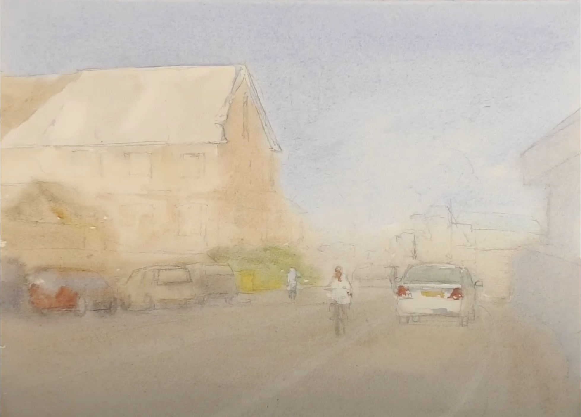
This first wash is your opportunity to lay down pigments that will contrast well with your darks and details later. Remember - it is hard to lighten things up once you've laid the darker values down. This layer is your chance to include the light values. And without a full range of values, paintings fall flat.
But the mantra here is light and loose, not just light. So what does the loose mean?
Notice how my colors fade into one another and mix at the edges. We've got soft edges, and that is exactly what we want at this point. Embrace this characteristic of watercolor paint and allow some of this mixing to happen on the page. Your first wash should be a real loose version of the scene.
Second Wash
Of all the washes, I get the most questions about the second. Admittedly, it is the most difficult to master.
The word you should have at the top of your mind is connection because this is what you're doing - finding (and creating) connection in the scene. You're using middle value hues and you're making a point to connect them as you go from left to right through your scene.
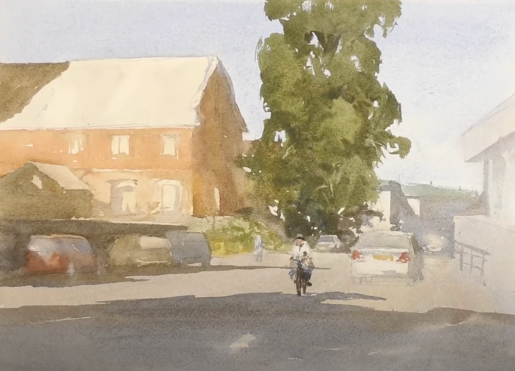
Compare this wash to the first wash and notice what I've added. Can you follow the middle value hues throughout the painting and see how I've connected them?
A great place to see this clearly in this painting is the shadow in the foreground connecting to the middle hues in the bicycling figure and then the way the car's shadow and the middle values in the trees connect to him.
This connection goes a long way in creating a unified painting. We're not looking at several separate subjects, but a cohesive scene.
Third Wash
The approach to the third wash is different from the second wash. Now, you are thinking about separation and distinction between subjects in your scene. You're adding those last marks that define the objects and spaces in your painting.
In this third wash, you add the darkest values to your watercolor and watch the contrast pop. With this full range of values now on your page, all the work you've done pays off.
Don't throw the word connection out the proverbial window, though. If there are ways to connect the darker values, do it. But there are some things - like the dark outlines of windows that have to be separate. Their purpose is to draw distinct lines or boundaries, not to connect with one another.
The Goal of Each Watercolor Wash
Now that you have these mantras to accompany each wash, it should be a little easier to focus on the particular task at hand as you work through the 3-step watercolor painting process. I hope this helps you as you paint this scene and all others!
Related Blogs
Learn to Paint this Calming Beach Scene with These Step-by-Step Instructions
Neighborhood Watercolor Scene: A Study in Texture
How to Paint Sunlight in Watercolor - Step by Step Instruction