Colors to Use for Brilliant Watercolor Paintings
Aug 18, 2025If you want to create strong light in your watercolor scenes, you have to pay special attention to the colors and the strength of your mixes. To have bright, vibrant light, you must also have dark values, reflections, and appropriate placement of warm and cool colors.
Let's dig into this topic!
Use Color Temperature Strategically For Bright, Beautiful Scenes
When you're painting light in your watercolor paintings, a consideration you should keep at the forefront of your mind is color temperature. Notice how the light operates in the painting and how it affects the rest of the colors.
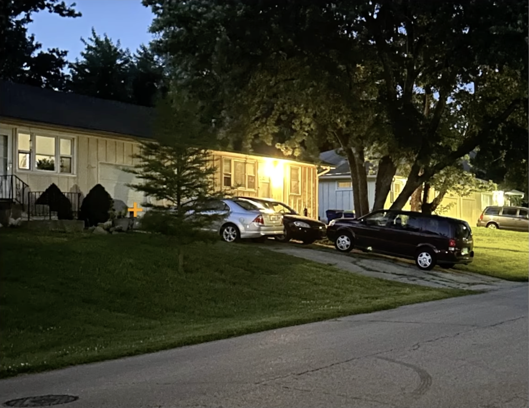
Color theory can be a tricky thing to understand, but what I notice when I look at this scene is:
- the shadow side of objects are cooler hues,
- the more distance there is from the light source, the cooler the colors become, and
- the distinction between the warmth of the light vs. the coolness of the grass in the foreground (for example) provides interesting contrast.
To Depict Bright Light, Achieve a Full Spectrum of Values
A more simple observation to make is that in order to create bright light in a painting, you must also have it's opposite.
Without a full spectrum of values, this scene will fall flat. So let me walk you through my 3-step process that focuses on values.
I started my first wash at the lightest, brightest part of my scene and go from there. This way I ensure that the other hues in the scene are all darker than the bright light I'm trying to create.
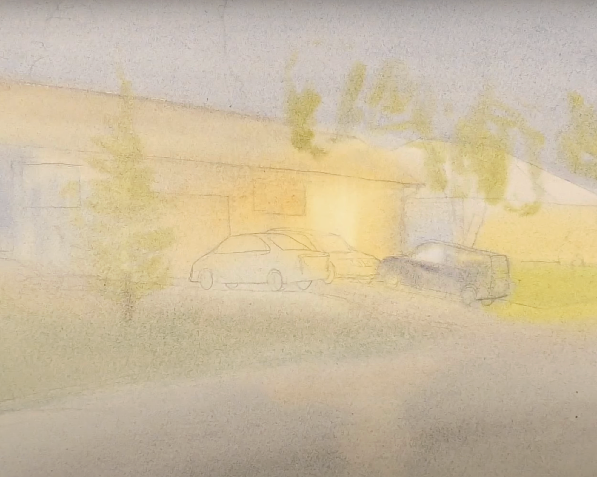
Curious what Daniel Smith paints I mix to paint the different parts of this wash?
Garage Light: Raw Sienna Light, Cadmium Yellow - increasing amounts as I moved away from the brightest part of the light
House and Car closest to the yard: Neutral Tint, Lavender, Cobalt Blue
Roof: Raw Sienna and Neutral Tint
Grass: Cobalt Turquoise, Raw Sienna, and Neutral Tint
Sky: Cobalt Blue, Neutral Tint, Cerelean
Other House: Cobalt Blue
Tree: Raw Sienna, Cobalt Turquoise
Once my first wash dried, I began working on my middle value connected shape. I started out at the side of the house by the light and painted negatively around the light values already laid. Then I lifted off some paint around the edges of the light to distort it just enough that the effect of the light was realistic.
Then I continued, always working from the wet edge of my wash, to paint the middle value colors in the painting.

An important thing to remember at this stage in the process is that this is going to look rough. Don't judge your painting yet. Your goal right now is to lay in an array of values that sets you up to create shapes and distinctions that make the final product satisfying and realistic.
The final wash is when I paint the darks and details.
Notice I gave both the sky and the grass another wash. And notice how it isn't until I added the darkest values that the lightest values really pop. This is what I mean when I say that you need a full spectrum of values to create brilliant light.
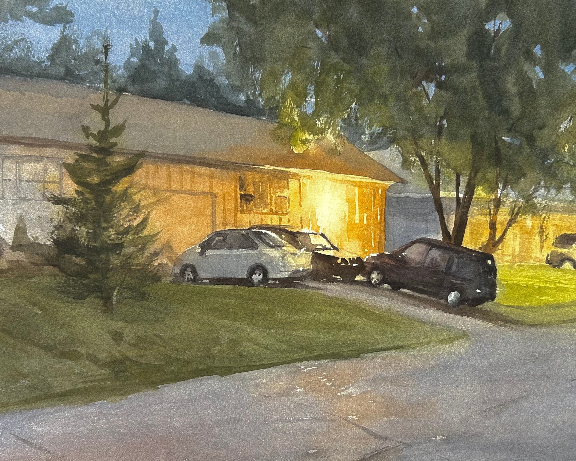
For a more detailed look at how I handled this last step, skip ahead to 6:30 on this week's video. I also tell you exactly which colors I used to mix each hue.
Related Blogs
Learn to Paint this Street Scene Tutorial - Light, Shadows, and Figures
How to Paint Sunlight in Watercolor - Step by Step Instruction