Guide to Creating Greens with Watercolor
Jul 19, 2023Especially if you're out painting plein air in the spring or summer, you will not be able to avoid the challenge of mixing greens to capture the scene in front of you. There are so many hues, such various shades, and such dimension in the greens out in the wild.
So today, we're going to talk about how to achieve a wide spectrum of greens for your watercolor paintings.

Steps to Mix the Perfect Shade of Green with Watercolor
Greens can be tricky to mix, but there are some tricks to achieving the color you're hoping to create. In this post, I am going to cover:
- What brand and colors I paint with most often
- How to make a spectrum of greens: cool, neutral and warm
- When to use each green hue to create the atmosphere you want
Enjoy this Post? Like This Pin!

The Watercolor Paints I Use
While you can make similar colors with different brands, if you want to use the same exact paints I do, you'll want to use Daniel Smith watercolor paints.
Last summer, I shared with you all all the paints on my palette, which would be a good blog to review as you're thinking about mixing paint. For a quick summary, click on the Pinterest pin below that includes labeled colors on my palette and the 4 colors I could not live without.
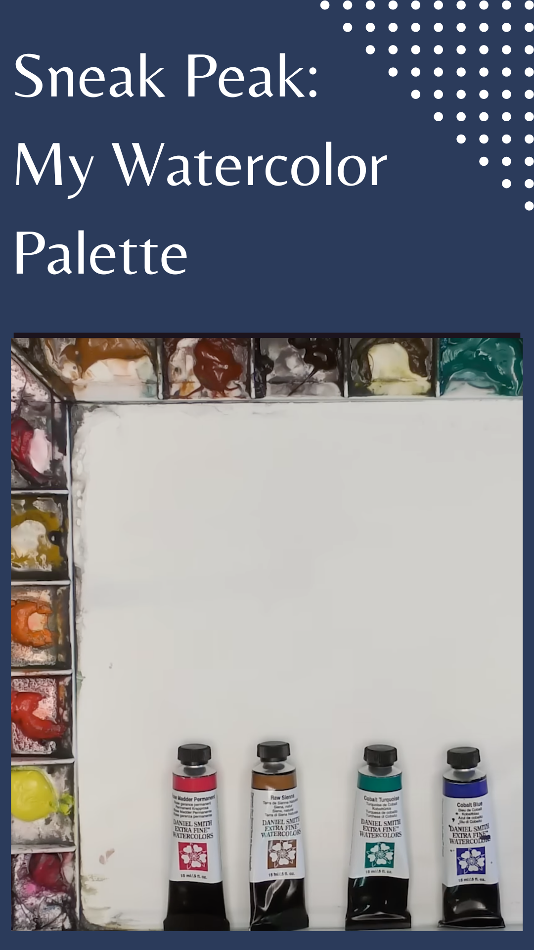
You don't have to use Daniel Smith paints to create vibrant greens, but if you want a one-to-one conversion as you watch my video or follow the instructions in this blog, you might consider using them.
Where Different Kinds of Green Belong in a Landscape Painting
Like I've said before, so much of art is learning to see and observe. And while I can tell you about all the varied greens that make up landscapes, the point is better made by asking you to practice noticing - starting with these pictures. Take note - what kinds of greens do you see in the foreground? The background? What shades help to convey distance? Which do you see in the green objects that are closer? How does the particular light affect the color?

In order to create a feeling of distance in your scene, you'll want to cool down the distance. And when I say cool down, I mean mix in cool colors: blues or purples. You want a cooler color green here then you would want in your main area of interest so the background really feels like it's in the distance.
As you get closer in the scene, you want a little more neutral green - less saturated and less vibrant than where the main light is in your painting. This neutral is good for transitions from the cool into the more vibrant greens.
When your working on the main area of your scene - or you have some trees that have some vibrant light - you'll want to mix a glowing green color that's more saturated and more vibrant.
Once you get those three mixes down, you can create other hues from those three bases.

Creating a Spectrum of Green in Watercolor
If you're just reading the blog and have not watched the video, I encourage to you watch the section to see how I mix each of these 3 basic green colors. Here, I will type out the basic formula, but it's difficult to describe the ratio. I encourage you to take a little time and play around with these colors, mixing them with different ratios and seeing how they turn out. It is this practice that leads to ease when you're in the middle of a painting and need a specific color.

So, here are the formulas:
For a cool green, I mix Cobalt Turquoise with Lavender. I use these mostly in the background to convey distance.
For a neutral green, I mix Cobalt Turquoise and Raw Sienna. These types of greens are good for transitioning from a cooler green to a vibrant, glowing green.
For a vibrant, glowing green, I mix Cobalt Turquoise, Cadmium Yellow, and Raw Sienna. You can use this green for spots where the light is shining.

Using Greens in Watercolor Paintings
There are so many variations of this that you can play with, but first you must understand this principle of cool, neutral, and warm greens. This will make a big difference for you and will make mixing your greens so much easier - even when your painting is full of greens of every shade. And once you master these basic greens, you can use them to to direct your viewer's eye, create a compelling sense of distance, and convey vivid and interesting light.