Tips to Achieving the Perfect Paint-to-Water Ratio in Watercolor
Oct 16, 2023Do you remember painting with watercolors when you were a child and being disappointed with the watered-down pigments? Was it a surprise to you when you realized that you could achieve strong, bold colors with watercolor paints?
It's surprising how little this has to do with the quality of paints and how much it can be attributed to the paint-to-water ratio. This is our topic today - how to mix paint and water to achieve different saturation levels for different parts of your painting.
A Framework to Achieve Perfect Paint-to-Water Ratio in Your Paintings
When you're learning a skill, it is always helpful to have a framework to follow, to compare your work to, and to guide you toward your goal. It's also helpful to know how different concepts are connected - for instance values and paint-to-water ratio. Today, we're going to dig into this topic and I am going to offer you a helpful framework for achieving both bold colors and lighter, more transparent colors. We'll also talk about when to use each, and we'll also identify various paint-to-water ratios in specific parts of a recent painting I did.
Enjoy this Post? Like this Pin!

The Essential Connection Between Values and Paint-to-Water Ratio
The main tool we have to convey light in your watercolor scene is value. Below is a value chart that I use to demonstrate the spectrum of values you find in art. Often, you'll hear me talk about the lights being the concern of my first wash, the mid-tones the focus of my second wash, and the darks spared for the third wash.
What I don't always articulate - but that you can see demonstrated in my tutorials - is the way I create the paint mixtures for their respective values.

Often, when I mix a light color for my first wash, I simply add pigment to the pool of paint to achieve the mid-tones of that particular hue. When it comes to the darks, I often will create a new pool of paint with very little water for the dark, bold color I need.
From Tea to Butter - Borrowing a Framework from Joseph Zbukvic
In Joseph Zbukvic's book Mastering Atmosphere and Mood in Watercolor, he includes what he calls a watercolor clock that can help watercolor artists consider the consistency of their paints as they move through their watercolor painting process. You can see this framework below.

I think what's so helpful about this is the way he relates the thickness of your paint to everyday consistencies you're familiar with. Note how he has offered us insight to how the paint should move (or not move) on the palette.
In my mind, I have simplified this framework a bit, reducing it to just four basic consistencies: tea, milk, cream, and butter. It can help if you have a scrap piece of paper handy as you paint so you can test out the consistencies you've mixed on your palette. You can even tip your paper and see how the paint moves to gauge whether you need to tweak your paint-to-water ratio before applying the paint to your watercolor scene.

Identifying Paint-to-Water Ratio in a Painting
Maybe it's more helpful to see this in practice. Here is a painting that I recently finished. Note where I have labeled specific parts of the painting with the various consistencies I used to achieve different values.
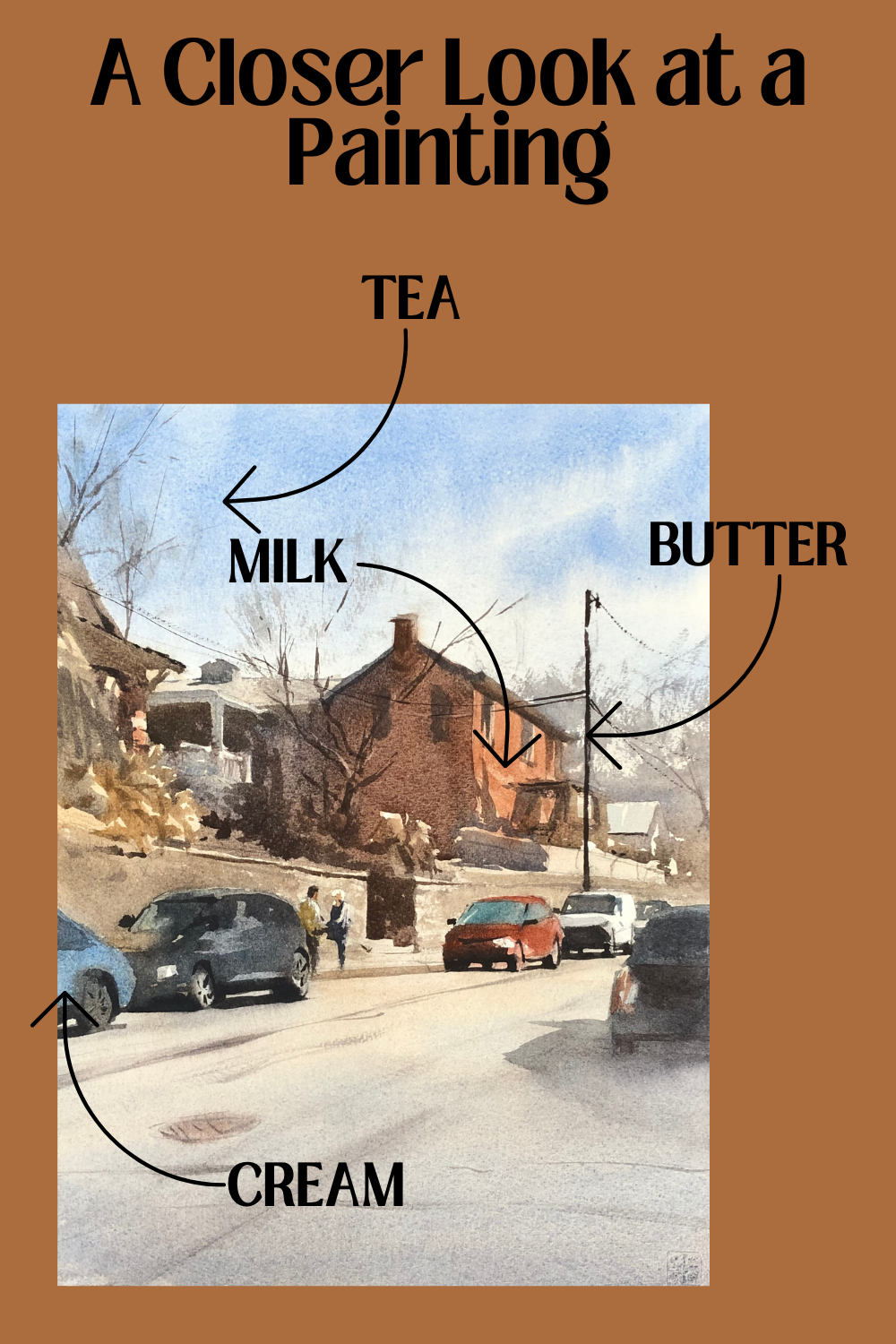
The blue of the sky is a perfect example of a tea consistency. There is a lot of water mixed in with my paint on this part of the painting.
The light side of the rust-colored building has a nice milk consistency - thicker than the sky, but still creates a bead.
The middle tones of the painting, along with much of the hues on the cars are a cream consistency.
And then there is the sparingly used butter consistency that you see on the darkest of darks in my painting. A great example of this is the pole to the right of the rust-colored building.
Why It's Important to Mix Paints on a Value Continuum
The most important takeaway is that to achieve the contrast and light you want in your watercolor paintings, you have to be able to create a wide spectrum of values. Paint-to-water ratio is an essential piece of this. Whether it helps you to think in terms of a spectrum of values, a number system (1-4) or to think of familiar consistencies like tea, coffee, milk, cream, and butter, you must make the connection between values and the consistency of your paint.

Related Blogs
Improve Your Art Through This 3-Step Watercolor Painting Process