How to Take Professional Photographs of Your Watercolors
Jun 22, 2026A very important skill that you need to have is how to photograph your painting.
If you want to share your painting anywhere, you first need to have a photograph of it. That can feel overwhelming to some artists, but today I'm going to show you a simple method for photographing your art and getting it out into the world.
Capture the Beauty of Your Watercolors in a Photo
1. Find a Source of Even Light
The first rule about photographing your painting is to photograph it in even light.
So if the sun is low and you're setting it by a window and light is shooting across it, that's not good for photographing your painting. First of all, when the light angle is low, you're going to see a lot more of the texture of the paper. When you do this, you can see all the little ridges, all the texture of the paper, and that's not the look that we're going for. We want a nice, even photograph of the actual scene.
I'm lucky in my studio because I have some nice, big lights up on the ceiling that allow me to photograph my paintings in even light, but if you don't have that, you can use sunlight. You could lay it on a surface next to a window or go outside and take the photograph. Try to find a nice and even light source if you can.
2. Avoid Casting a Shadow on the Painting
Now the other thing is when you're over your painting and you're taking a picture, you might accidentally cast a shadow on it. Sometimes when I am taking a photo of my painting, I'll notice that it's a little darker in a certain section.
If you notice this, try to pull your camera back, zoom in, and then snap that photo. This can help you avoid shadows on the paper.
3. Crop Your Photo As Needed
With that photo that I just took, I did not zoom in to the edges of the painting. What I have found is it's easier to do that when you edit the photo. So I'm not zooming in and trying to only capture the painting. I've just made sure the edges around the painting are visible.
Now, I'm going to be working on an iPhone today. You might be on a different kind of phone, but the concepts are still the same.
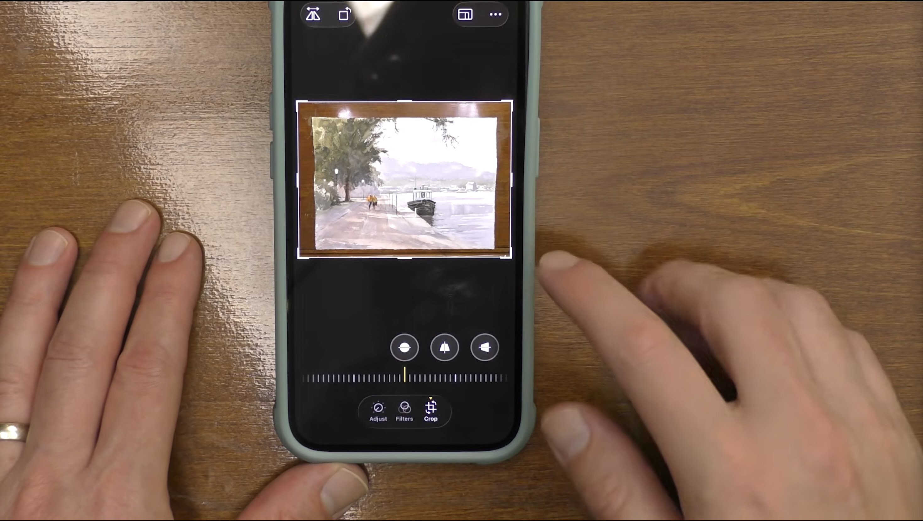
The first thing that I'm going to do is I need to crop it. So I'm going to go in here, and I'm going to hit the edit button, and I'm going to go to crop.
Then I'm going to fix the orientation. So rotate it around. Now I'm going to crop it again. You'll notice you want to be as directly over your painting as you can.
See how the edges are nice and even? If I'd had that angled, when I go in to crop it, I'm going to end up losing part of the painting when I crop it. So try to be as even as you can with your borders and be directly over your painting when you photograph it. So now I'm ready to come in and crop like this.
4. Adjust the Color to Represent Painting
Get that corner right. Drag that in, and now I've cropped it. So after I have the crop right, then I can start to adjust the color.
When I adjust the photo in editing, I want to have it look as accurate as possible to the original painting. I'm not trying to enhance the photograph to make the painting look better than it actually is, of course, just making small adjustments so that the picture represents what it looks like in real life.
Especially if you intend to post pictures online to sell your work, you'll want to make sure that you're offering your customer the most accurate view of the product as possible. So while I'm editing the photograph, I'm also looking at the actual painting. So that's important too.
Sometimes it might be a little bit underexposed, so I could add just a little more exposure to it. Brilliance, I don't touch. Highlights, I don't touch. I don't touch shadows. Now, if it needs a touch of contrast, actually, sometimes it's the other way around. Sometimes the photo has too much contrast, and I need to take a little bit away so it looks more like the actual painting. So then I can back the contrast off just a little bit. And then brightness, I'm not going to touch. Black point, I'm not going to touch. Saturation, now I'm looking at the color on my photograph. Is it as saturated as the actual painting? And I think it needs just a little bit more. Vibrance, I'm not going to touch. Warmth, I'm not going to touch.
Tint - now this is an important one. I'm using LED lights that are tuned to daylight color temperature. What happens sometimes with these lights is it can add a tint of green to my paintings. I found over time that it looks more green in my photo than it does on my painting. That's where tint comes in. So I can slide this a little. If you go too far, you can see now it's really adding some green to it. If you go too far the other way, it adds more magenta, kind of a pinkish look to it. I'm looking at the painting and I'm adjusting that tint just a little.
Okay, and these are all really small changes. That's something I'd like to point out, is just small changes along the way, so we're getting closer to how the actual painting looks.
I don't need noise reduction and I don't need vignette.
I have seen people post photos online of their paintings where they add a vignette around the edges to focus it more in the middle, or they might soften it with a little bit of a blur. This is fine if you're trying to be creative in how you're posting the photo, but if you're trying to show your actual painting, you want it to look like the real painting.
Where Can You Find My Paintings Posted Online?
To see numerous examples of my paintings photographs, visit mwhiteart.com or follow me on Instagram at https://www.instagram.com/m.white.art/.
I hope this little tutorial helps you out the next time you have a finished painting you want to capture and show off.
Related Blogs
You Took a Photo - Now What? Paint a Beautiful Watercolor!
How To Use Any Reference Photo To Paint A Stunning Watercolor
Social Media and Watercolor - How to Become Unstoppable