Free Tutorial: Paint a Simple Watercolor Sketch
Mar 25, 2024Watercolor sketches differ slightly from a regular painting because they are meant to be quick studies of a scene with the goal of practicing skills and techniques you want to improve in all your watercolor paintings.
This tutorial is just that - a sketch for watercolor artists who want to develop their abilities and boost their confidence. Try your hand at this watercolor tutorial to practice:
- timing as you complete the three-step watercolor painting process,
- conveying distance in a watercolor landscape, and
- achieving the look of reflections on bodies of water
Improve Your Painting Skills Quickly with this Easy Watercolor Sketch
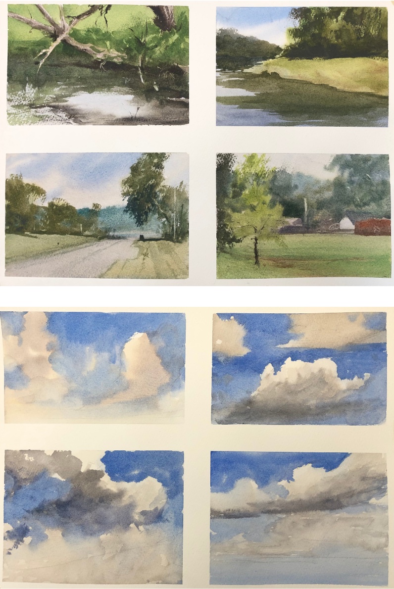
Enjoy this Post? Like this Pin!

Watercolor Technique to Grow as an Artist: Paint Small and Often
It can be tempting to paint in a large size all the time, and little sketches can feel less satisfying to complete. But let me tell you - quickly sketching a watercolor scene (whether you do it to prepare for a larger version of the scene or just to practice a certain skill) can teach you a lot.
In fact, if you really want to improve, painting small watercolor paintings is crucial. This is truer for watercolor than other mediums because timing can put pressure on the whole process. We only have a certain amount of time before that paper is dry and we can no longer get certain effects. So painting a sketch instead makes it easier for you to manage the time you have.
The more scenes you paint, the more opportunity you have to practice all your skills - drawing, composing, color mixing, etc.
While today's watercolor landscape sketch was done on a standard-sized paper, the same concept applies. I painted this with the goal of creating distance and the illusion of reflection on the water. Because I had less investment in the outcome of this painting, I was able to move quicker and practice these specific elements, building skills to take into the next painting.
Watercolor Washes to Sketch This Landscape
Here is the reference photo that inspired this watercolor sketch. I was drawn to the distance represented in the scene and the reflections on the water.

Before I started my first wash, I outlined the landscape scene with a simple drawing. Some decisions that I had to make right away were:
- Which is more important, the sky or the land? This decision dictated where I place my horizon line. If you want to emphasize the sky, it should be placed in the bottom third of the paper, and if you want to emphasize the land, you'll want to place it on the top third of the paper.
- What elements of the painting will I need to paint around or be aware of throughout the whole painting process? Consider what kind of guidance you need as you paint as you draw. You don't want to forget to paint around something important or inadvertently paint over a part of the painting you were trying to keep white.
- How might I want to change the layout of the scene for a more aesthetically pleasing composition? As an artist, you are not beholden to render a scene exactly as it appears in a photo or in real life. Unless your primary goal is verisimilitude and precision, you can rearrange, zoom in, or change the focus of a scene in ways that advantage your painting.

Before I start painting, I wet down both the back and the front of my paper, evenly dampening the front of my paper. This gives me more time to work wet into wet. Then I move into my first wash.
First Wash
In my first wash, I'm focused on painting the lightest values of the scene. And if you take a look at the reference photo, the lightest values are the sky, the light on this field, and the water.
At the top of the sky, I'm using Cerulean, and toward the bottom, I'm using a little bit of Rose Madder Permanent and Raw Sienna. As I get down to the horizon line, where the ground starts, I lay in some of the greens. When it comes to mixing greens, I like to use Cobalt Turquoise, Raw Sienna and Cadmium Yellow (medium hue). I use the Cobalt Turquoise and the Raw Sienna for a neutral olive green, and where the light is more prominent, I want a more saturated green, so I mix in some of my Cadmium Yellow.
As you get down where the water is, you'll start to see a transition from grass color to dirt color.I drop that in when things are still wet and allow those colors to merge softly together on the paper.

And now we're down to the surface of the water. What you do here is key.
When you're painting water, you want to start off with your lighter colors in the middle ground of the painting. And as you work down to the foreground, you want to use a stronger mixture of paint.
So you'll see, I'm really pushing that value of blue as I get near the bottom of the painting, so as to lead that viewer's eye into the scene. When you can make it darker on the edges and lighter in the middle of the painting, you drive the viewer's eye into the scene and you give a feeling of believability to the water.

Remember to push those values in the first wash, because when the paper dries, the colors tend to fade a little bit. So you have to compensate for that.
Second Wash
The focus of the second wash is painting the large, connected, middle value shape of the scene, which I have found is one of the most difficult concepts for students. It took me a while to learn too; it's a challenge.
Finding the connected shape involves grouping shapes found in your scene together and learning to see them as one connected shape that lays over the top of your light values.
See how there's connections between all these shapes - the hills in the background, the green in the middle ground, the stronger area of dirt over the water, and right into the reflections?

That's all I'm talking about - connectivity. I'm not painting each of those elements in separate little areas. I'm painting them in a way where they will flow into each other. And you can see that in this stage right here. We're looking at one big connected shape.

Third Wash
The focus of the third wash is adding the darks and details that will really give it the contrast and depth that we want in our painting. At this stage, I am working hard not to overwork the painting and I'm trying to simplify my brush work.
The fewer brush strokes you use, the fresher your painting is going to be. I think one of the temptations when we see reflections is to get really into every little mark of the reflection, but I really tried to keep that as clean as possible. State what you're trying to state in as few marks as possible.
I touched up the shoreline just a little bit and added a few little vertical reflections of the power poles in the distance.
Verticals are a great tool that lead the viewer's eye up and around the painting. And notice I'm not just doing a straight line down, I'm breaking it up, suggesting the surface of the water with broken lines. You'd be surprised once you get a few of those lines in there how effective they are. You don't need to put them all over the surface of the water. Just hint at a few.
Here's a look at the final painting:

How Do I Convey Distance in My Watercolor Paintings?
If you watch the video at the top of this blog, you'll hear me talk about conveying distance throughout the process of this watercolor landscape sketch. What elements in the painting above do you notice that help give the scene depth? I'm going to cover 3 major watercolor techniques to achieving depth and distance in your paintings.
Texture
The first thing to consider when you're trying to convey distance in a watercolor painting is texture. The more texture you add to an aspect or section of your painting, the more it is going to move forward to your viewer. Compare the blue tree line in the background with the green flora. One reason it appears closer is the texture I added to it.
Color Temperature
The other reason the tree lines have different depth is because of the color I used. Cool colors tend to recede into the background, and warm colors read as "closer" to the viewer. This is why I chose to use this cooler blue in the background tree line. It doesn't compete with the green trees, and it is clear how distant they are to the focal point of the painting.
Color Value
The value of a color refers to how saturated it is. We're talking about the lightness and darkness of a color rather than its temperature here. When you want to bring an element forward in a painting, it helps to strengthen the value of a color (darken it), and when you want an element to recede into the background, it helps to weaken the color - or make it lighter.
Related Blogs
Dive into the Serenity of Landscape Painting with our Guided Watercolor Tutorial
Paint this Glowing Landscape in Watercolor
Creating Depth and Realism: Essential Strategies for Watercolor Landscape Artists