What We Can All Learn From Watching Critiques
Nov 02, 2026Having your paintings critiqued is so valuable. The next best thing is watching others have their work critiqued. It's a powerful experience because we all have similar lessons to learn and things to work through when it comes to painting.
You're going to want to see all three of these critiques today. There are important lessons to learn in each one.
By the way - these are all paintings that have been submitted to me through my email newsletter group. Follow this link if you'd like to sign up for that - and have a chance at having one of your paintings critiqued too.
First Critique - Jane
First up, Jane painted this lovely coastal scene.
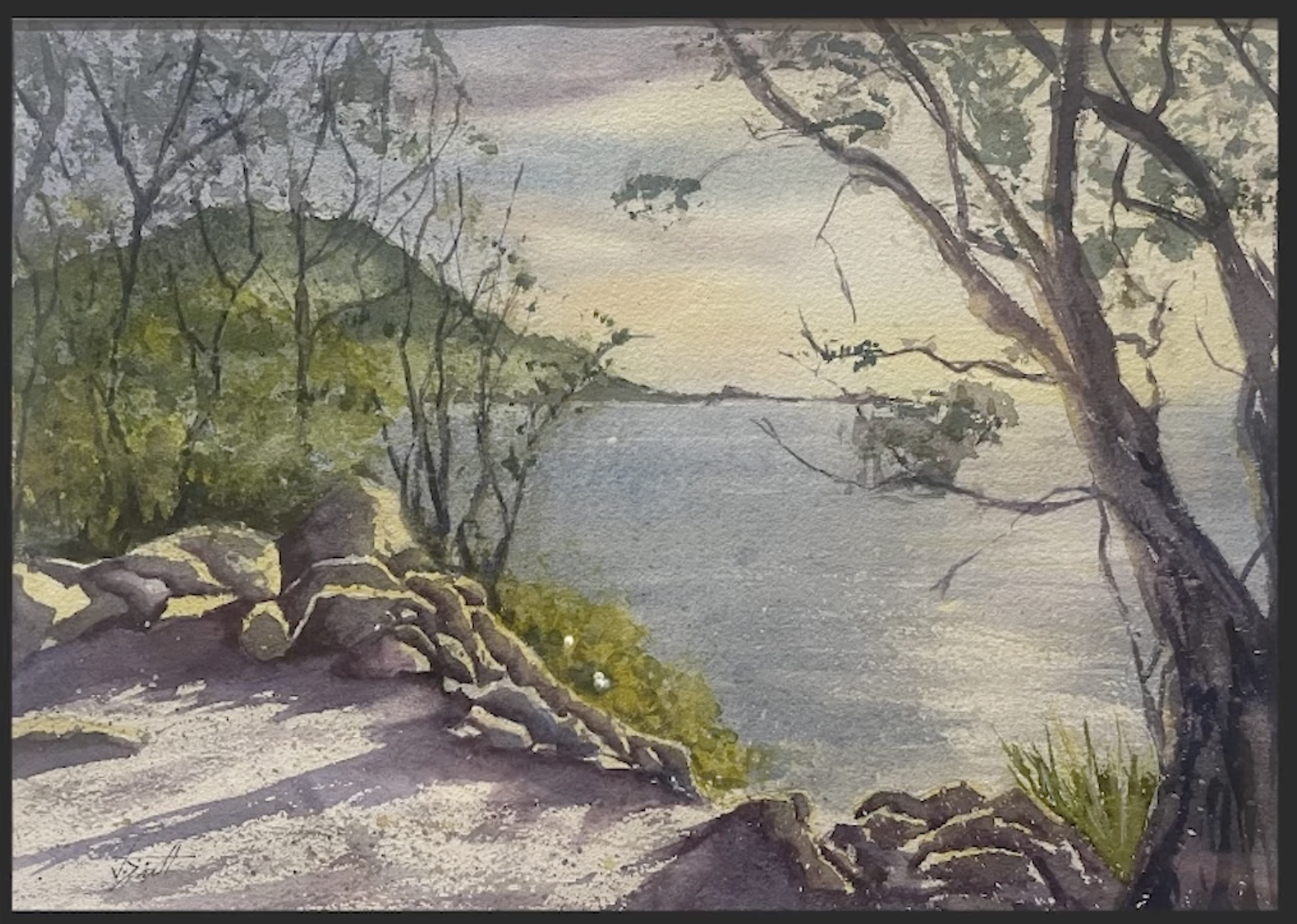
First of all - there is a good feeling of light in this.
The first thing I like to do is to look at values. And I find that the best way to do that is to turn your reference and your painting black and white.
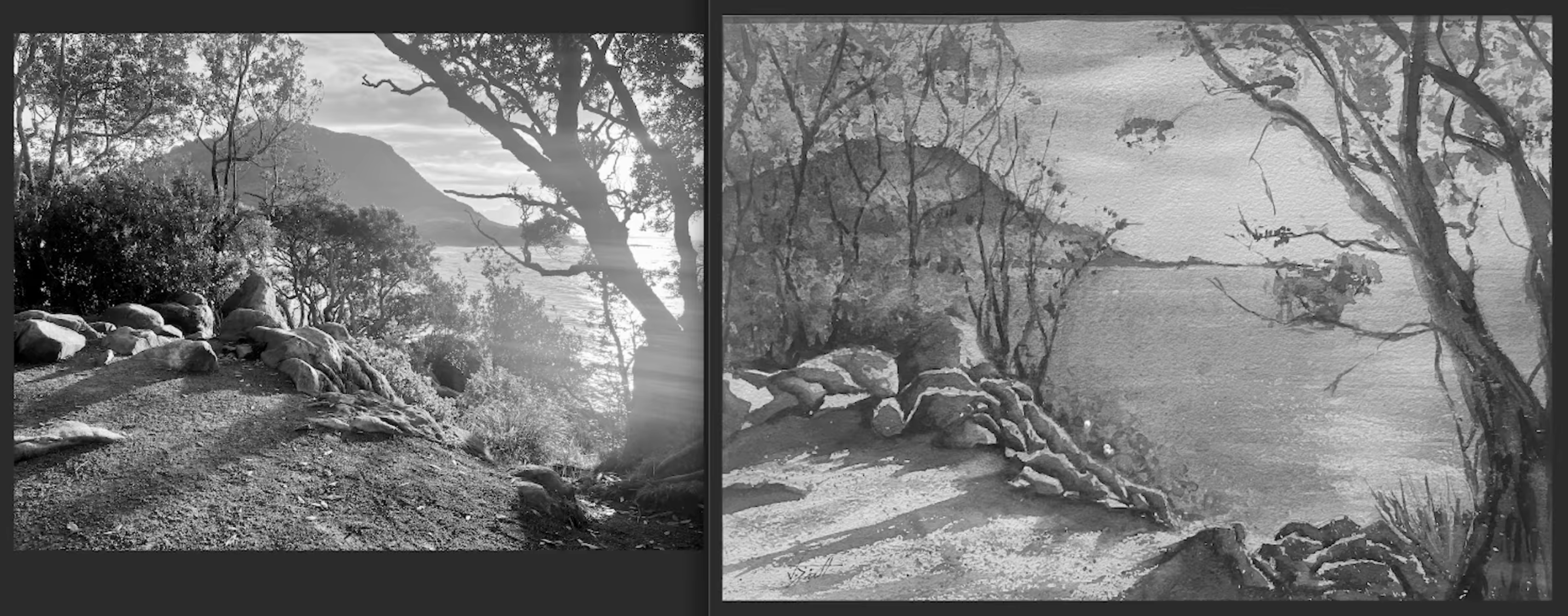
After taking the color away, we can see more of the nuances within the value structure of the scene. And one thing that sticks out to me is we have a good feeling of light in the foreground and not as much on the water. If you were to flip these two values where you were lighter on the water and darker in this middle area on the ground, that would help the focus be more into the center of the scene. One lovely thing about the reference photo is the light glaring off the ocean. Preserving more of the light on the water and painting around it such as you did here in the shadow shape will get you that sparkling light look of the sun glaring down on the water.
I also want you to notice the value difference in the reference photo between the distant hill and the trees that are a closer. That little distinction between these values helps organize the painting. It's helpful to really lean into the idea of a foreground, a middleground, and a background. That allows the painting to have more organization. And it also will also help you understand what each area of the painting needs to do in order to make it work.
So, the foreground, you have plenty of interest here. Let's get the interest a little further into the middleground of the scene with that little value change I was talking about. And then when we paint this distant hill in the background, you can go a little bit lighter on that hill and just a little bit darker on some of these trees that are in front of the hill. That little distinction will help the feeling of distance and give your painting more organization.
When I see groups of trees like the one in your painting, I like to squint, turn it black and white, and see how all of this is connected in a very similar value. You need just a little more strength on some of these trees in order to really see that difference. Let's talk about trees for just a minute. Over here on the right, we have this tree, and you did a pretty nice job with this nice brush work, but I think that this tree here is obstructing the view and kind of keeping us stuck right in the foreground.
So, if I was painting this scene, I would eliminate the tree closest to the center, but I would keep the one that leans over the edge and kind of frames the scene. The branches kind of come over this way, and it creates this nice tunnel where we can look through and see more of that sun glaring off the water, which is a good prominent area of the painting and adds to the drama of the scene.
To continue our discussion on trees, we have a lot of branches that are kind of coming up and we've kind of created a similar pattern with branches that are about the same size that have a similar flow and direction. When we look at the randomness of nature, we want to try to bring some of that into how we paint the scene. So, be mindful of branches that are the same size, the same distance apart, and creating kind of a pattern in this part of the painting.
Jane, you've done a nice job on this scene, and I'm hopeful with a few tweaks, you could take on a scene like this again, and you'd be even happier with your end result. Keep up the good work!
Second Critique - Kim
Next up, we have this street scene submitted by Kim.
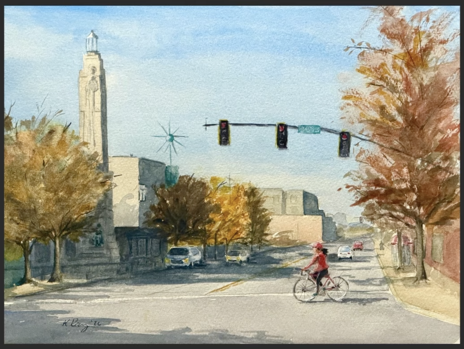
Nice work on this, Kim.
Overall, your drawing is pretty good. Your painting has a nice light effect, and overall, you've done a nice job with this.
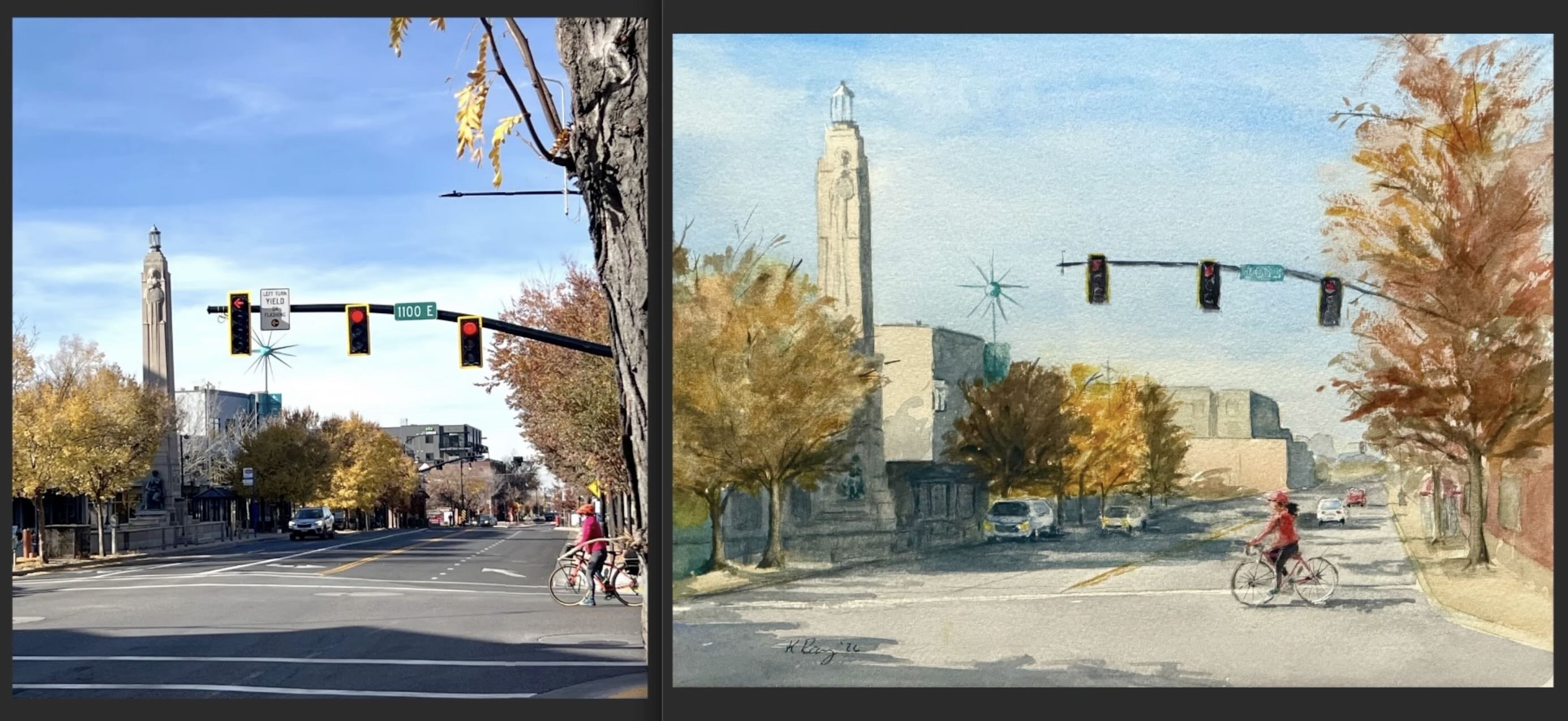
I love that you edited out this big tree on the righthand side. We didn't really need that. The longer that I paint, the more I realize that part of what we do as painters is learn how to look at something like this and interpret it into a scene - what to keep, what to omit, and what to change. I also like how you also added a few cars and a little more interest into this street area so we didn't have just a wide open area of the painting.
Your question to me was how to create variety in trees when they look so much alike: same size, the same color, etc. What I do in situations like that is I often will remove trees. If it doesn't serve the scene well, just take it out. If you want to keep it in, then we can start adding some more variety to it. Take a dash of this red and throw that into this one of the trees, creating a little bit of difference in color. You could make one a little bit smaller even if it differs from the reference photo. Finding little ways to add variation is good. But also remember that you can just eliminate things that annoy you or don't fit your vision for the scene.
Let's turn this black and white and get a look at the value structure.
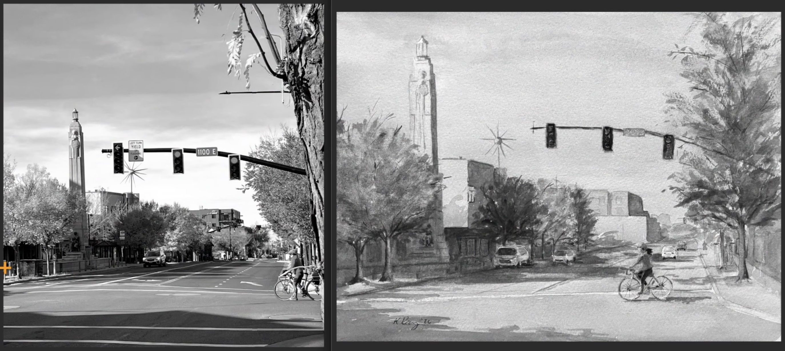
I thought your values in this scene were pretty good. I just had a couple suggestions. First of all, let's look at the value of the building in light against the sky in the background. This becomes a tricky thing in painting. When we see something in light, we want to paint it light. But we also have the sky that's a little lighter in the background. When you're painting your first wash of the sky, you can drop in some light value on other objects (like this tower), but make it a little darker than the sky. Then when you go back in and paint the middle values and the details, this shadow side is what's going to give this tower enough form.
A couple other small tweaks. You could go a little bit darker in the sky. So as we look up in the sky, notice that it's a deeper, richer blue the further we get from the horizon. Close to the horizon, it's more diffused and looks lighter. That bit of deeper, richer blue at the top creates a nice vignette around the scene. That subtle little value change can help focus the attention into this part of the scene even more.
The other thing is that's tricky to see and to paint is the ground when it's in light. Often we're painting that within the first wash of the scene. And when we paint it, we are comparing it to the white paper that we haven't covered up yet. When you squint at your scene, start comparing the value of the ground, even if it's in light, to that of the sky. And so, right now, if you put one more wash over your ground plane, that would help the light become even more apparent in the scene because you would get a little bit more value difference between what's on the ground and the light value of the sky.
The next thing I want to talk about is perspective. The perspective is not bad here in this scene, but I want to bring up an issue that tends to happen when we paint and draw street scenes. If you trace a line from a figure's head to the top of the vehicle, that's about exactly the same height. And you were pretty close on that. It's just slightly lower than where we would want it to be. When you're painting a scene with flat terrain, the roofs of those cars can be on the same line. So, that's not bad. I mean, you're pretty close, but scooting that the roof of that car up a little bit and bringing these cars in the distance down, ensuring that they stay on that same plane, even if they're far off in the distance, that's going to correct a perspective problem. So, your ground plane in the background was raising up. If you look at the reference painting and you trace over the top of her head over to where this building is, her head is above the bottom of that building. But here in the painting, you've raised it up a little bit so the building and her head are on the same plane. Paying attention to those extra little bits of detail on the perspective can help out your paintings quite a bit.
Notice also that the bottom of the rightmost building lands right where the top of her head starts. This creates what we call a tangent. I try to be mindful of where lines meet each other in the painting and try to overlap them when possible.
Nice job on this. I hope those little tweaks to values and talking about perspective can be helpful for you. Keep up the good work.
Third Critique - Pete
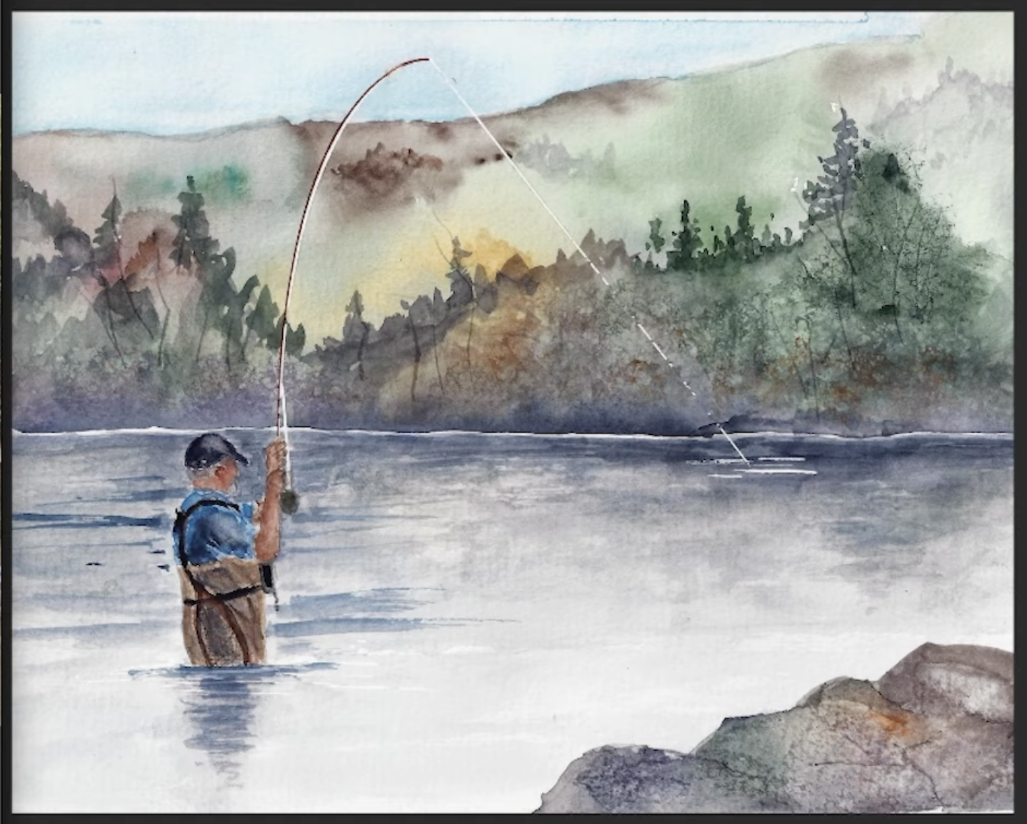
All right, next up we have this scene from Pete and he had a specific question about the background. So, I'm going to talk about the background and we'll talk about a few other things along the way.
The first thing we're going to do, Pete, is we are going to take a look at values. So, we're taking away the color from the reference and the painting.
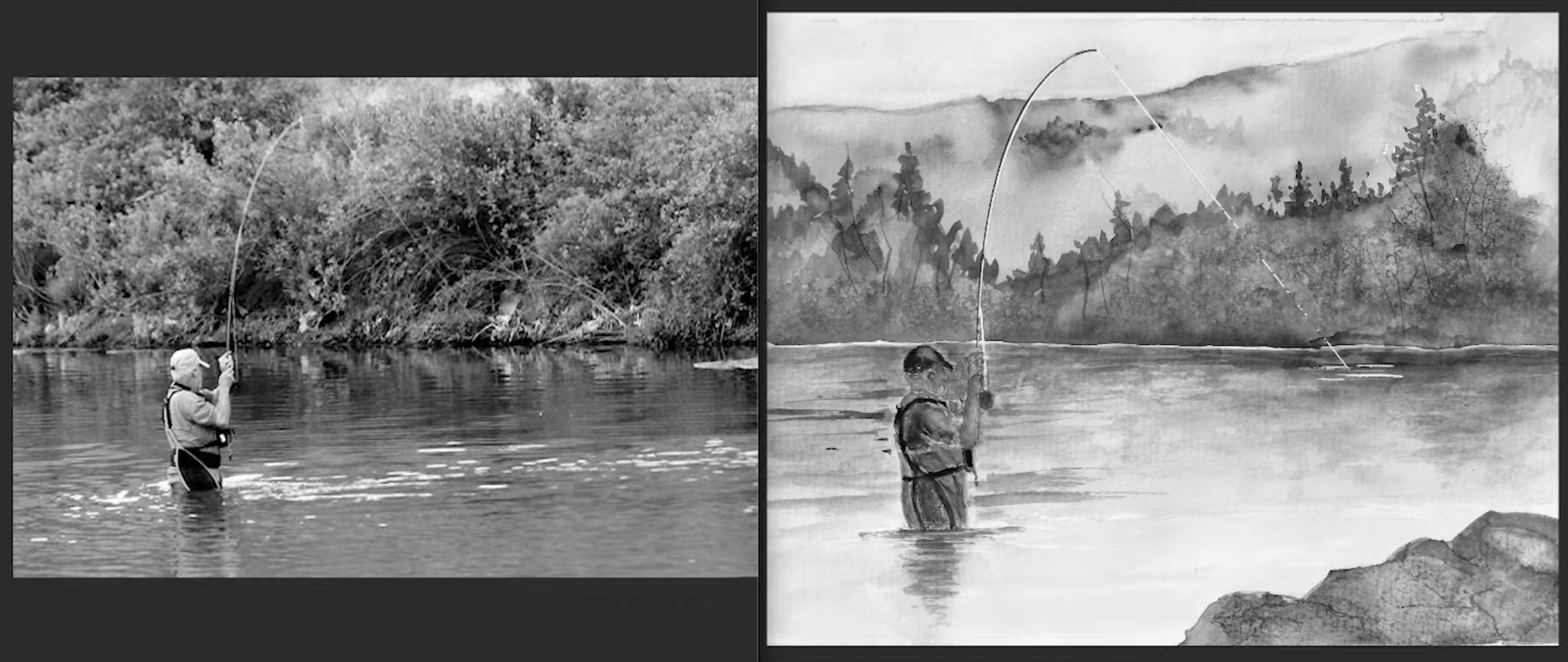
The first thing I noticed when I looked at values was you've inversed the values a little bit. Here we have the fisherman in light. And that means we would need to negatively paint around him to define him. Instead, you've painted him dark. In the reference painting, the water and the shadows and reflections are more dark. But you've made them really light in your painting. Instead, we want to preserve the light on our main character here and paint dark enough on the water around him to really let that pop out and create a clear focused point of interest and believable light.
In the last painting, I talked about a tangent. See how in your painting and reference photo the shoreline and the fisherman's head line up. This is also a tangent. When I see things like that in a reference, I change them in. my painting. In this case, I would probably lower the shoreline a little bit so his head breaks through that line. But where it is now, where it's sitting right on top of his head, that's creates a distracting line.
It's helpful to think about how to organize your painting with foreground, middle ground, and background. We want the foreground to lead us into the scene. The middle ground is where we want the most contrast, the most attention, the most interest. And then the background is where we really want it to just be a background. We want it to complement what's happening in the scene, but not necessarily be the main area of interest. So when I paint scenes like this, I like to think about how can I abstract the background? For example, we don't really need to see the sky. You've added some sky in here. Instead, you can keep it nice and abstract and simple.
One way to facilitate simplification is to squint. As I look at this reference photo, I squint and I'm think about the value: the value of the trees, the little bits of darker areas, and then also there's so much texture here. So, when we can squint at it and take away some of that detail, some of the more prominent texture might stand out to us. When you paint this background, you can just let colors merge on the paper, creating softness, and then drop in a few of the darks while it's still wet for the shadows.
And then when you paint the water, you can bring the same value right down into the water. The reflection in the water and the trees in the background are very similar in value, and we can paint them in that way. Most students want to have a really clear division between the water and the ground. But you can blur that a little bit to make it feel more connected and not separate parts of our painting. Then you can drop in just a few little subtle darks along the shoreline that will give you enough information to organize those two bits. But we don't need a hard line through the scene that separates both of them.
Nice work on this, Pete.
And thank to all three of you for submitting your paintings!
Sign Up For the Opportunity to Have Your Painting Critiqued
If you would like me to consider reviewing your painting, follow this link to sign up for my watercolor newsletter.
Related Blogs
I Critiqued 3 Student Paintings (And Fixed the #1 Mistake)
What to Expect at an In-Person Workshop - My Complete Watercolor Process