I Critiqued 3 Student Paintings (And Fixed the #1 Mistake)
Oct 05, 2026A few weeks ago I reached out to my email newsletter audience and I asked for submissions to be critiqued on my channel. I had a lot of paintings to go through and I picked three of those to feature in today's video.

I'm going to be teaching on composition, brushwork, and I'm going to explain a common value mistake that is easy to fix but makes a massive difference in your paintings.
If you want a chance to be critiqued on my channel or would just like watercolor tips and valuable lessons sent right to your inbox, click the link down in the description to sign up.
First Critique - Carla
First up we have Carla's painting and she painted this dynamic sunset scene.
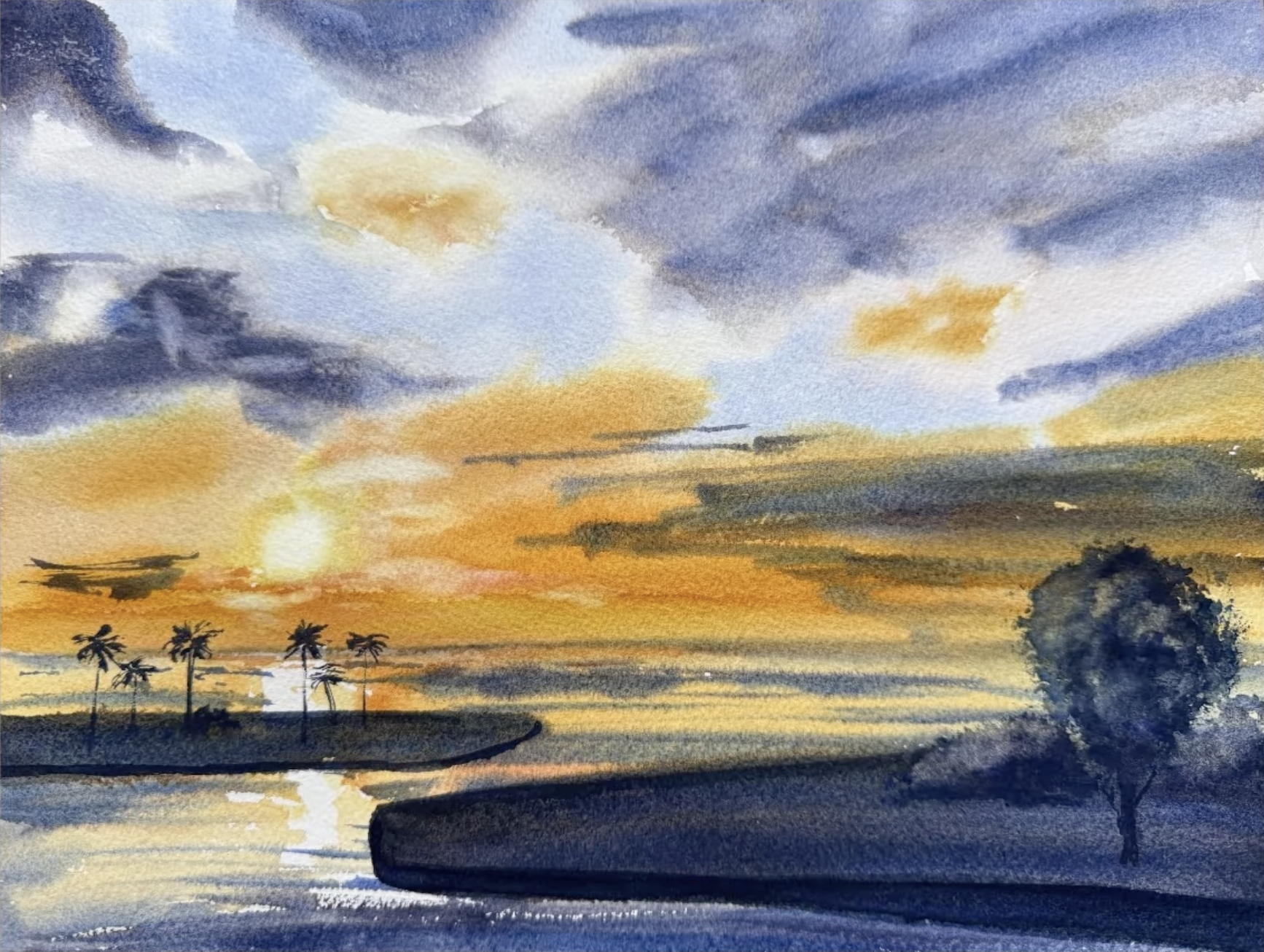
I like how you created an area of interest with the reflection of the sun in the water. You have some nice, delicate brushwork here.
So a few things to talk through here. First, we have these two separated islands and we have these dark lines, and the one on the left leads us right out of the scene. Instead of leading the viewer right out of the scene, you can use them to lead into the scene.
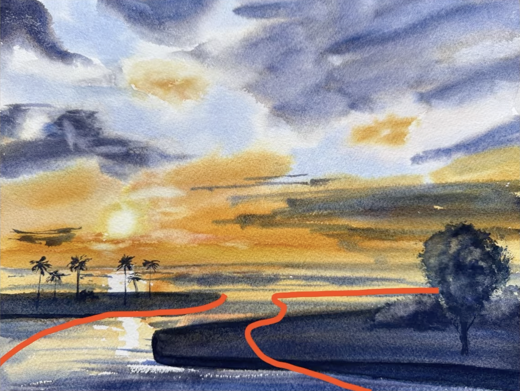
We would have the edge of this island come like this and then angled down this way and then this one we could do something like that. That can really help out your composition.
What I always like to do when I give feedback is to look at the values of the scene. If you take the color away and look at them black and white, you can see the values really clearly.
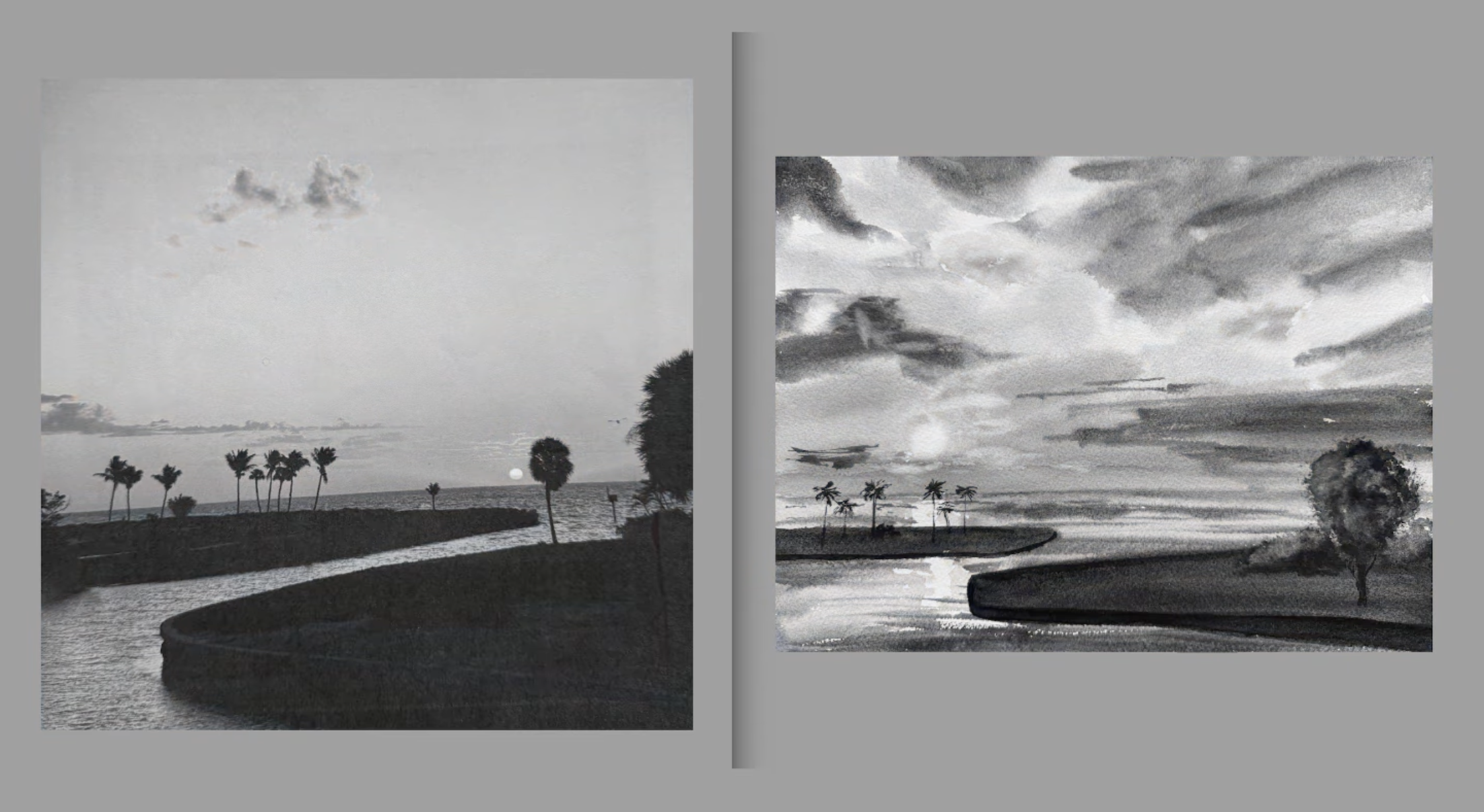
Now I will say you have a nice effect of light here in this scene, but there's one thing that's missing that I think would enhance this even more. If you look at the reference photo, you can see a noticeable value difference between the water and the sky. If you were to do another wash over the water and darken up the bottom part of this, it would really enhance the feeling of light in the scene. A lot of times when the light effect isn't exactly working how we want, often it is the case that the ground plane, or in this scenario, the surface of the water, is not dark enough.
But your question was really about painting skies. You are on the right track, but here's my advice:
As much as you can, paint it all while it's wet without letting your paper dry, that way you can have a lot of soft edges in the sky.
When painting sunsets, the challenge is getting the value strong enough. You made a really nice effort here. I think you can do it a little bit more, which means you would paint your lightest values first and then ensure that everywhere else you're painting is darker than that. If you push that a little bit more in the sky wash, push the value, paint a little stronger, that light effect will become even more clear. I always say this when we paint skies, simpler is better. I would leave out a lot of these clouds and some of the brushwork above the tree on the right edge.
Knowing when to stop is really a big part of painting a fresh realistic sky. I find that I'm most disappointed in my skies when I overwork them. So, really try to simplify your brushwork, and try to focus more on the values instead of chasing the details that you see in your reference photo.
Another thing I wanted to address was the tree on the right edge of the painting: it looks really, really solid. I would just suggest trying to leave a few more gaps in the tree to let the light shine through. We could also scoot that in and have one tree that's more prominent at that bottom right third.
Those are the tips I have for you. Thank you for sharing your painting, Carla! I wish you all the best.
Second Critique - Navya
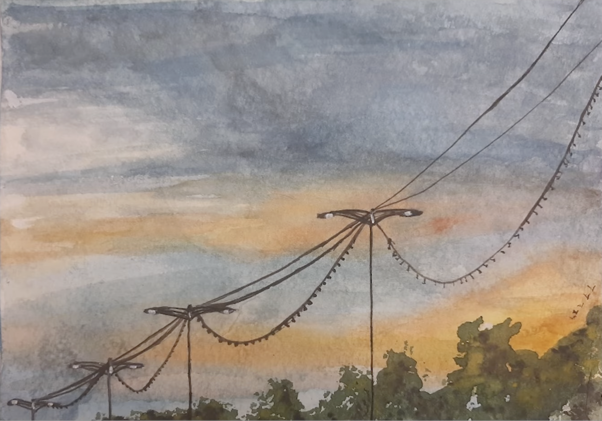
Next up, Navya was really wanting to know how to get more light into her scene, how to make it feel less flat and more dynamic.
The first thing that we want to do is look at values, so let's look at the painting and reference photo in black and white to see the values really clearly.
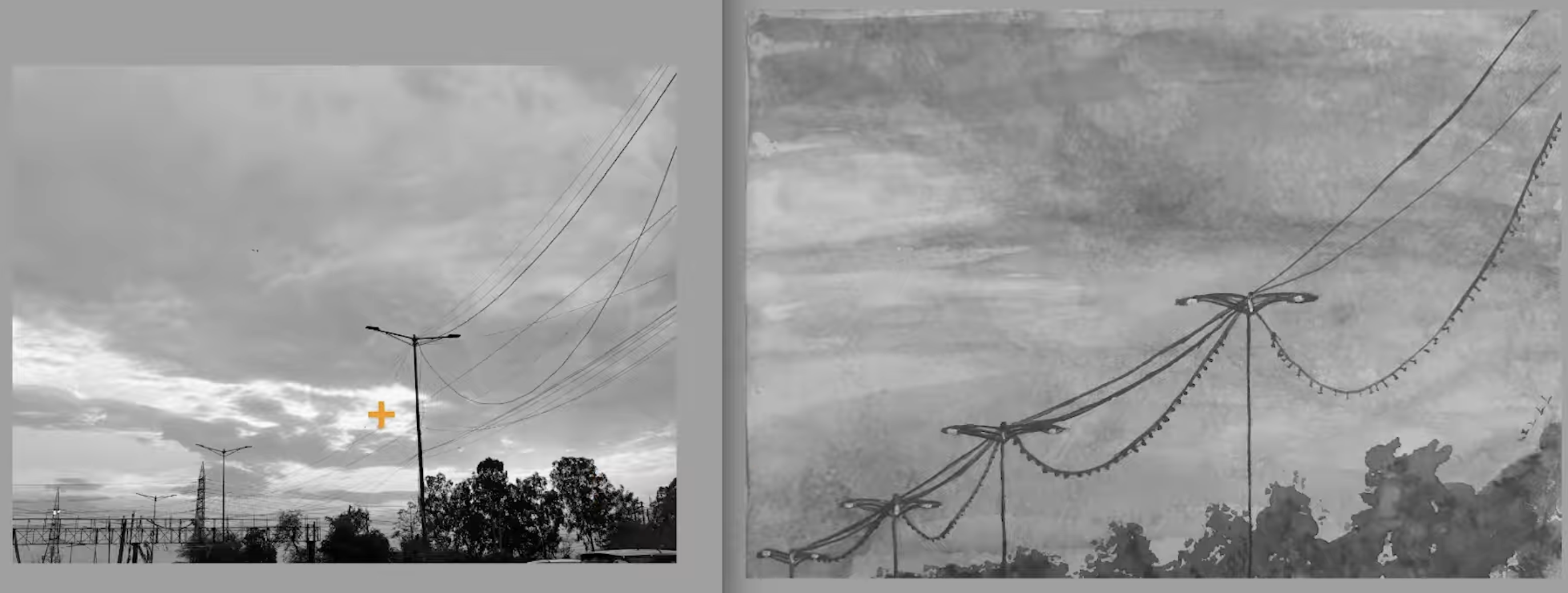
What I see here is there's a lot more light in the sky here in the reference photo than what you've created here in the painting. When you are painting the sky, you want to keep that light area really low in value. This cloud above the light area - which is really a middle value shape of the scene - needs to be darker.
And you're really close on that value, actually. I think it's strong enough. The only thing we're missing is the light that we needed to preserve.
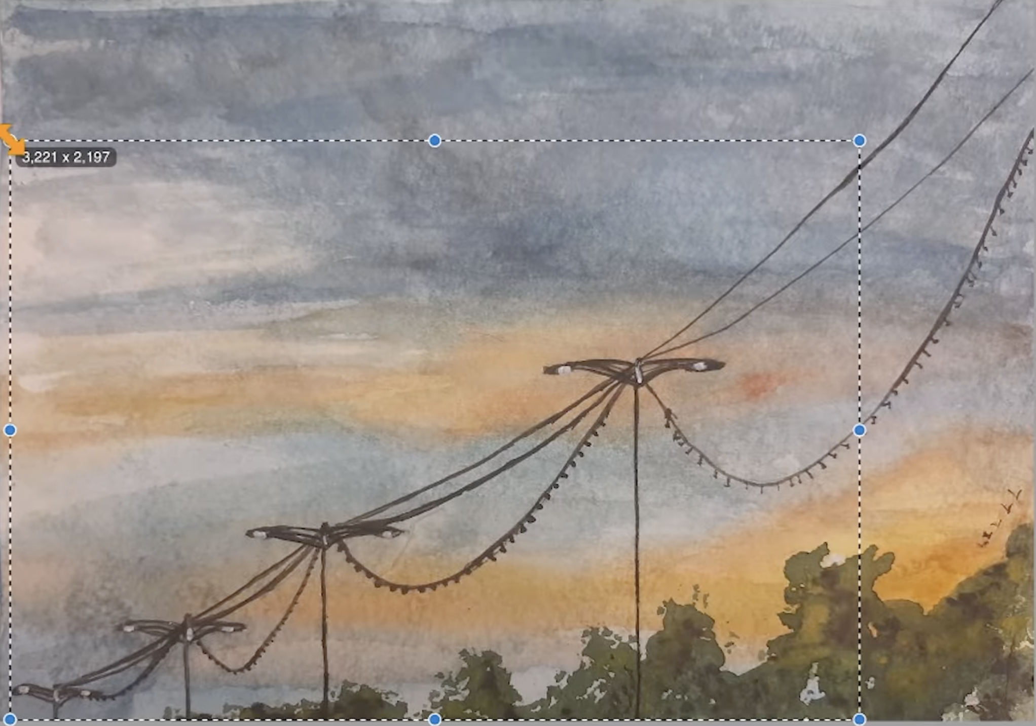
The next thing I wanted to talk about was composition. What you have here are these wires running through the painting that are separating the bottom half of the painting and the top half of the painting. We could fix this by cropping it just a little bit differently.
Let's put this main pole in a more prominent area of the scene, like the upper right third. Something like this, that feels a little bit better:
The next thing I want to talk about is brushwork.
Painting these thin power lines can be really tricky. I always recommend when you are painting things like that, use a piece of scrap paper to practice getting the right consistency on your brush and then get some nice sweeping brush movements.nThat will look a lot more natural and energetic than tracing this line out really slowly. Another to keep in mind is as things get away further into the scene, they need to get smaller. So the wire should be thicker on the right edge and be getting thinner as you go to the left.
Let's also pay attention to the thickness of the light poles. The thickness here is about the same as the wire, so we want to be a little bit thicker on the poles. The trees in your reference vary in size; there's a lot of difference between these shapes. Variety goes a long ways in painting, so having one of the trees be a little bit taller, having some be a little bit smaller - just creating variety in those trees - will help your painting out a lot.
Now this is a small thing, but here I see a line of birds flying on the right edge of the sky. Let's move those into a more prominent position and vary their sizes and spacing.
So those are my tips for you. I hope that that was helpful for you, and keep up the good work!
Third Critique - Mary
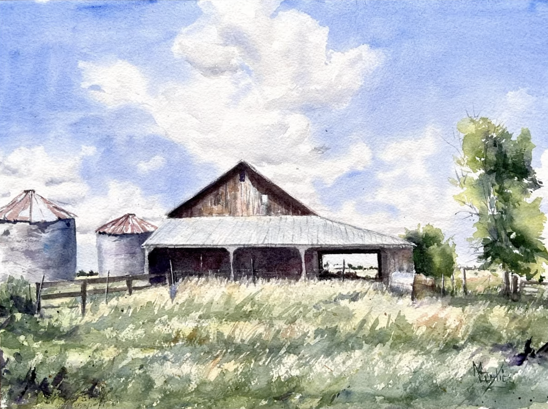
Next up we have this painting from Mary and what a great subject. I love old barns and farm scenes!
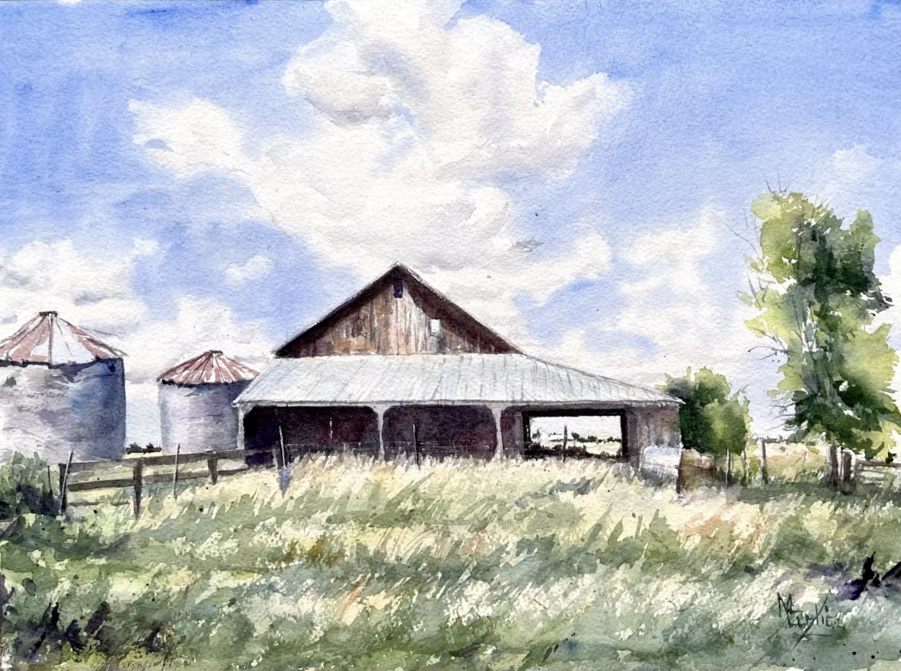
This has a nice feel to it. You have a very good eye for texture and detail. The brushwork here on the tree is nice and interesting. Nice, delicate brushwork creating these areas of texture.
But I want you to keep in mind that texture gets us in trouble sometimes. When we have texture all over the scene, it can quickly feel kind of overworked. Instead, we can use texture to help enhance the feeling of depth within our painting. Having this amount of texture in the foreground and simplifying that texture as we get further into the scene is a great way to create depth and simplify your painting.
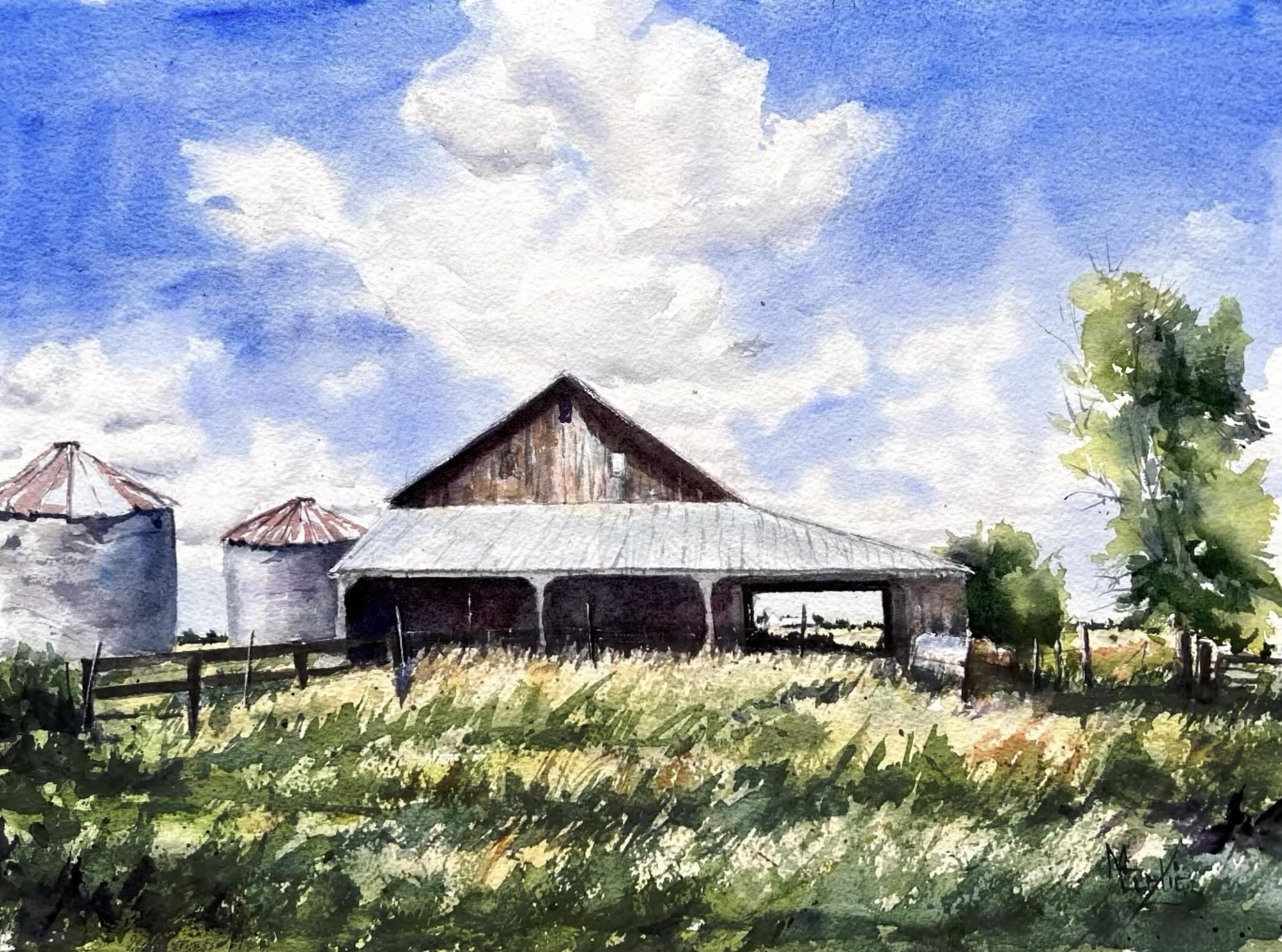
Let's go ahead and look at values for your scene. I think you could have gone a little bit stronger with the blue of the sky.
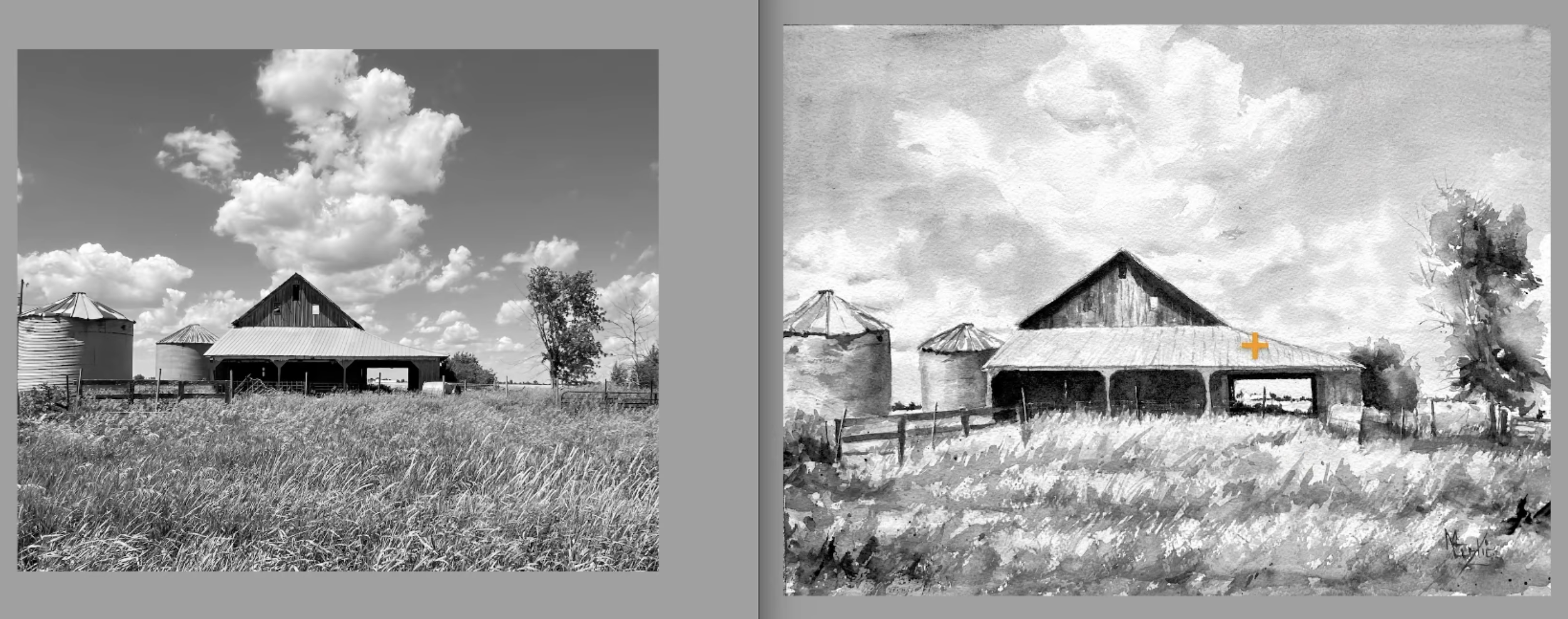
That would enhance the feeling of the clouds and really push the light here on the roof of the barn.
Now the other thing I noticed was similar to the first painting we looked at where the ocean could have been increased in value. I think a little wash over the ground here would also enhance that feeling of light.
If we squint and we look over here at the reference photo, we can see the value difference between what we have in the grass and the light on the top of the barn. So if we do a little wash over that, I think that's going to help your feeling of light. When you're looking at your scene and transforming it into a painting, try to not get too into how every individual piece looks and the detail of those areas, but think about how all of those things relate to each other.
If we give every area of the scene a 100% finish where we add all the details that we see, we end up putting a lot of information into the painting. Whereas if we can minimize certain areas, we can create more of a feeling of focus and use those bits of texture and finish to direct where the viewer's eye goes in the scene.
Now the next thing I wanted to talk to you about was composition.
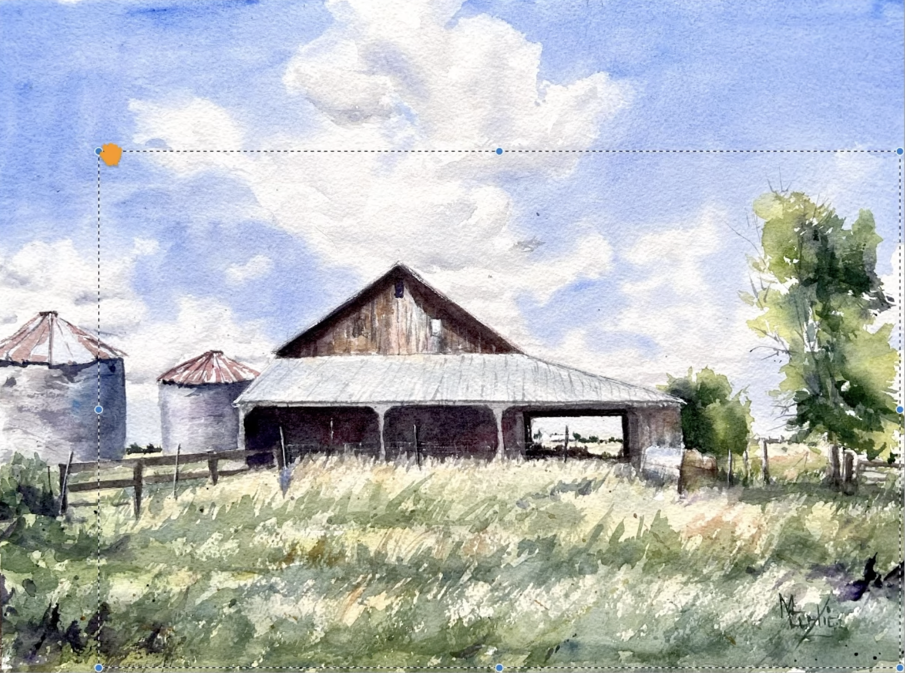
So we have this barn that is centered in the painting. One thing that's helpful is to think of a two-third versus a one-third rule.
Do I want the ground to be two-thirds of the focus and the sky to be one-third of the focus or the opposite of that? This helps me determine my composition. If we crop out a little bit of the sky and maybe we don't have the barn so much in the center, let's see what that feels like. So here we've moved the barn into that upper left third.
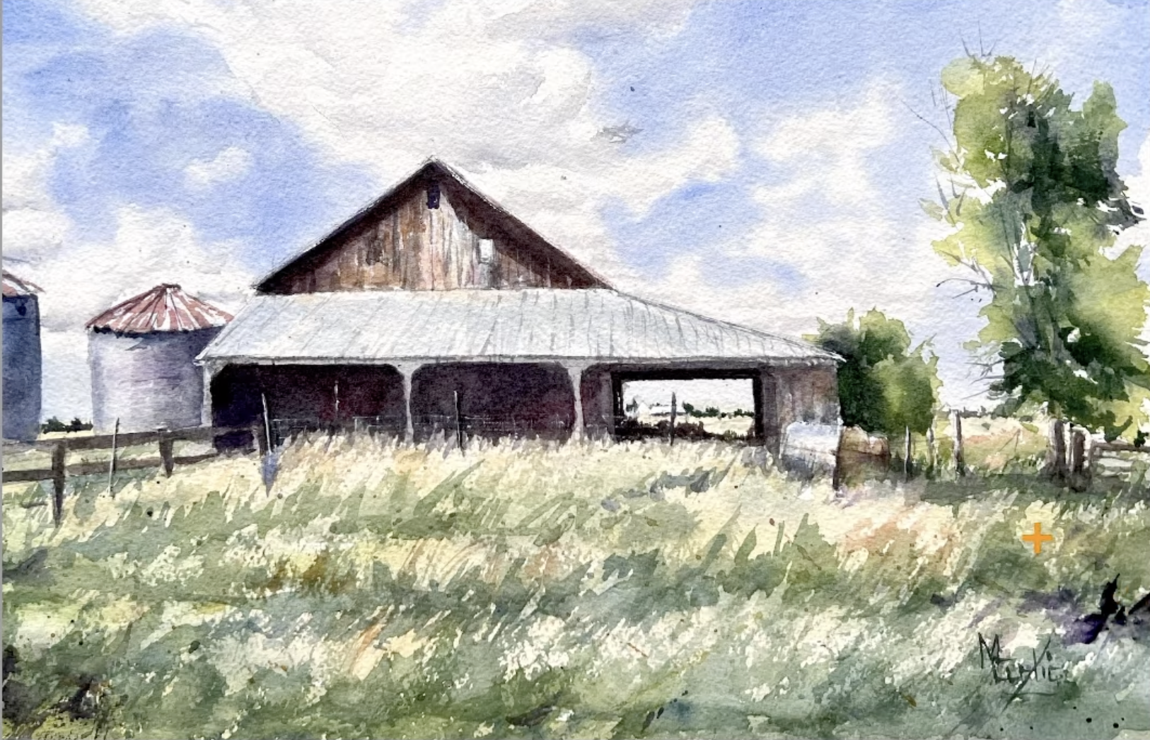
That feels a little bit more natural to me, feels good to my eyes. And we have this prominent triangle shape that is helping direct our attention in the scene. So when I glance at this, my eye goes right here to the roof then I follow this line here and then I come down over here to the tree and now I have this great circular movement when I'm looking at the composition. So when we're thinking about how to build the composition, think about how your eye moves around the scene and how can we lay out those elements and crop in order to keep the eye movement going around and in the painting.
You've done a lot of great work here, Mary. Hopefully these tips are helpful for you!
Sign Up For the Opportunity to Have Your Painting Critiqued
If you would like me to consider reviewing your painting, follow this link to sign up for my watercolor newsletter.
Related Blogs
This One Simple Watercolor Technique Unlocks Insane Luminosity