Learn How Valuable Values Truly Are in Watercolor
Jul 20, 2026Values Are King
If you take the color away from any of your favorite paintings, you are still going to be left with a strong, compelling image.
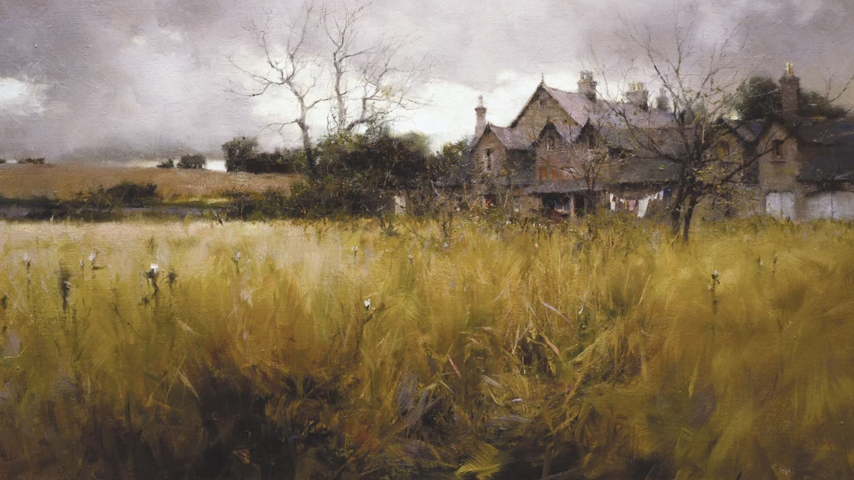
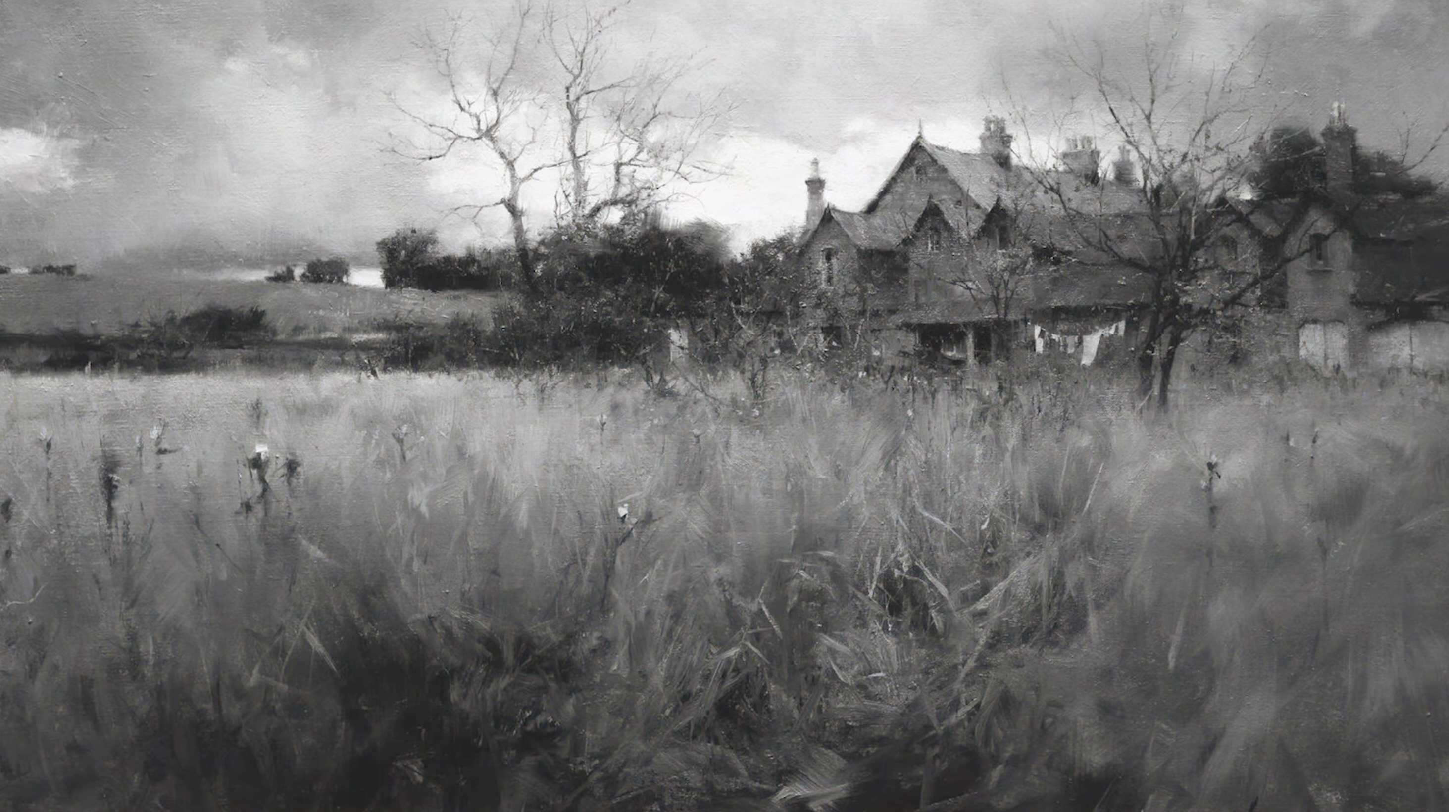
Spindlestone Farm by Richard Schmid
Values are the biggest tool that we have to create compelling light and powerful paintings. I remember when I was first getting started and hearing the term values thrown around, and I didn't always understand what was meant by the term.
Today, I'm going to simplify this for you and give you some very practical tips on how you create better values in your painting.
What Are Values?
So let's make sure we're on the same page with a simple definition. It's not complicated. Values are how dark or how light it you are painting and how the different areas of your scene relate to each other.
Let me show you a simple way to understand values.
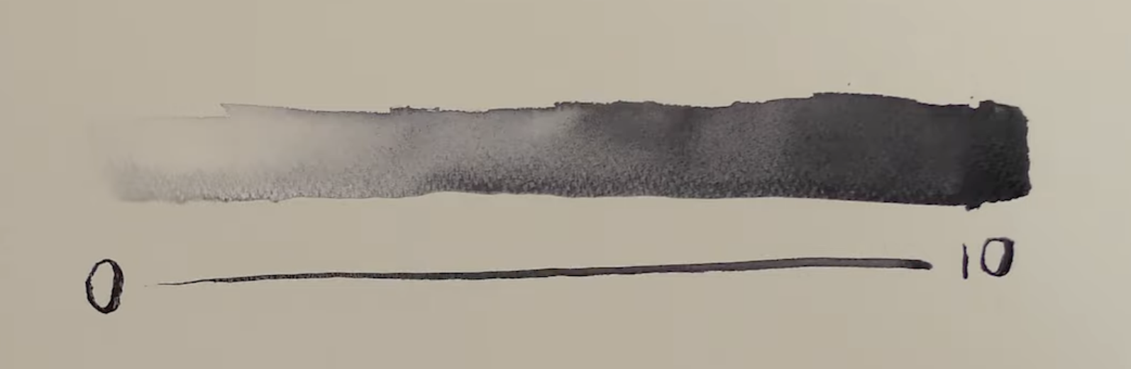
I created the spectrum above with neutral tint, representing the lightest of lights, the middle values, and the darkest of darks.
In each painting, or in a lot of paintings, we want to have a full range of values. So from 0 through 10, we want the lightest of lights, a good strong middle value area to the painting, and then we also want the darkest of darks.
Students have a hard time including a full range of values. A lot of students will just include 0 through 5 values but they're missing that higher end of middle value and a lot of the darks. Or most of the painting will live in the lighter area and then there'll be just a few little specks of darks around the scene.
In order to create compelling light in our scenes, we want to try to go from the lightest of lights all the way to the darkest of darks, an absolute 10. By having that full value range from 0 to 10, we can create compelling light within our paintings. Let me show you an example of this.
Here's a look at an old painting of mine.
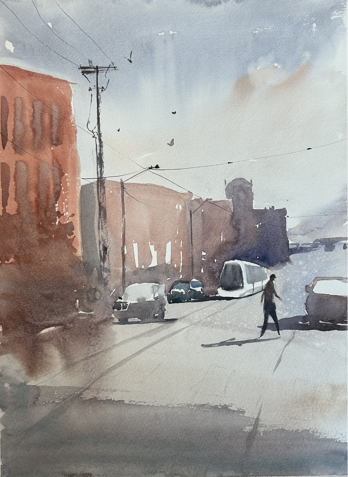
Obviously there are a lot of issues with the drawing and many things going on here, but what I want you to notice is how light everything feels. I don't have a good compelling middle value section of the scene that will carry the painting and let the light stand out, nor do I have many darks where I get all the way up to that richest value.
I'm not getting a full range of values. Now here is a similar subject that I painted several years after that one. I went a lot richer, a lot stronger in all of the areas.
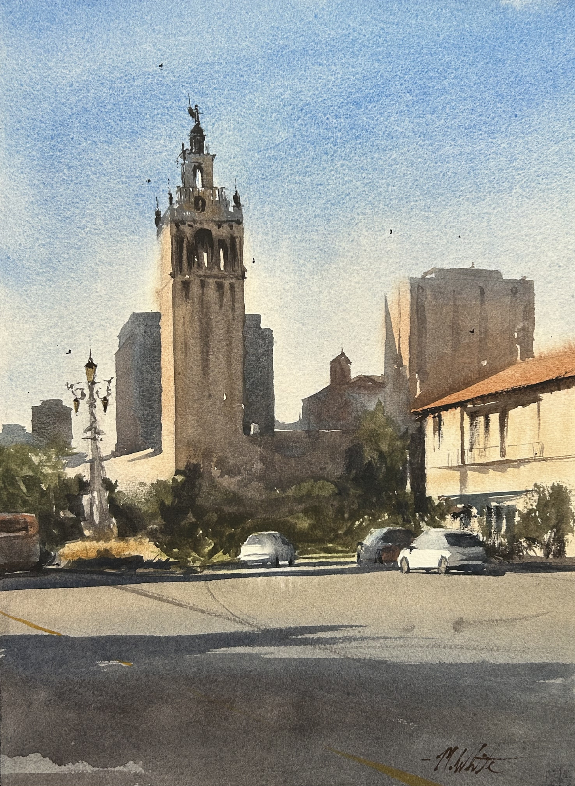
You can see that in this painting I've gone stronger even in the lights. I know that the top of the sky is a deeper, richer blue than at the horizon, so I push that value a little bit more. The middle values below the tower, the face of the main building, the things in shadow - those are a lot darker because I created more rich washes in my scene and mixed strong enough darks for that full range of values. This results in a much more compelling painting with believable, evocative light.
3 Quick Tips to Paint with a Full Range of Values
1. Turn your reference photo black and white.
If you take a reference photo and digitally take the color away, you can often see your values more clearly and understand how strong you need to paint in order for the light to become very evident. So by looking at your subject in black and white, you can better understand the values of the scene.
2. Do a value study before you do your actual painting.
If you are very serious about painting better values and improving, this is what you want to do. By creating a value study, we can take a complex reference photo and come up with a game plan to paint your scene that includes proper values.
Oftentimes when I do value studies, I'm looking at the scene and I'm breaking the values up from zero to ten and then into three groups. Zero through three are the light values and I leave all of that as the white of the paper. Four through seven is the middle values and I paint those in one connected shape, if I can. And then seven through ten are the darkest of darks.
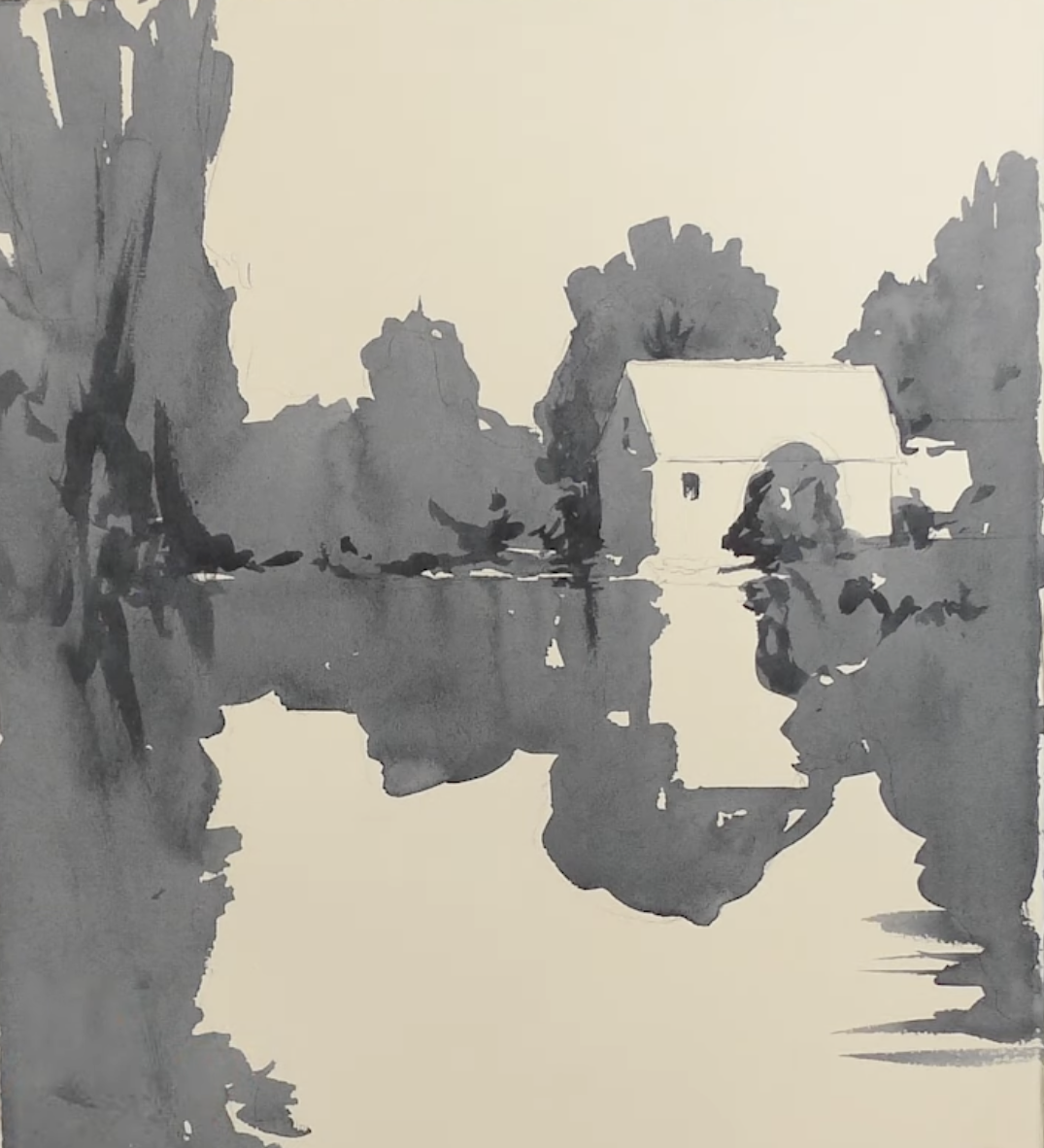
Approaching the scene in this way and thinking through it in that process, really helps me develop my game plan for the scene and paint better values.
So here's a look at one more value study where I combined the shape of the tree right down into the shape of the reflection, along with the painting I did after that value study.
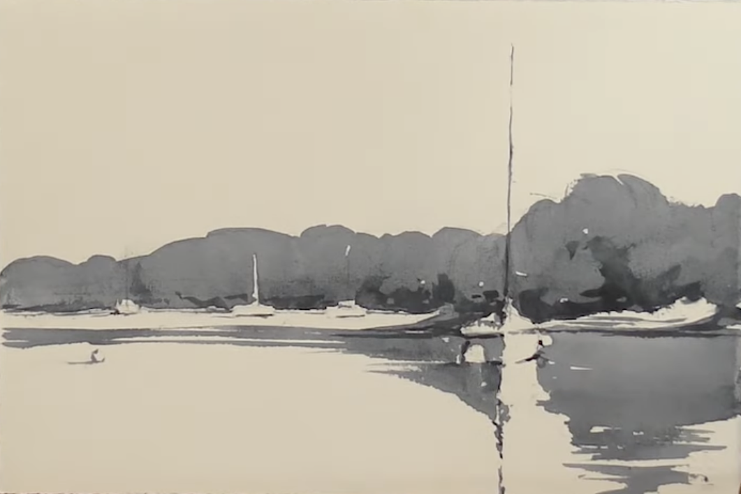
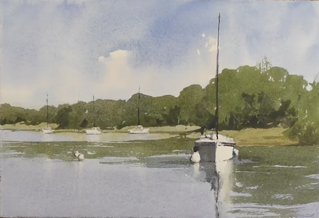
3. Use enough paint.
A common reason why students' values are too light is they aren't mixing rich enough paint. If you feel like your paintings are too weak and you don't have compelling light, often the problem is not using enough paint.
So a few tips on that:
- Use tube paints rather than pan paints.
- Pay attention to the ratio of water to paint in your value studies and replicate this in your paintings.
- Take time to practice mixing colors outside of painting a full scene so you get a good feel for the values different ratios create.
Want to Learn More?
If you'd like to know more about values, I have a whole course on this.
The first module of my online course - Watercolor Essentials - is all about seeing values, understanding values, and how you can apply that into your paintings to create richer scenes with more compelling light. Check it out and reach out if you have any questions at all!
Related Blogs
Watch Your Watercolors Improve With Better Water Control